Project Overview
Description: Cheese Pretty Please is a charcuterie board business based in Southern California. It is a relatively new company (2.5 years old) and caters mainly to its surrounding areas. They offer a variety of boards in different sizes for delivery or pickup for any and all occasions.
The Problem: Without an inspired and functional website, users aren't able to make orders online - which ultimately prohibits overall growth.
My Role: User Experience Designer, User Interface Designer, User Research, Market Research, Prototyping, Wireframing, Logo Design, Website Redesign
Tools: Sketch, Figma, Adobe Photoshop, Adobe Illustrator, Balsamiq, Pen/Paper
Timeline: December 2019 - February 2020
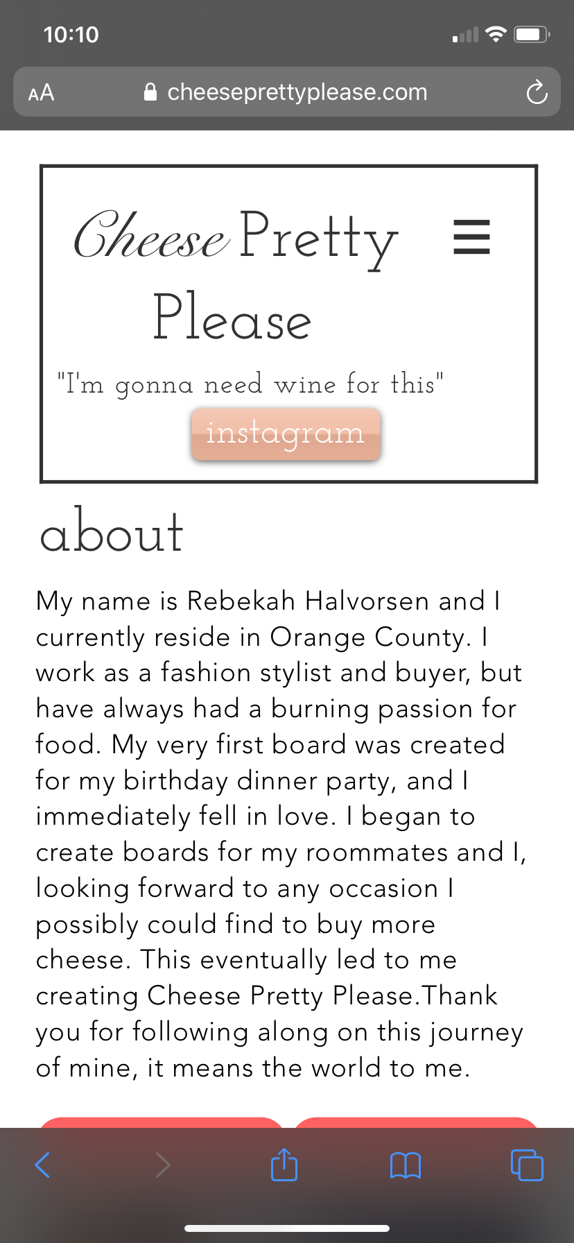
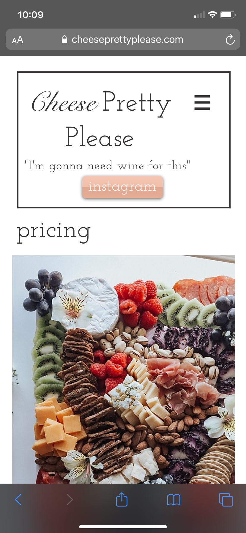
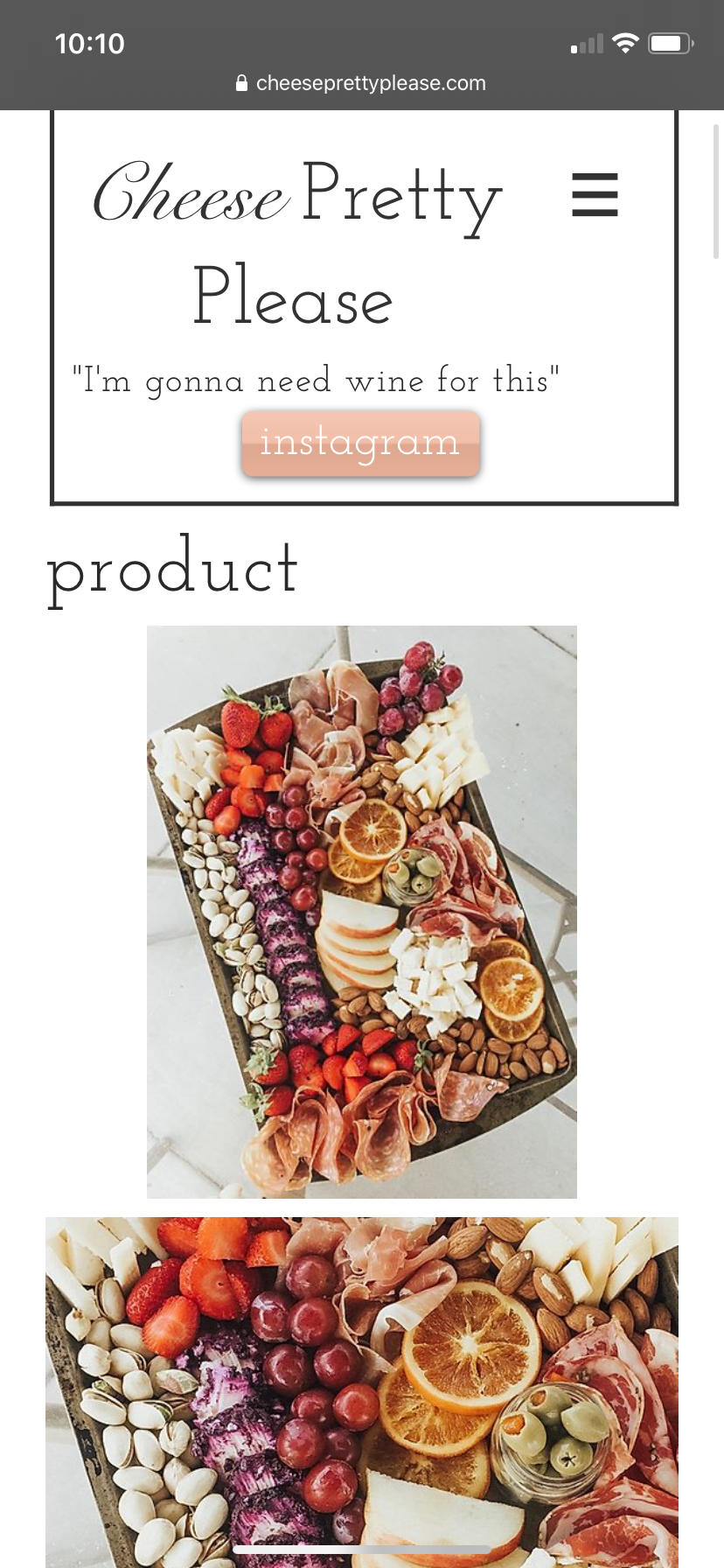
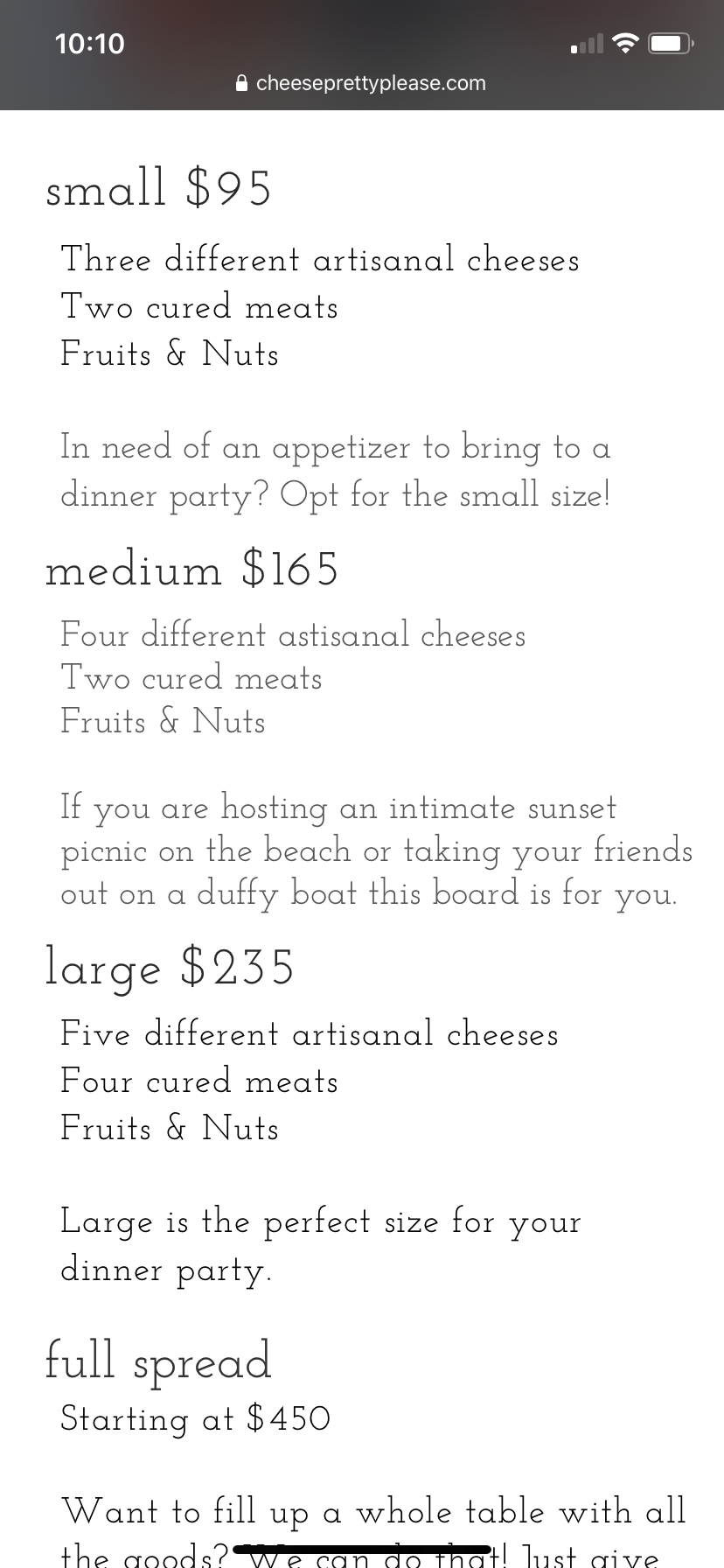
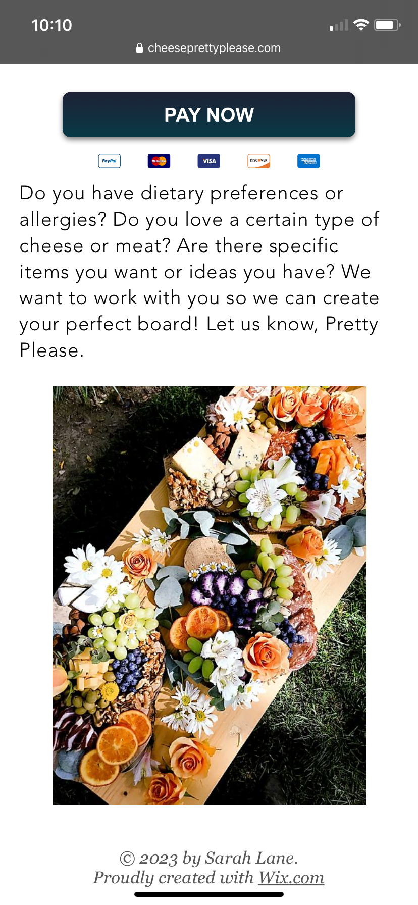
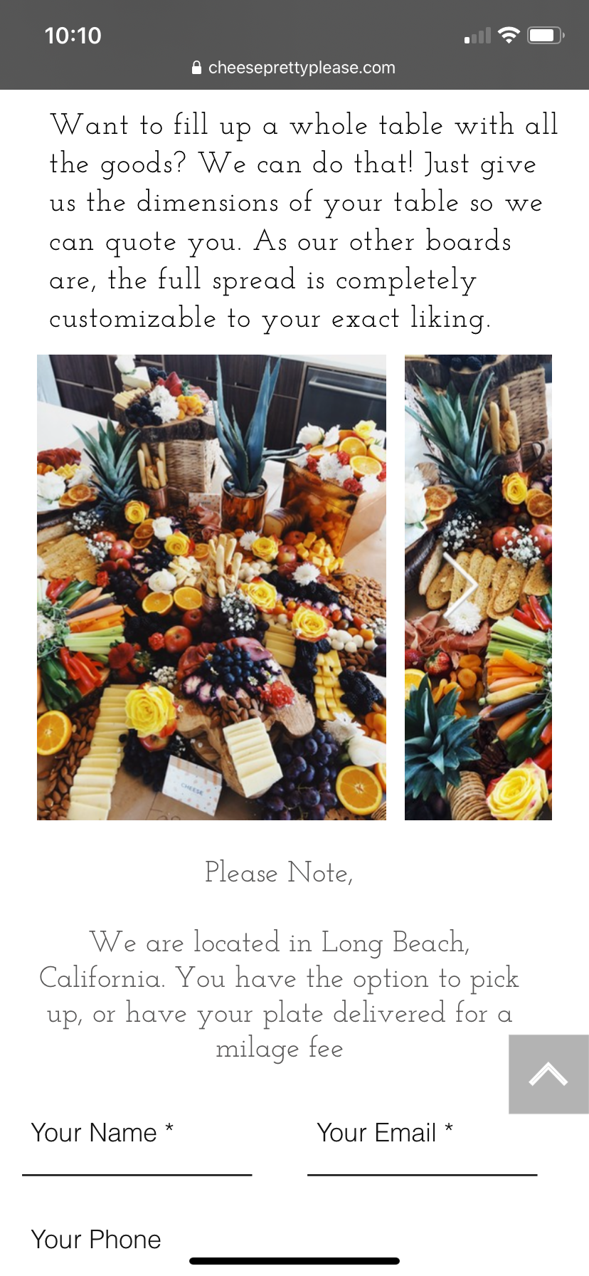
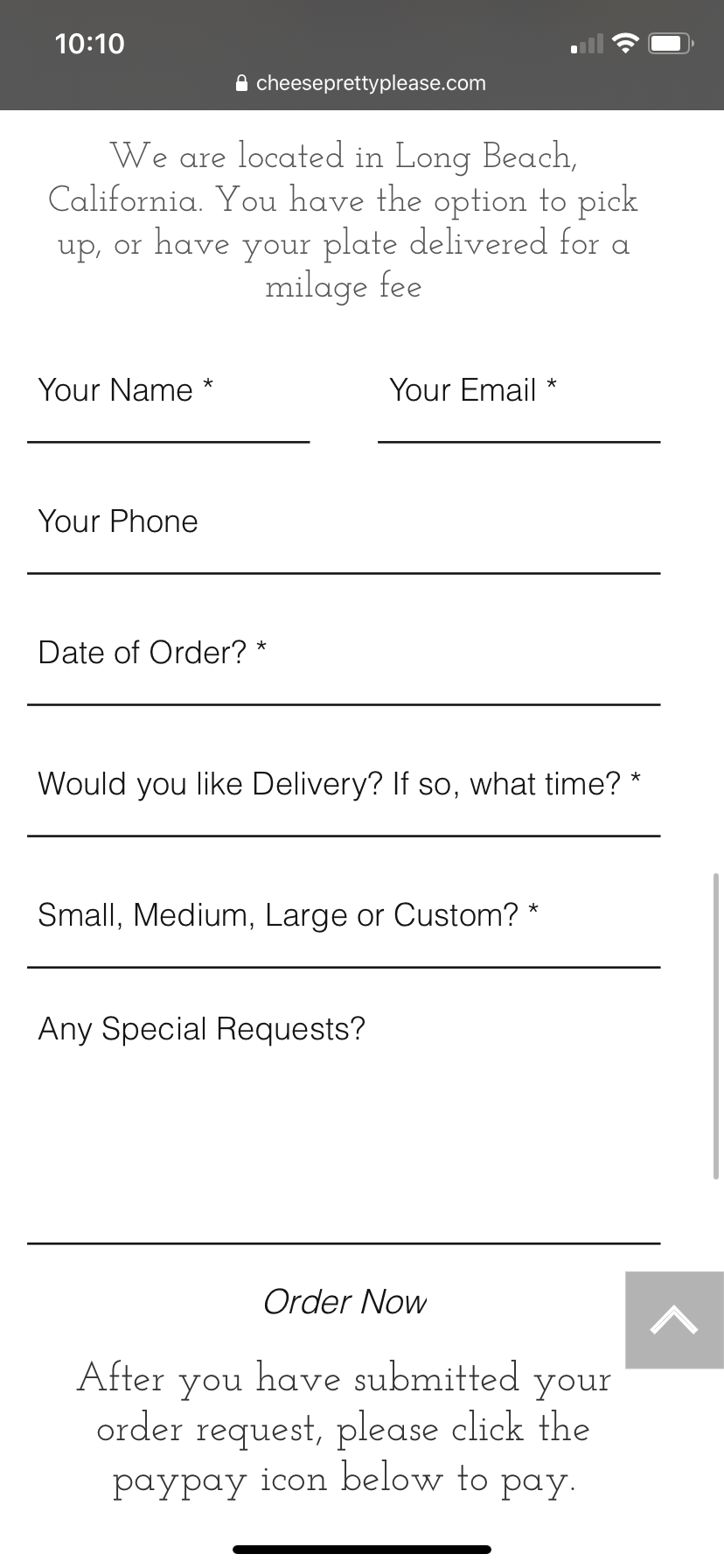
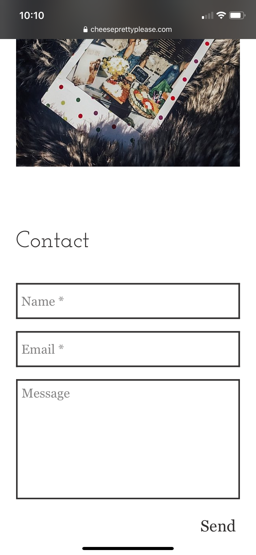
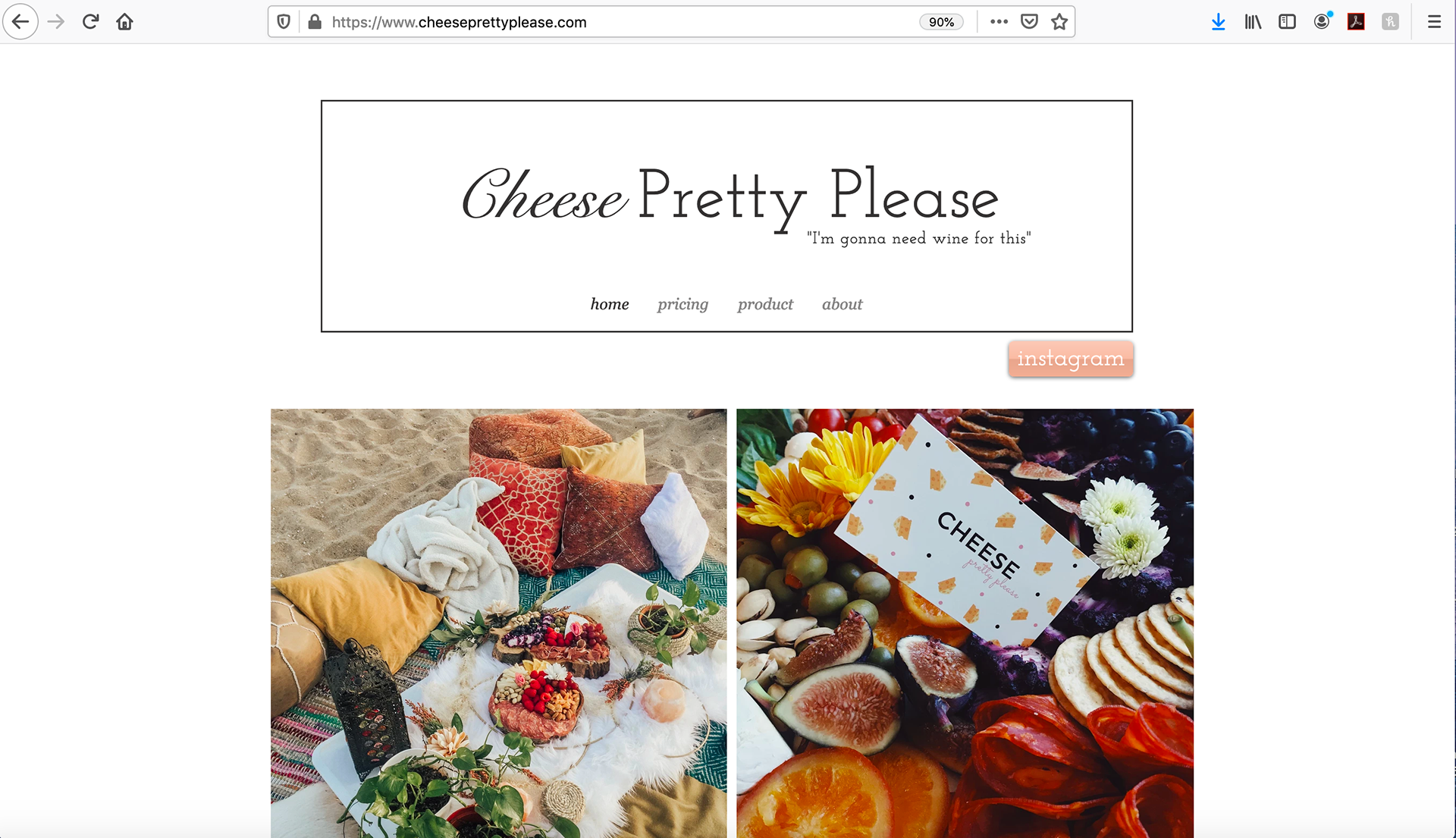
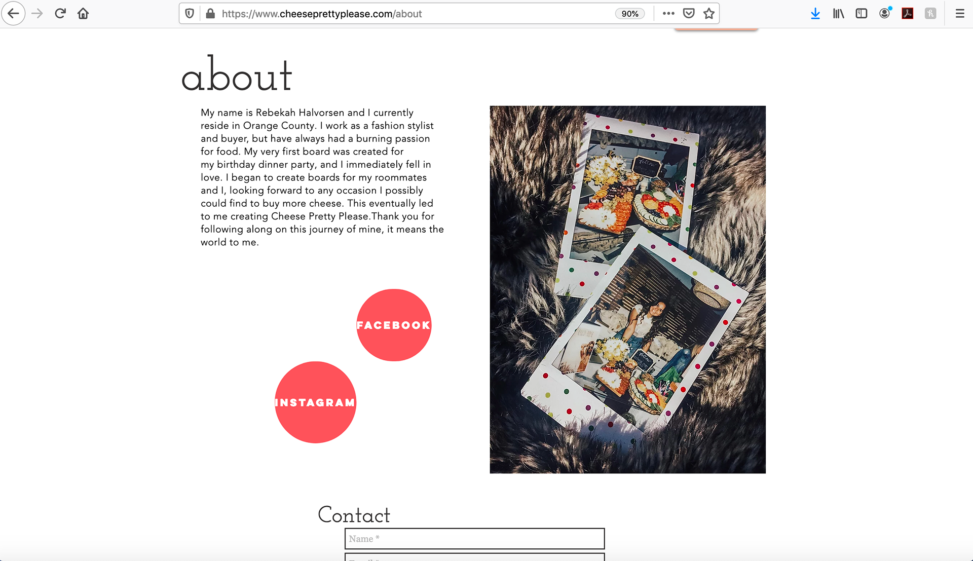
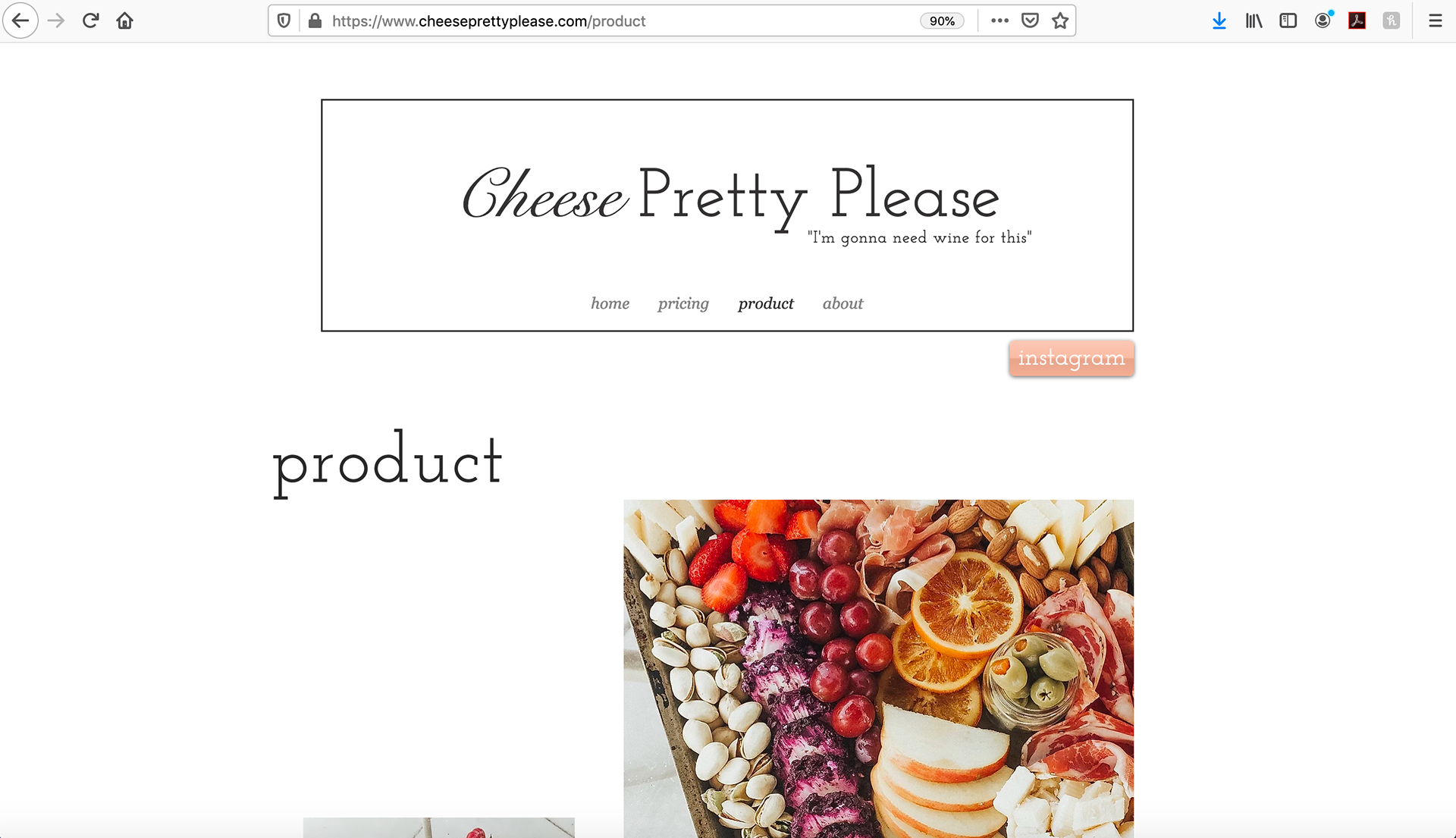
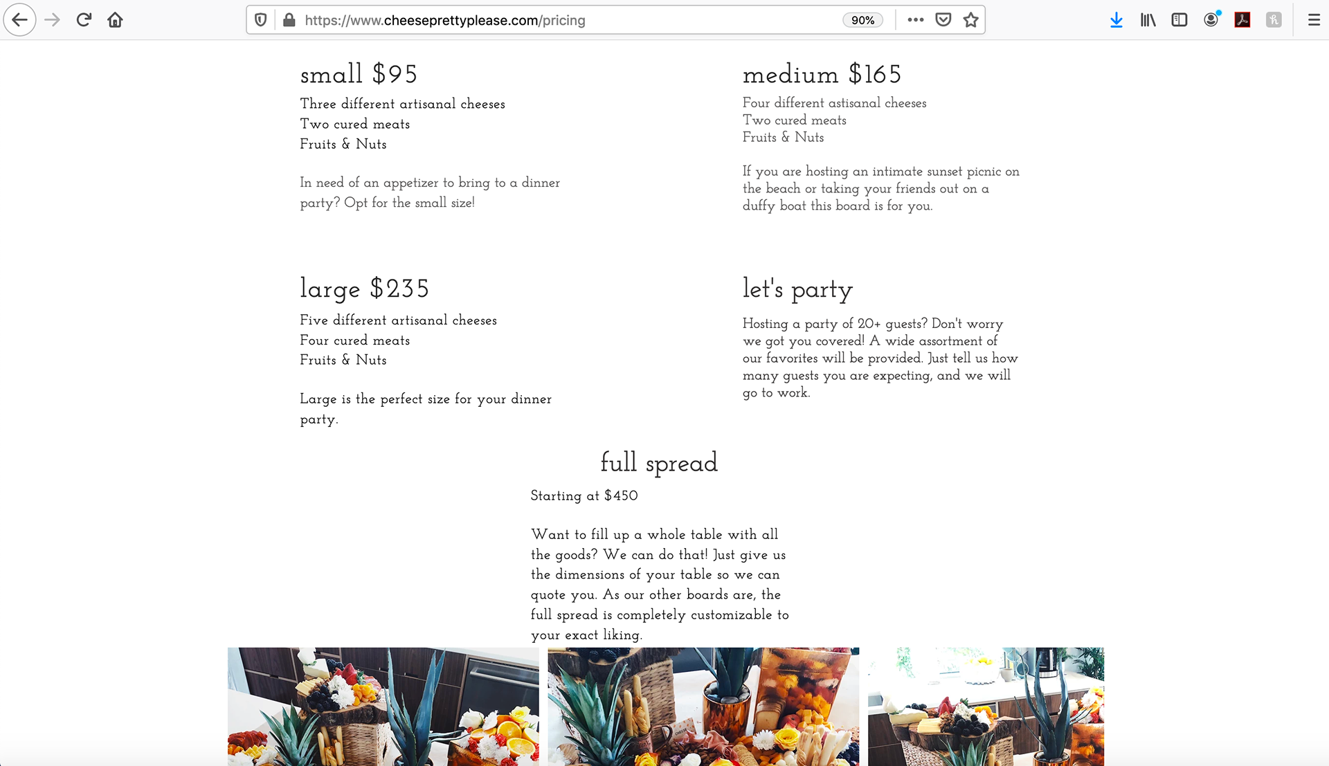
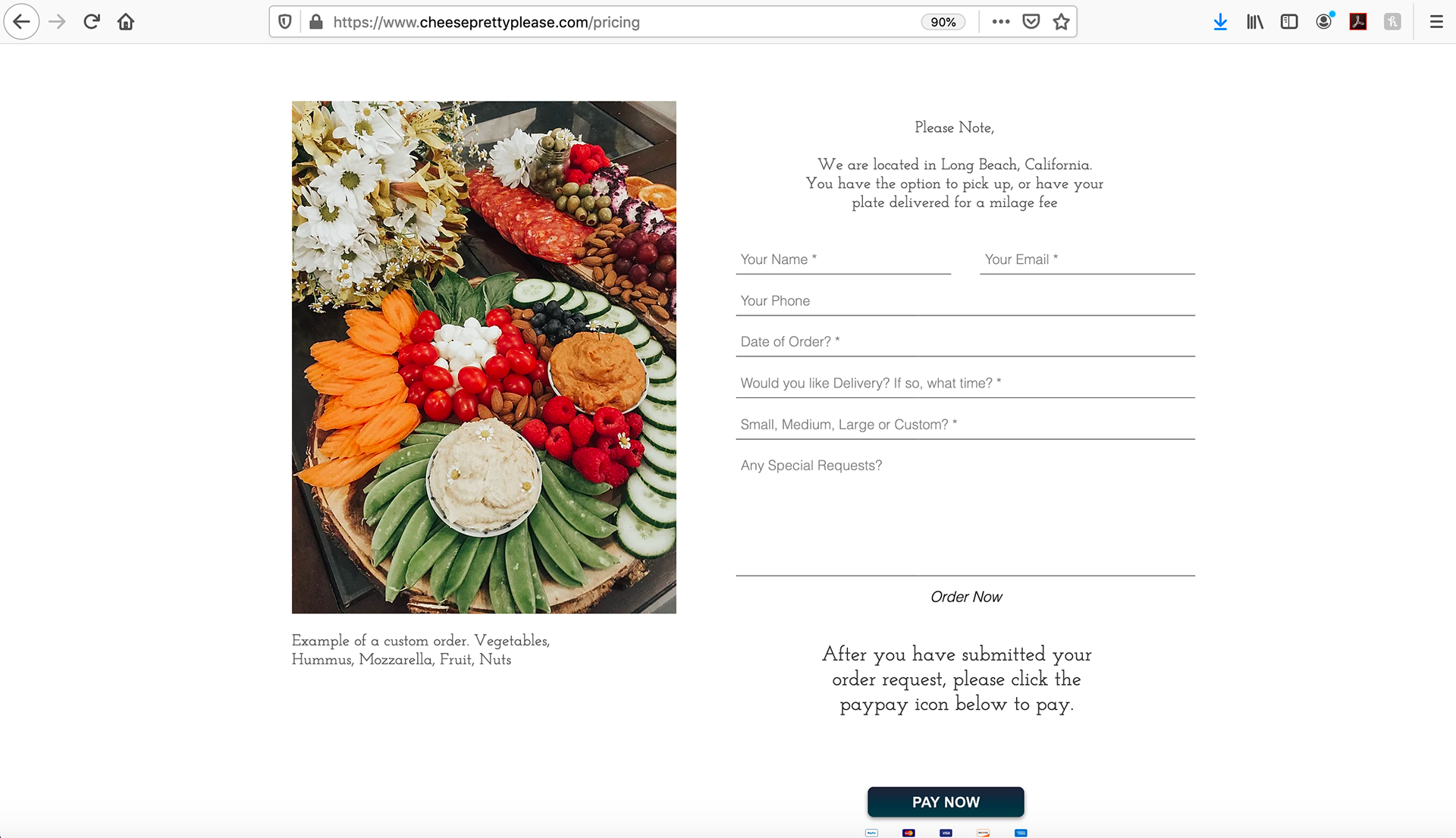
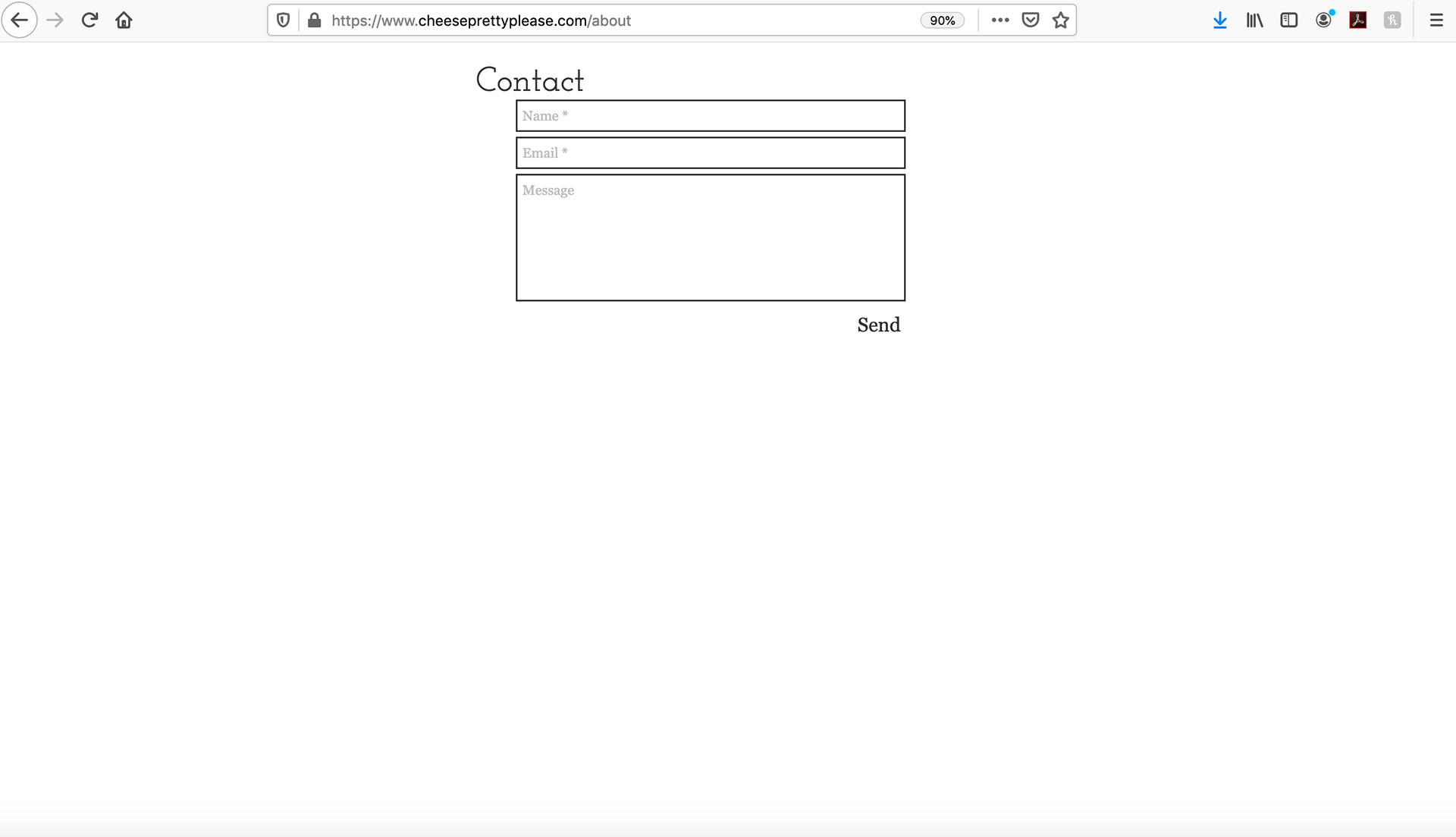
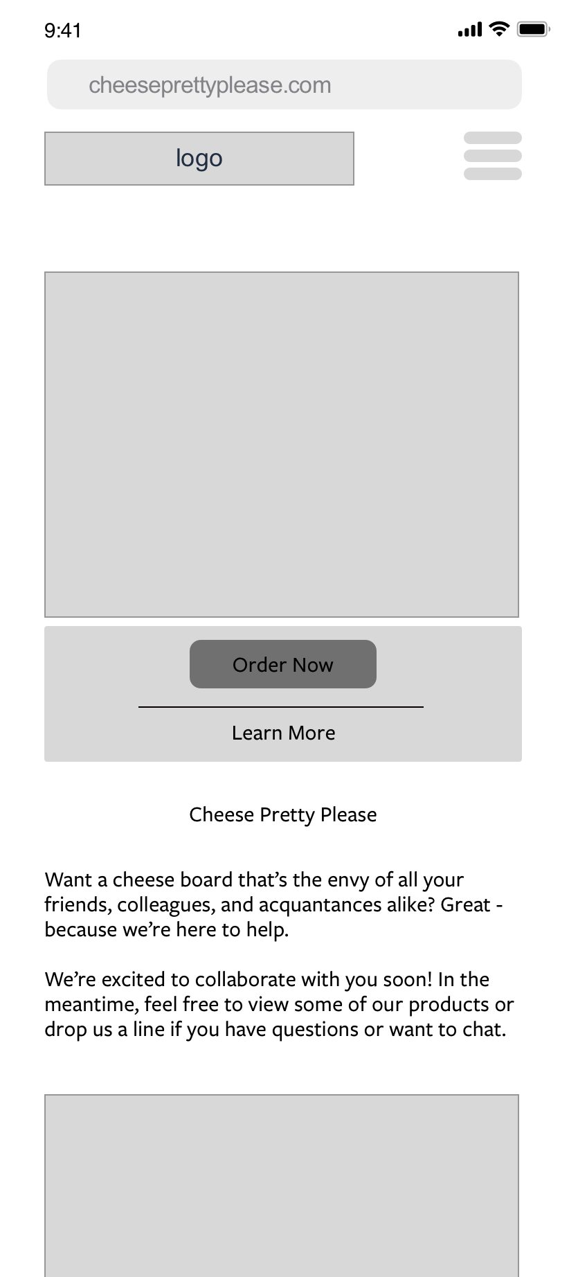
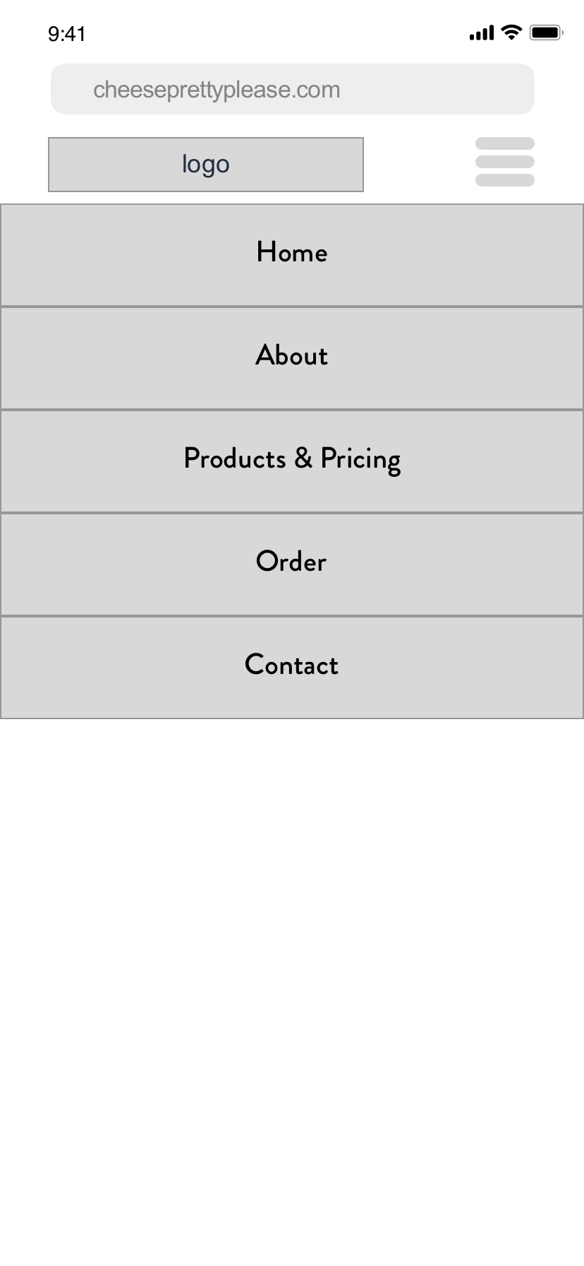
Current (Original) Website - Mobile & Desktop
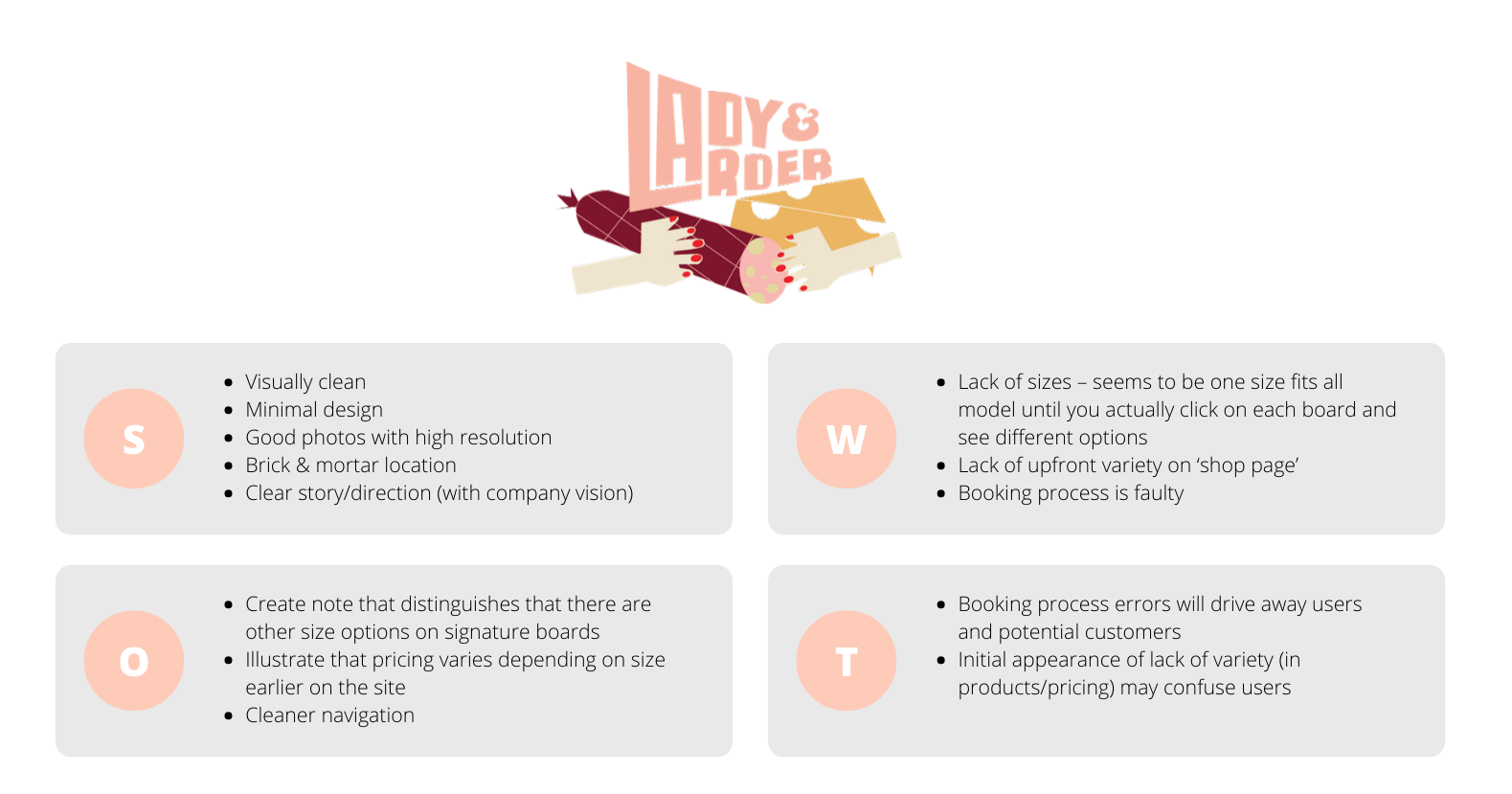
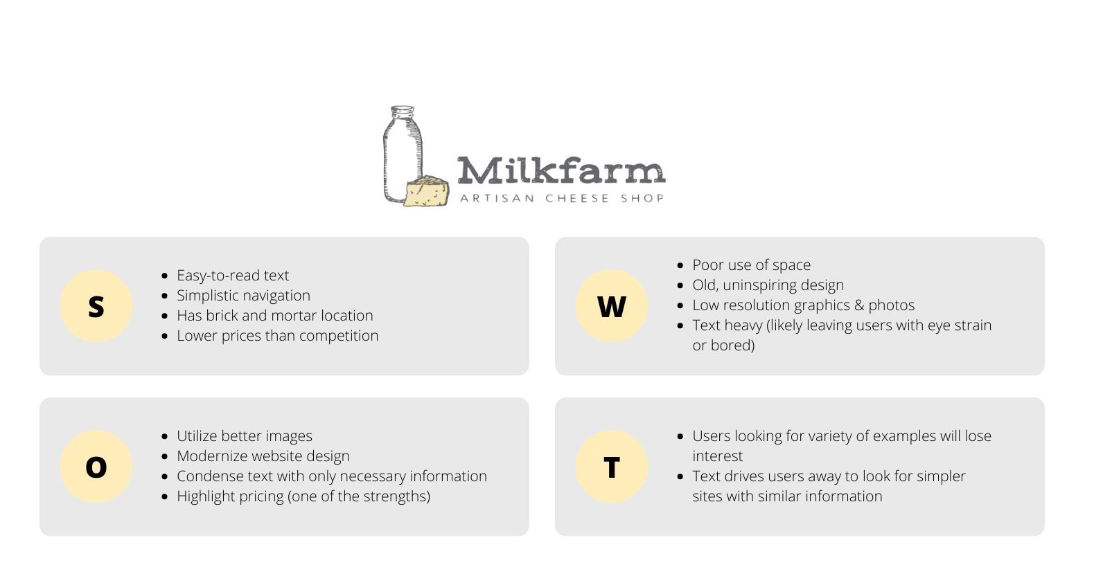
Competitive Analysis
To start my research, I wanted to look into the cheeseboard and charcuterie board market. This is a very niche space and getting a handle on the competition is critical to understanding what people are looking for. I wanted to narrow my search to Southern California because there are a surprisingly large number of businesses like this that exist nationwide. I wasn't able to find many other brands that were as small as Cheese Pretty Please with a large following, so I decided to enter a level one degree up. The market here was still Southern California and boutique in feel, but most had physical locations - a key distinction I think is important to note. From here, I selected two brands and conducted my SWOT analysis:
User Research
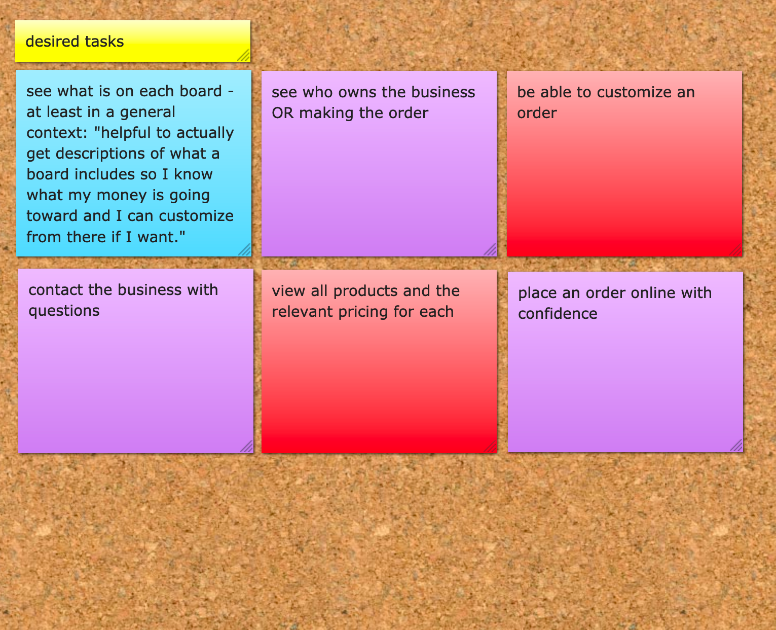
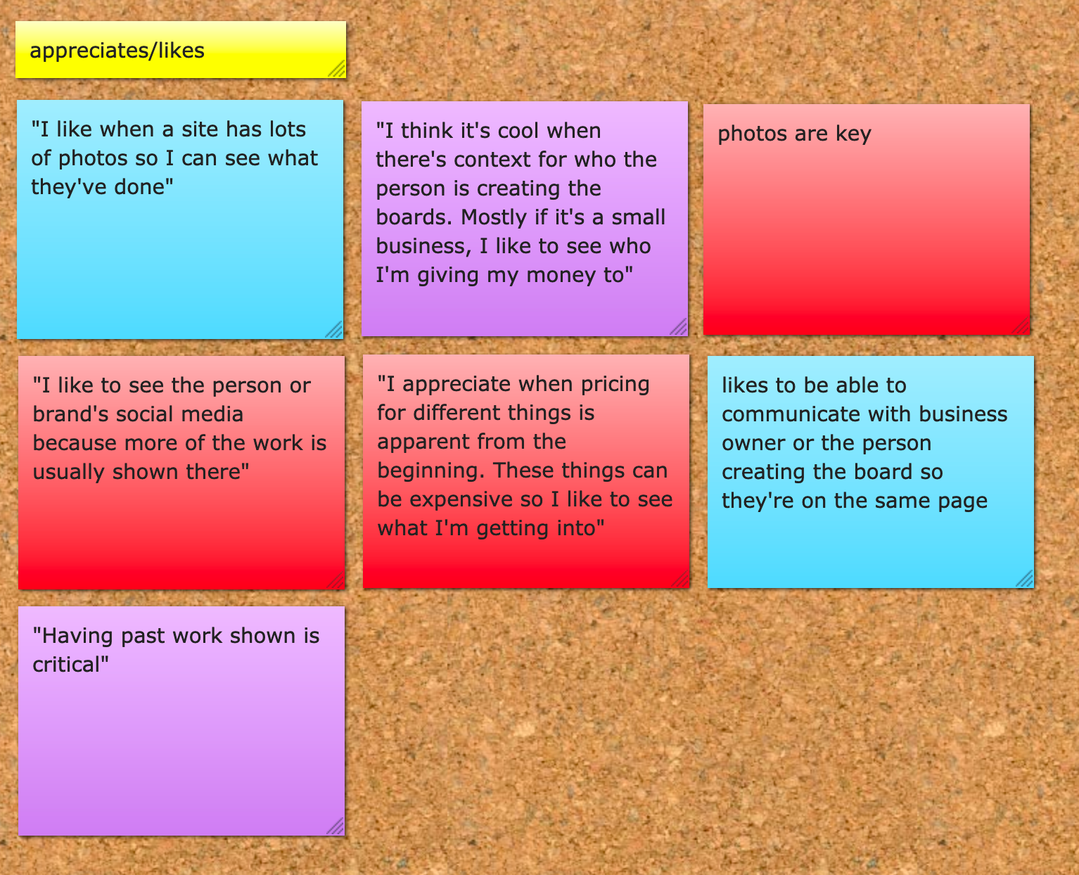
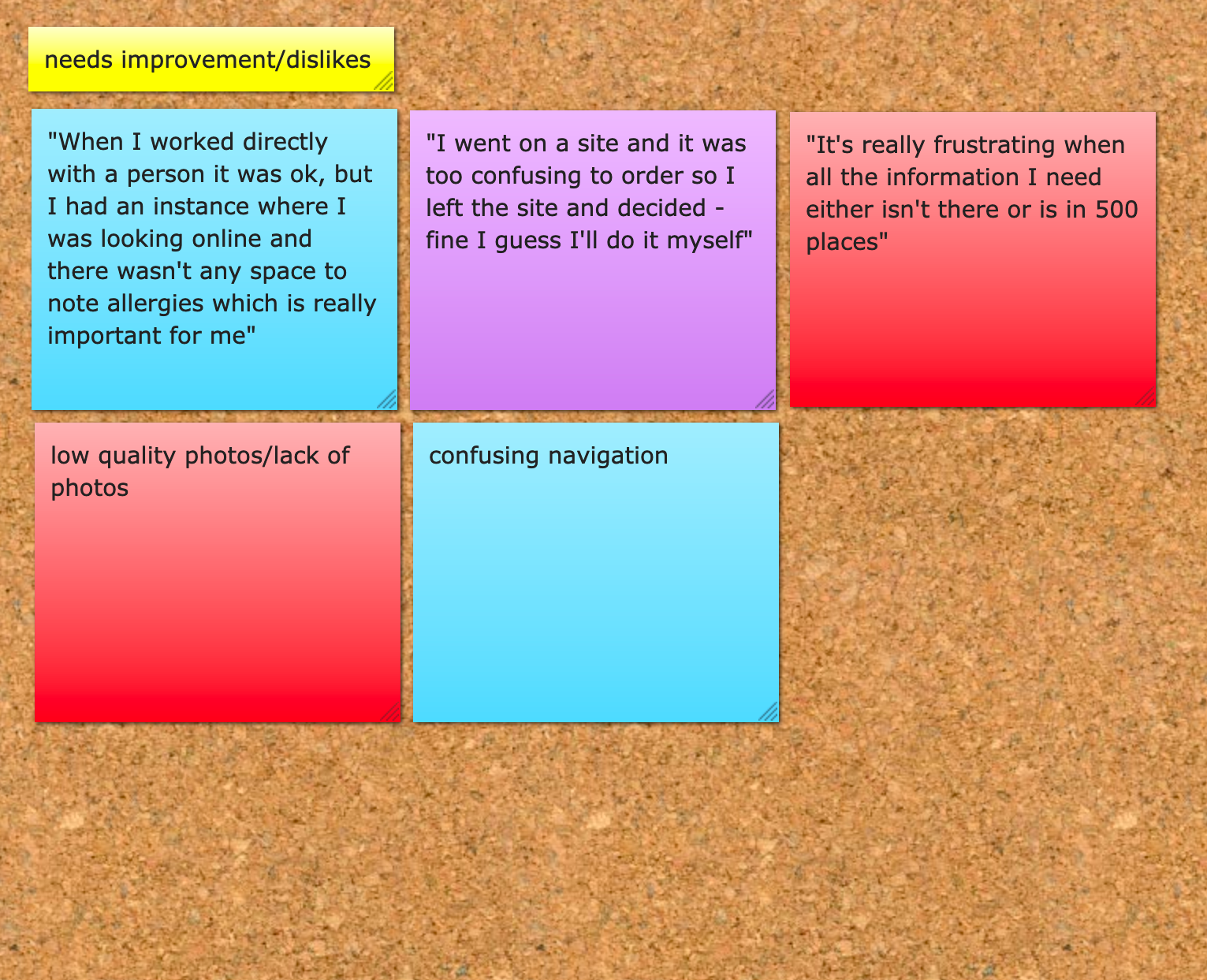
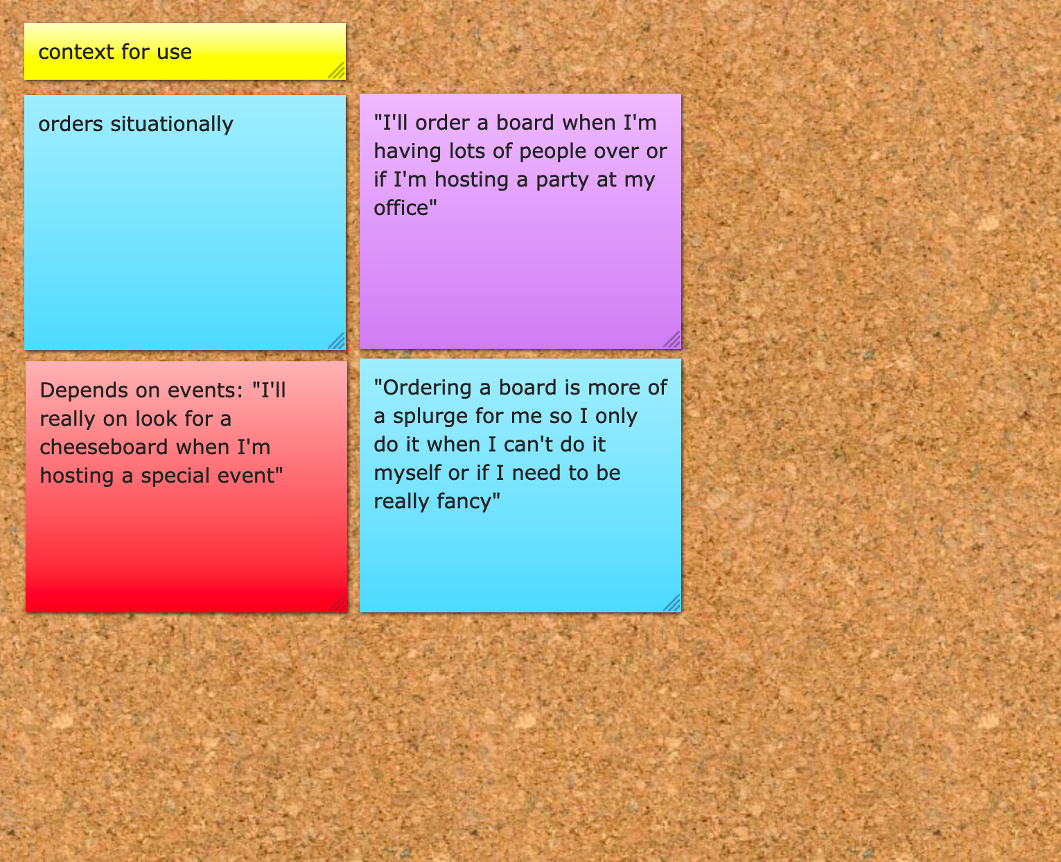
With a solid understanding of the space and a genuine interest in how this marketplace came to be, I moved into user researching. I was surprised to learn that quite a few people in my immediate circle (at least friends on Facebook) had ordered from a business like Cheese Pretty Please in the past 6 months for their personal gatherings or events they were in charge of for work. After surveying these three people (shown by different sticky notes), I created affinity maps to group together all my findings and hopefully find a cohesive link between them. Through mapping, I divided these discoveries into four distinct categories: desired tasks, appreciates/likes (in a service like the one in questions), dislikes/needs improvement, and context for use.
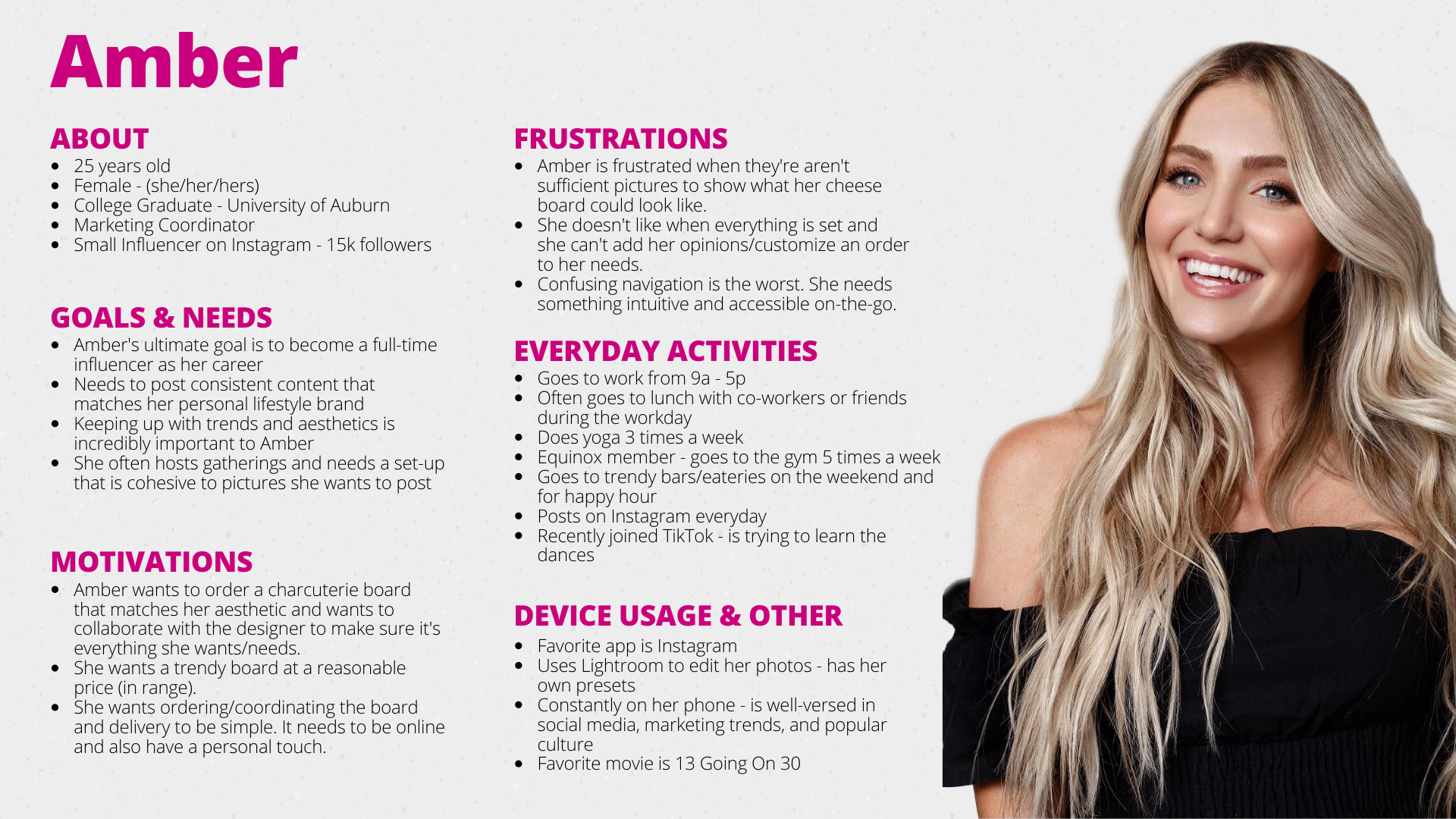
User Persona
Because Cheese Pretty Please is an existing brand, some of the user persona details are informed from actual consumers. The brand isn’t trying to steer away from its current base so I believe it’s important to consider that information. In fact, because growth is one of the key objectives, attracting a larger volume of the same type of people would be quite effective. Something else relevant to the user persona information included below is that the business also currently caters to smaller, yet trendy and fashion-forward boutique businesses hosting parties/events in their retail locations.
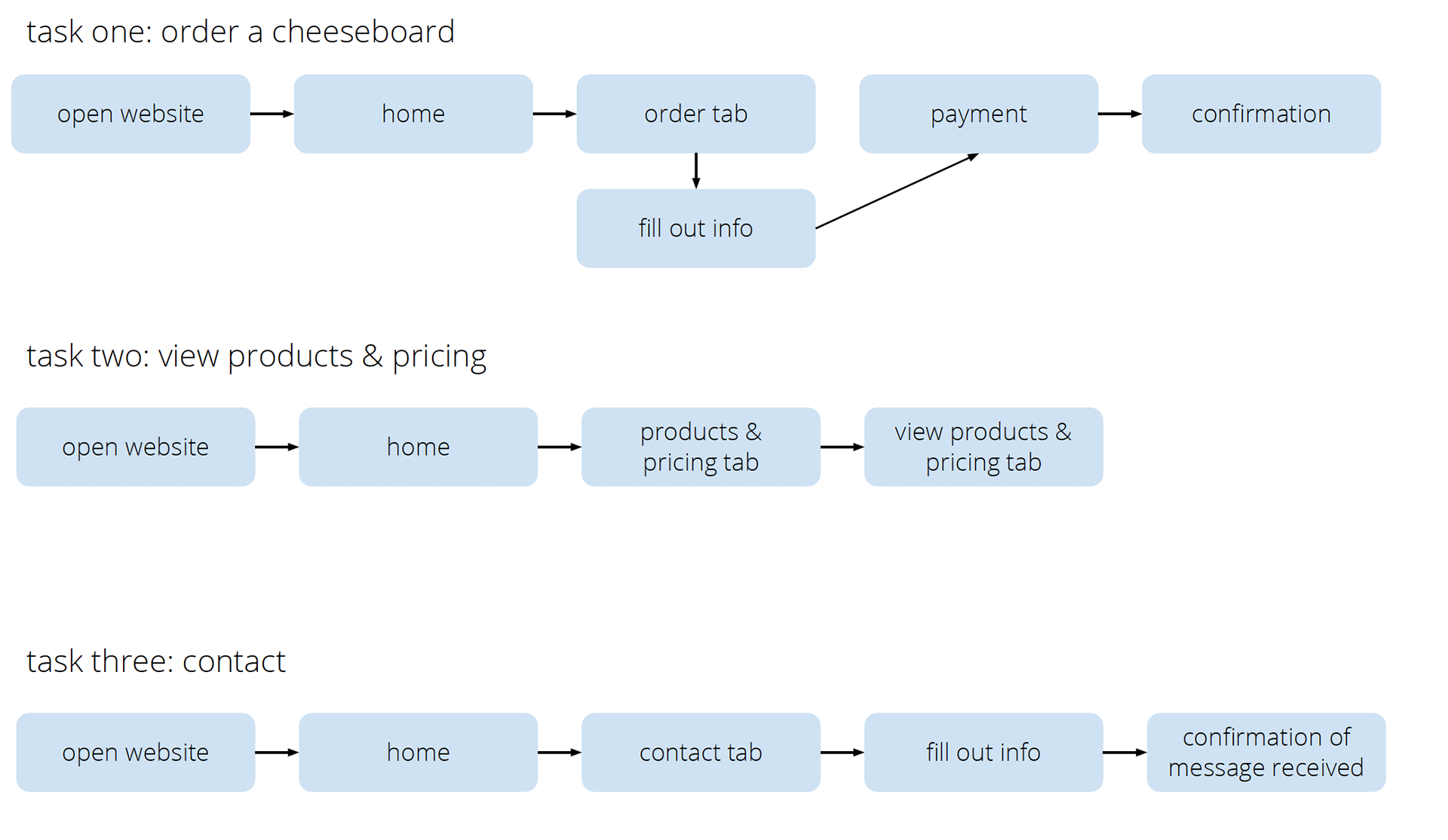
User Flows
I found that the most critical part of creating the user flows was to identify what were the most important tasks users wanted to complete. The site-map at this point ended up being relatively simplistic because extra pages would have lengthened the time to get from point A to point B.
Wireframes
Below are examples of my paper/pen, low, mid, and high-fidelity wireframes. I really enjoy seeing how the pages evolve from one iteration to the next – keeping some of the key elements, but also improving upon components that weren’t as detailed or needed clarifying (according to users).
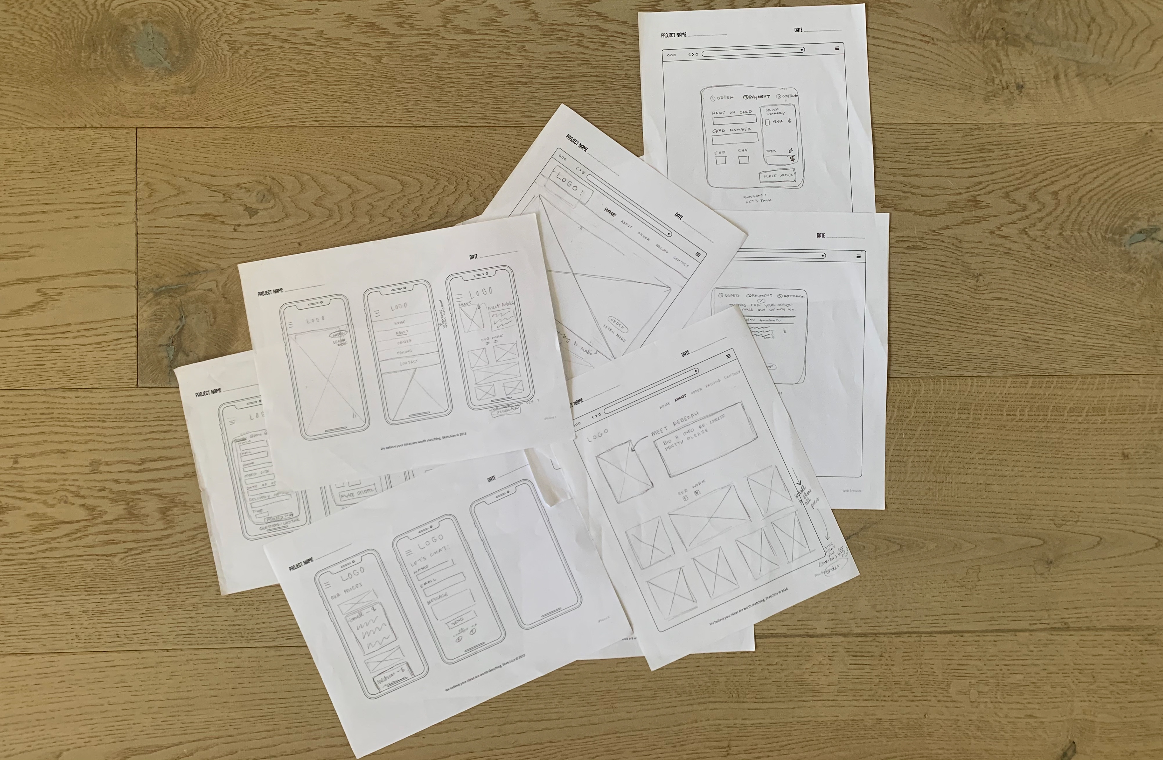
Pencil/Paper Sketches of Mobile and Desktop Wireframes
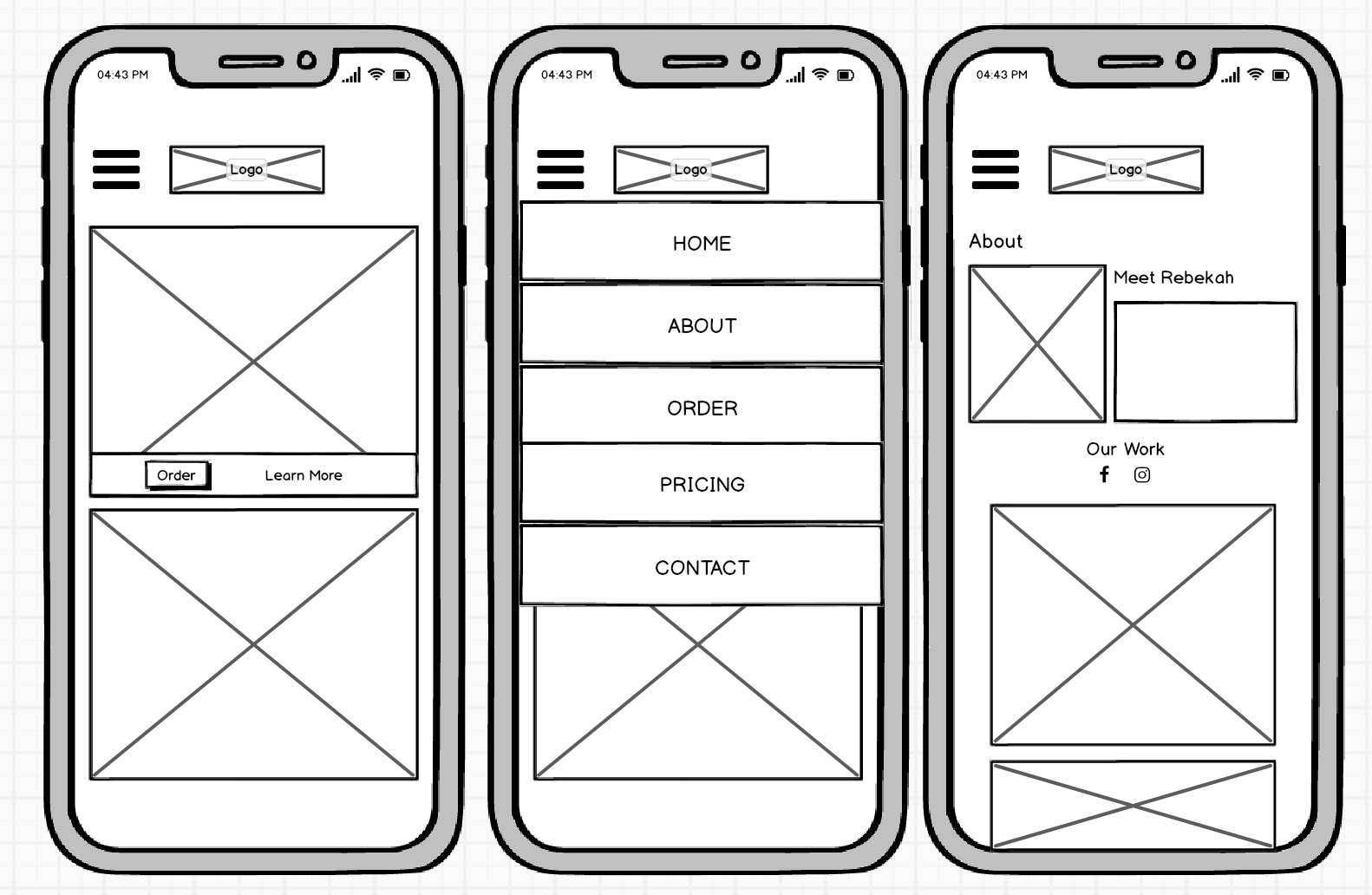
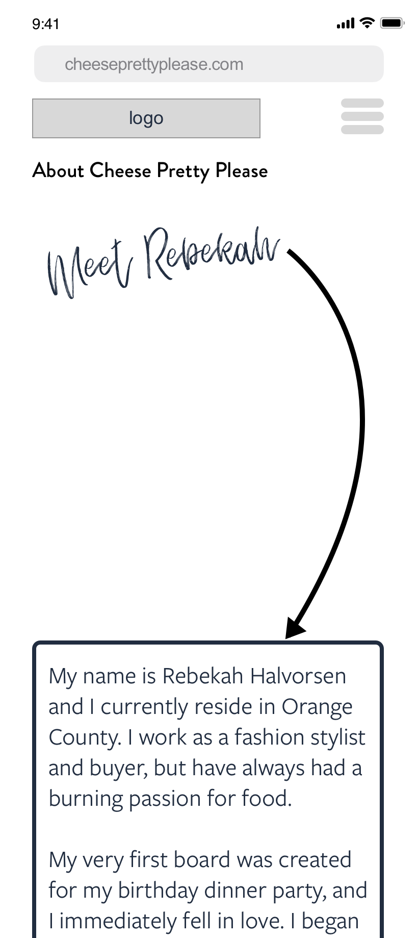
Low Fidelity (L-R): Home Page, Hamburger Menu, About Page
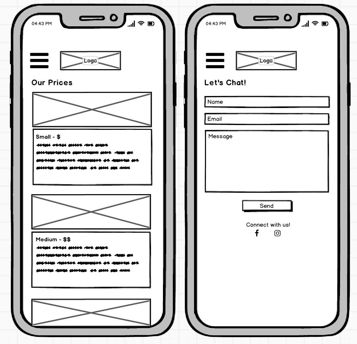
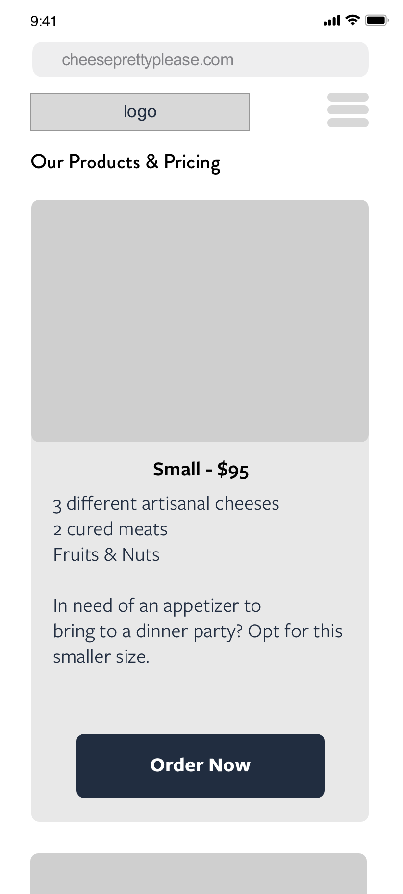
Low Fidelity (L-R): Pricing Page, Contact Page
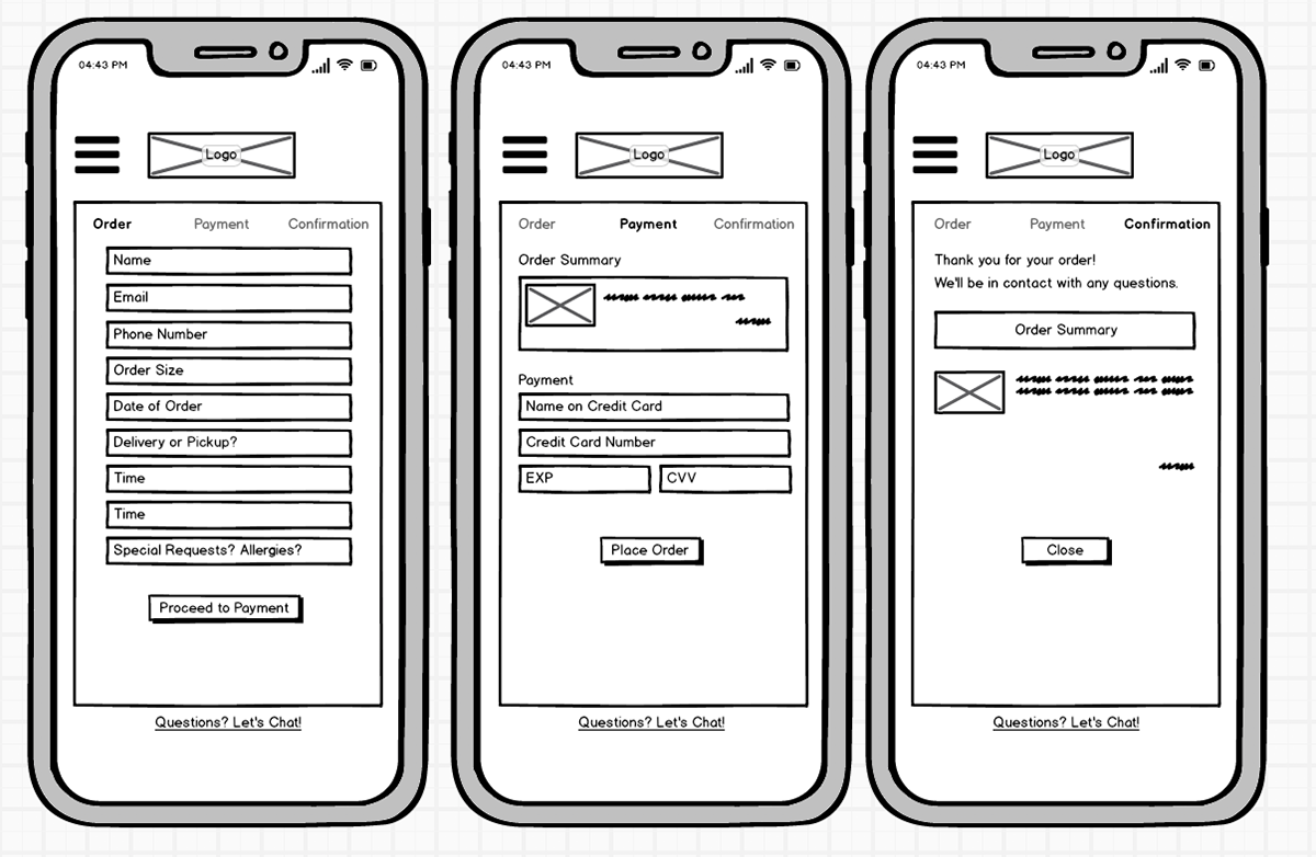
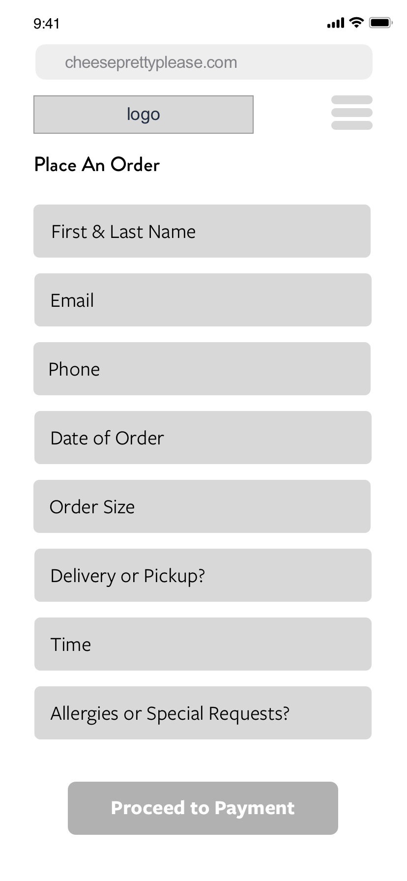
Low Fidelity: Ordering, Payment, Confirmation
User Testing
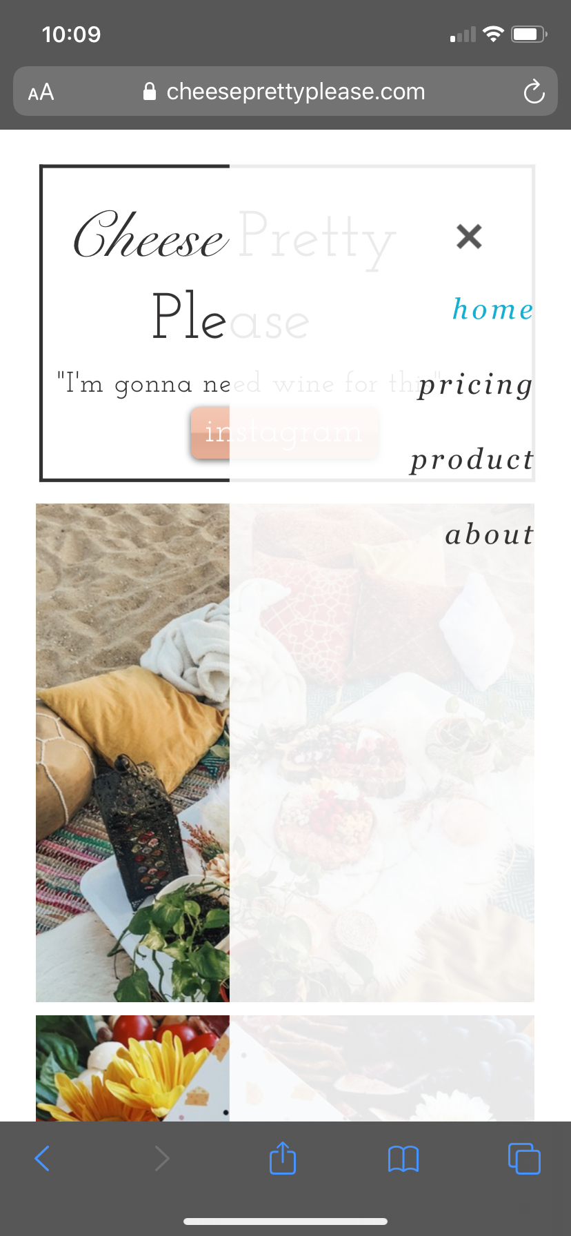
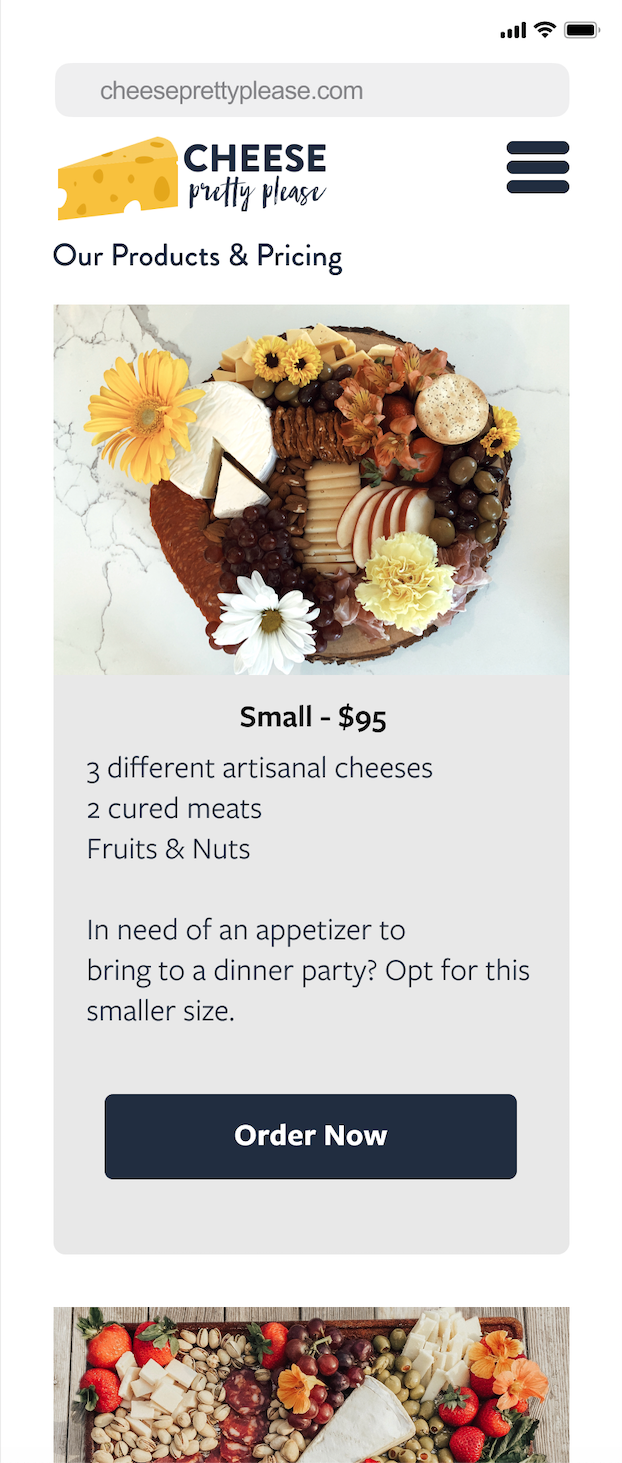
One notable difference that I changed between iterations was the amount of product photos I included. This was because of feedback from user testing emphasizing how important it was to see high resolution images of the food they were going to order. I also received feedback in two user tests that while scrolling on the ‘About’ page, they would’ve appreciated an option to go back to the home screen without having to move all the way up or down. Because of this, I secured the top header (with the logo and hamburger menu) and made that a consistency even as users were looking at images.
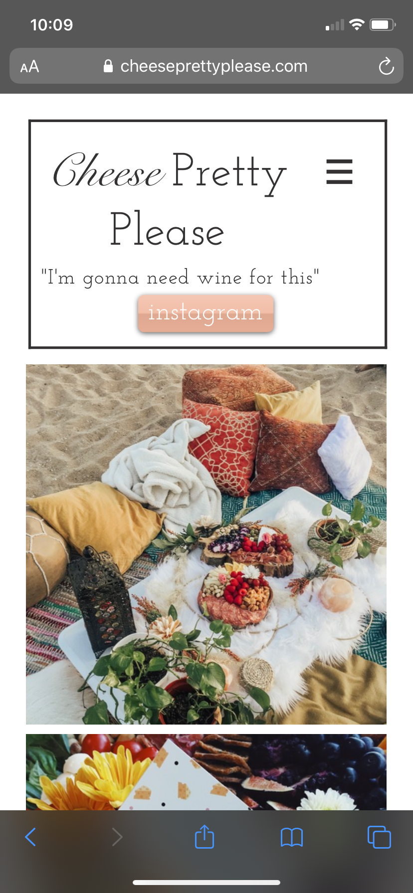
Before Testing (without locked header)
After Testing (with locked header)
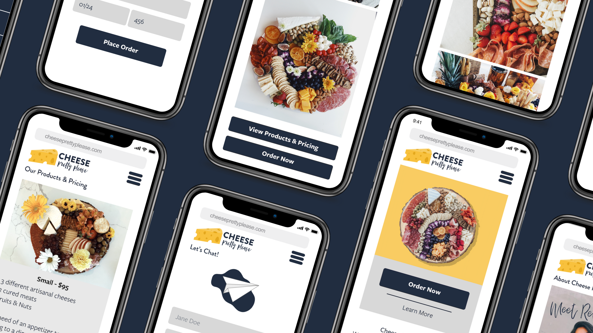
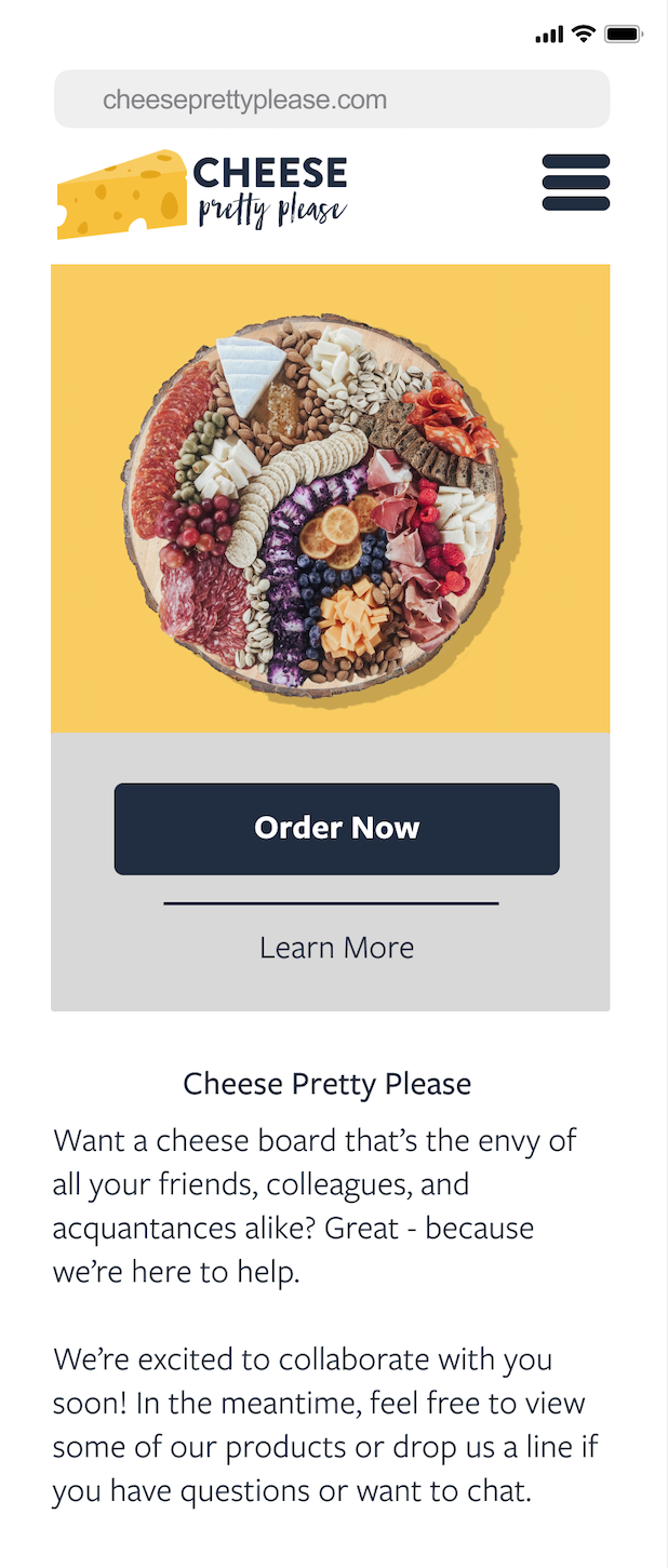
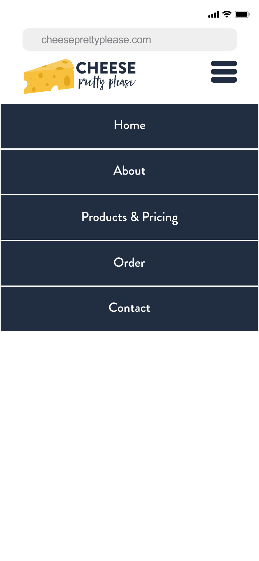
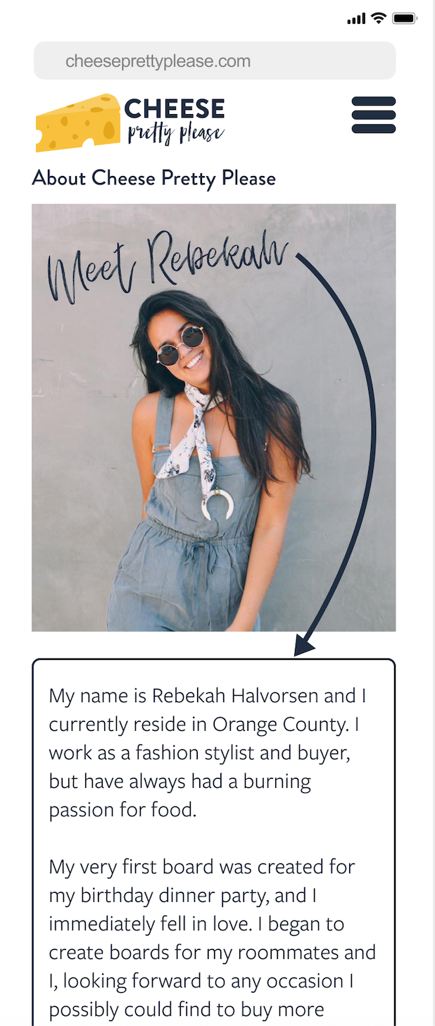
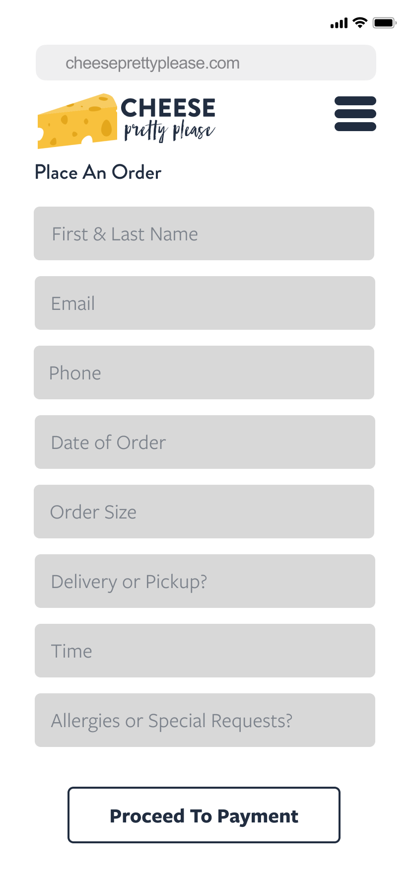
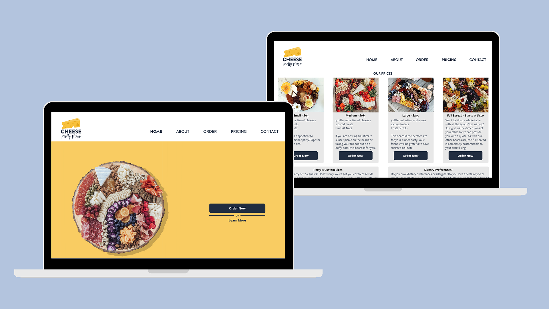
Final Design
With sufficient user testing and revisions to my initial designs, I resolved to create a final design that aligned with my users’ needs. The below images and prototype are my finished product.
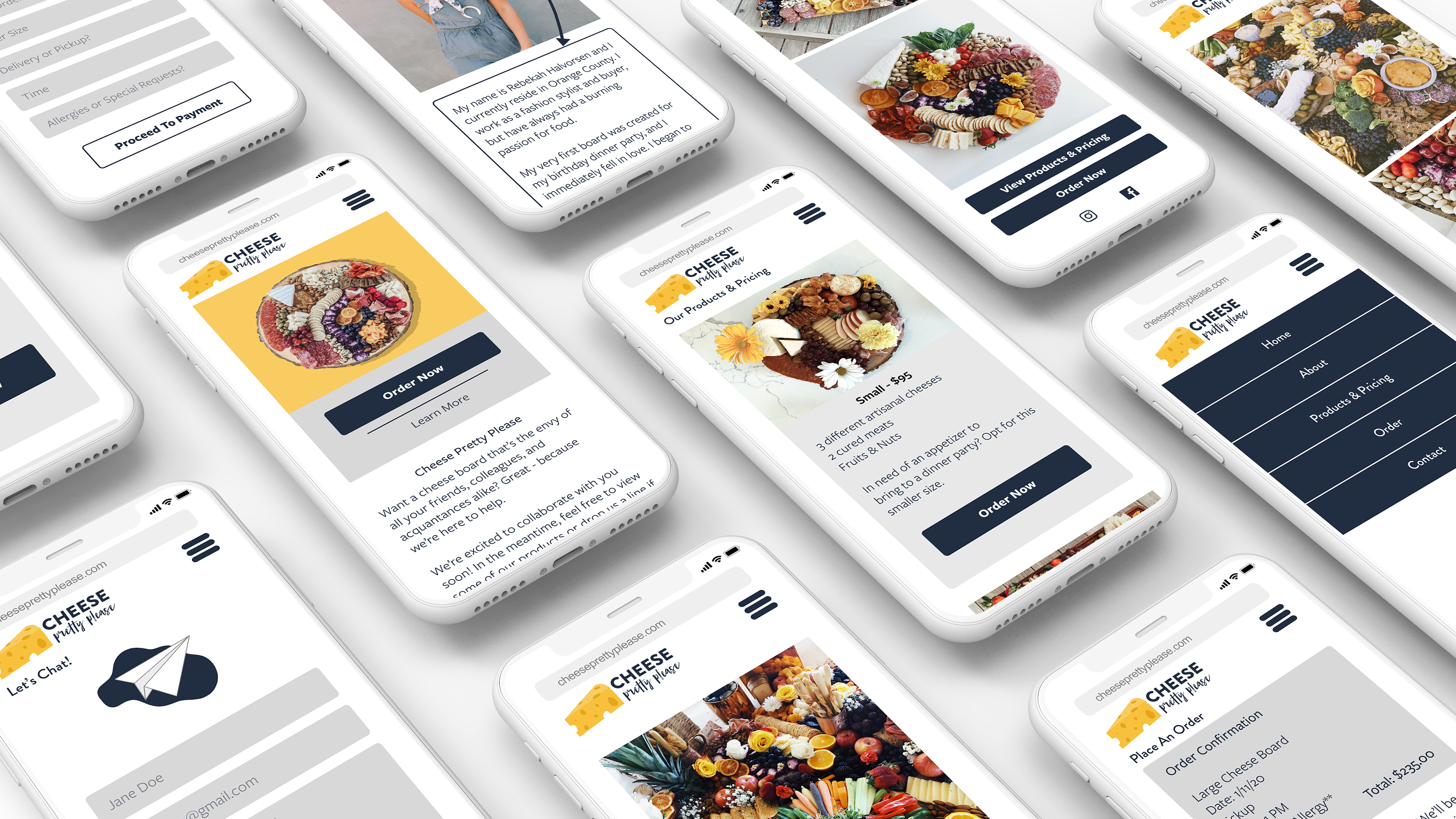
Prototype
Learnings
When in doubt, test again: After receiving the user feedback about adding essentially a locked header, I was a bit conflicted and, mostly in my own self-interest, thought it wouldn’t end up looking as good as the current version. Then, once I implemented the change and re-tested with users, I saw what they were seeing. I had a better understanding of why the locked header with access to the hamburger menu was important to the them and the overall navigation of the app. The user really does know best!
Images are everything: One thing I was consistently reminded of in this redesign was how critical good product images are. I had always taken high-quality images when online shopping for granted as a user myself, but once I stepped into the design seat, I really noticed how much a good photo affects a user’s attention.