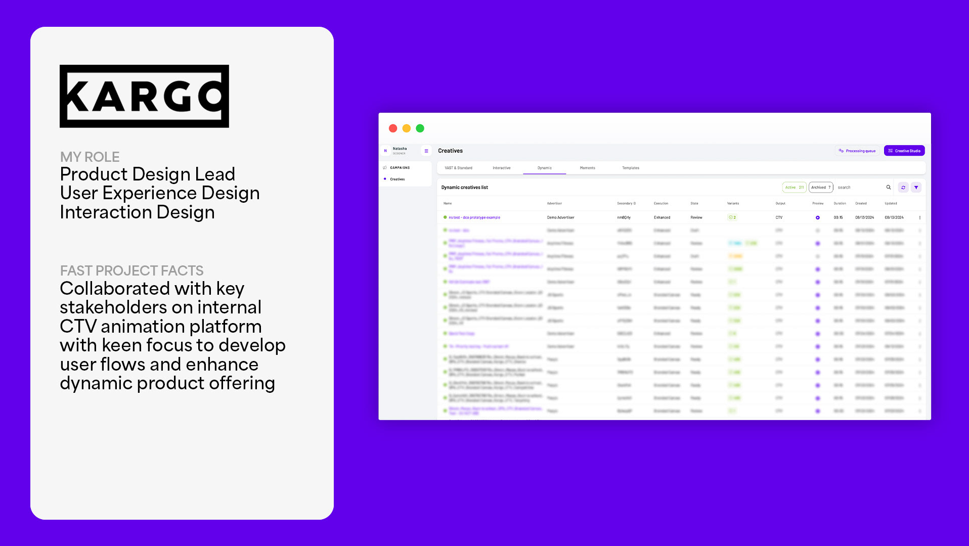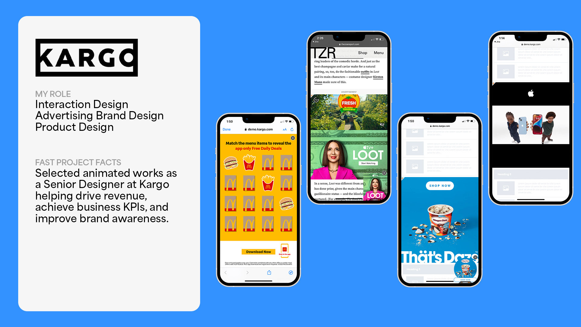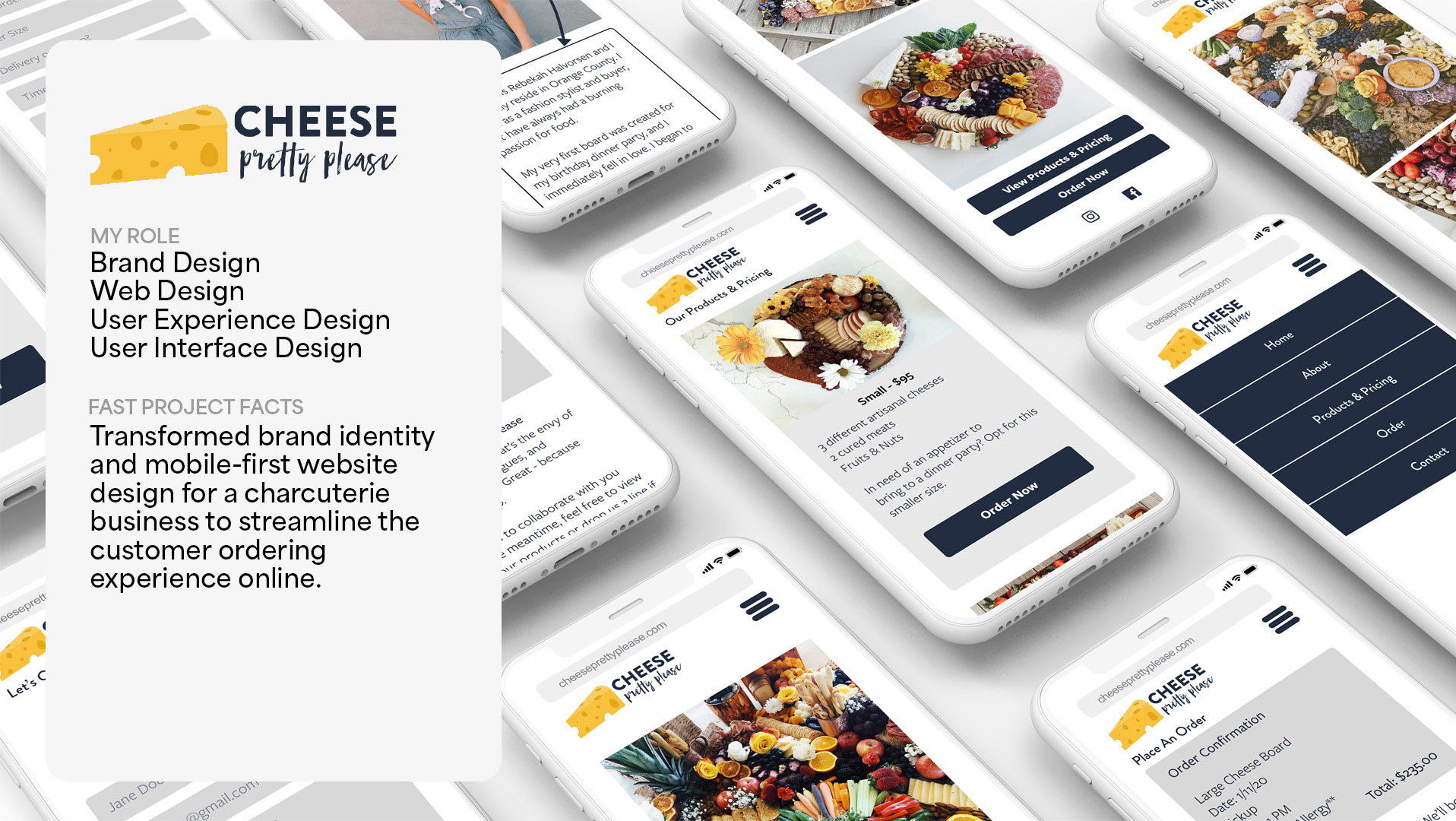
Project Overview
Description: The Bigg Chill is a small frozen yogurt store located in Westwood, California that has a large cult following. As part of a personal project, I wanted to explore updating the website, its imagery and overall presence to something more current.
This project is in no way affiliated with The Bigg Chill.
My Role: Visual Design, Brand Design
Tools: Pen/Paper, Figma, Procreate, Photoshop, Illustrator
Timeline: May 2022
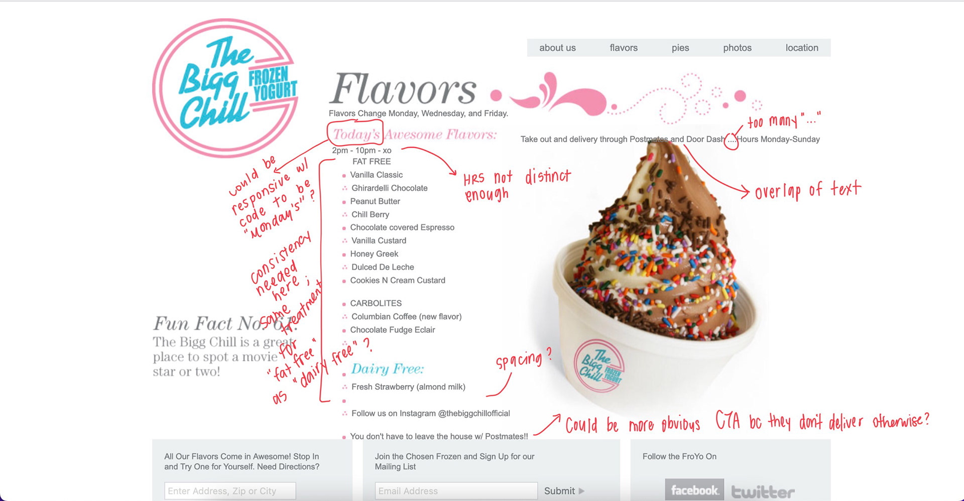
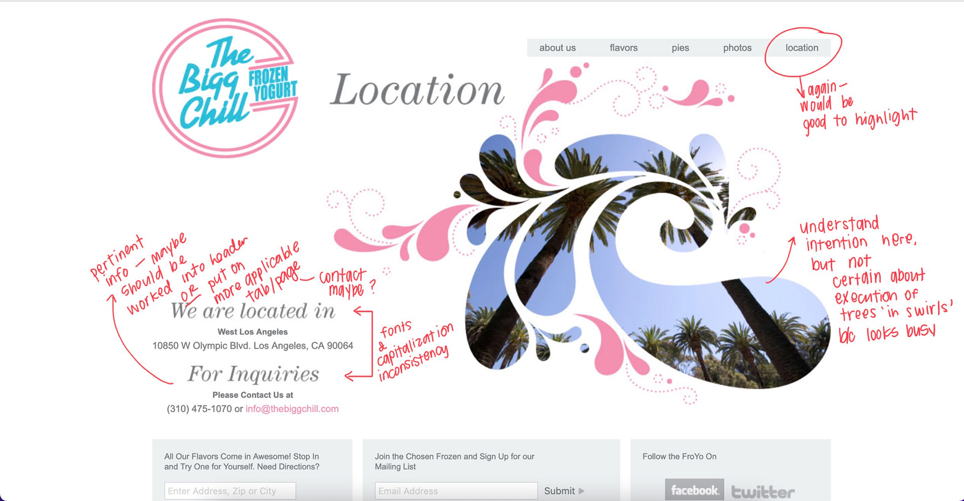
Website Evaluation
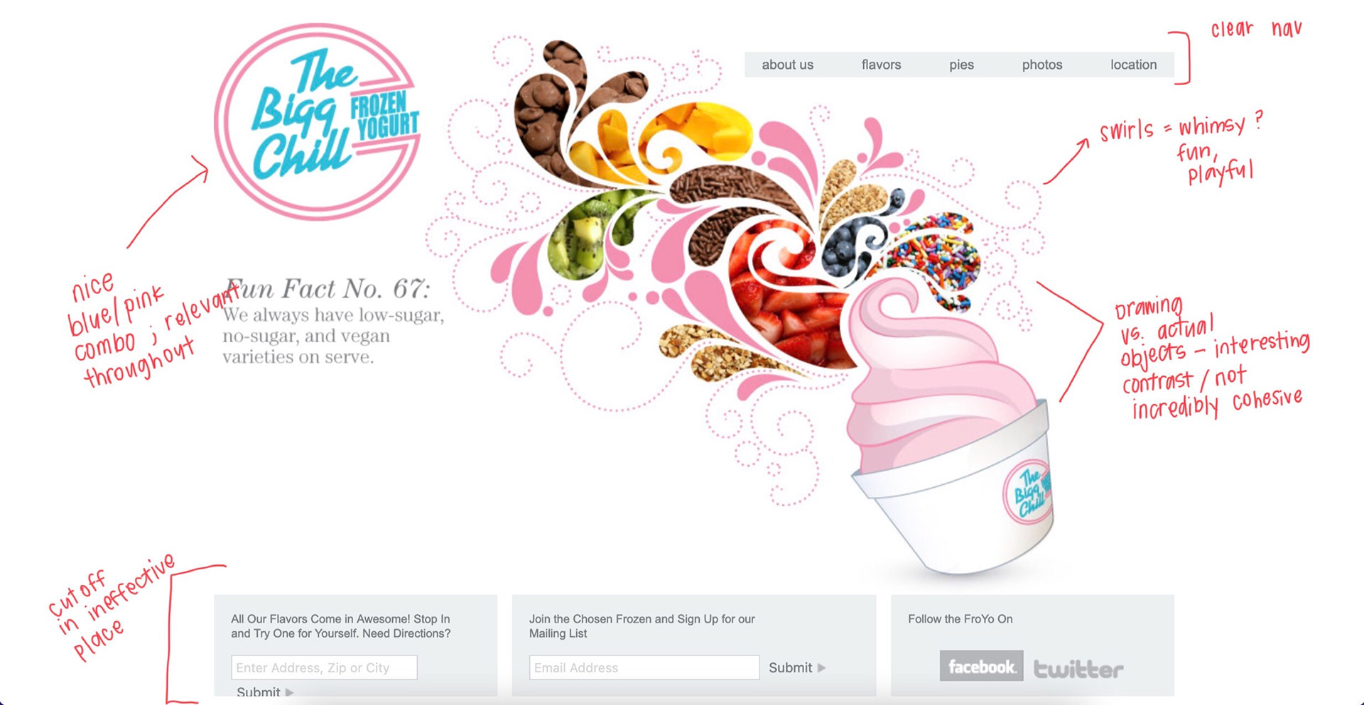
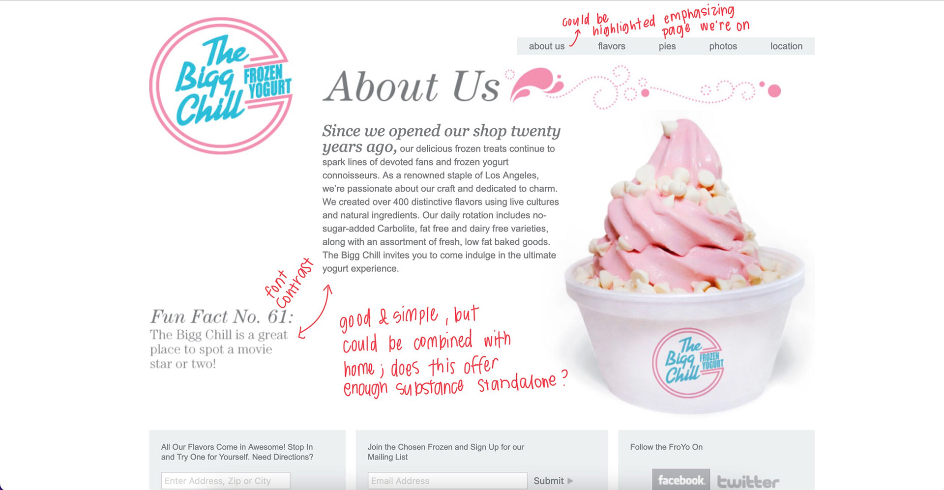
The idea for this website rebrand came to be because my family is a fan of The Big Chill and one night I went online to check the flavors and felt that a product so well loved needed more love on their site. Below are some screenshots of the current website with the relevant commentary and initial thoughts on how to alter the design.
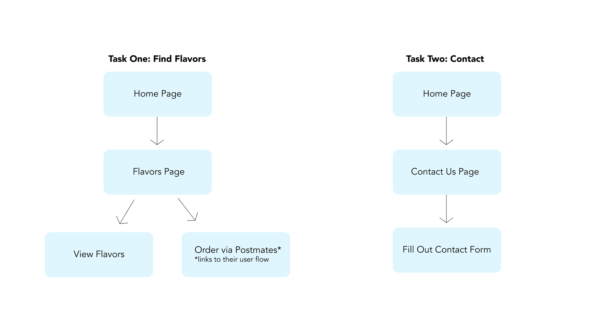
User Flows
While this exploration wasn't explicitly user experience focused, I still thought it was important to define this flows to see if there were any hiccups within the existing system or some things that worked particularly well.
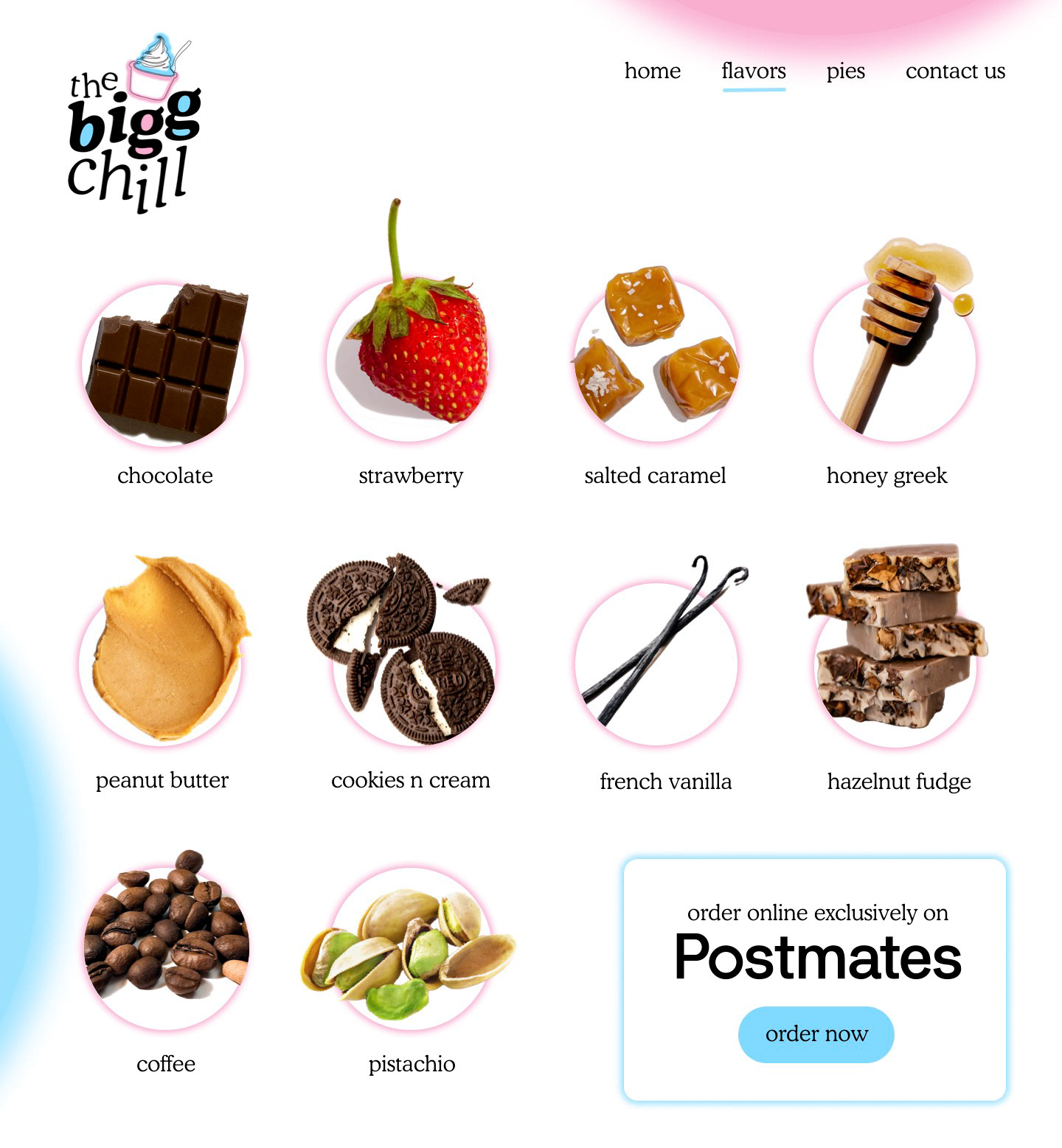
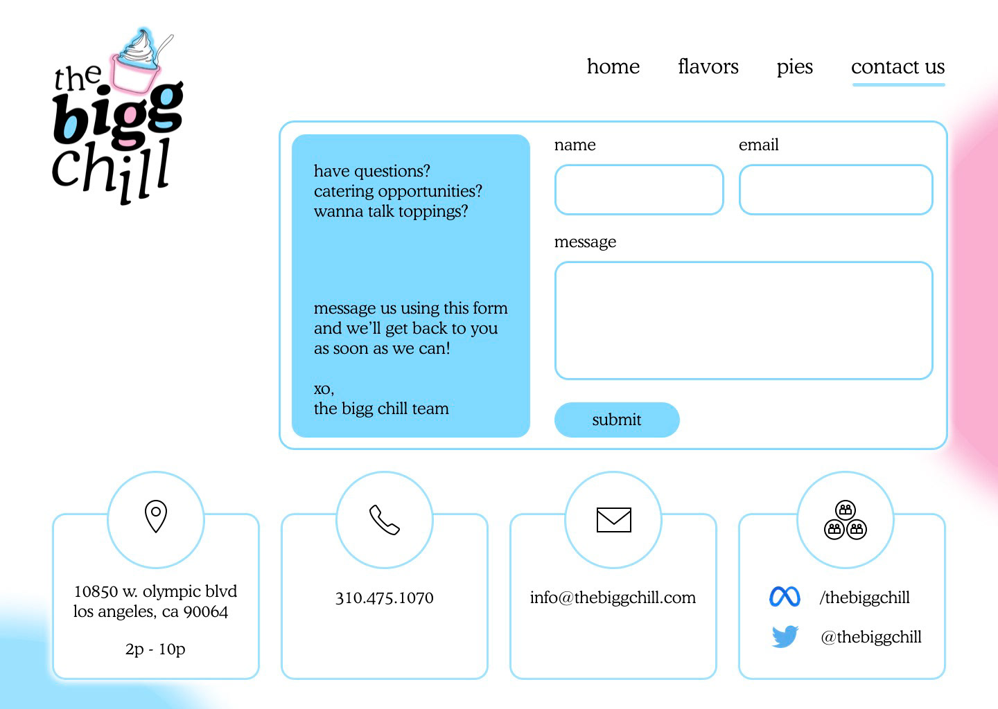
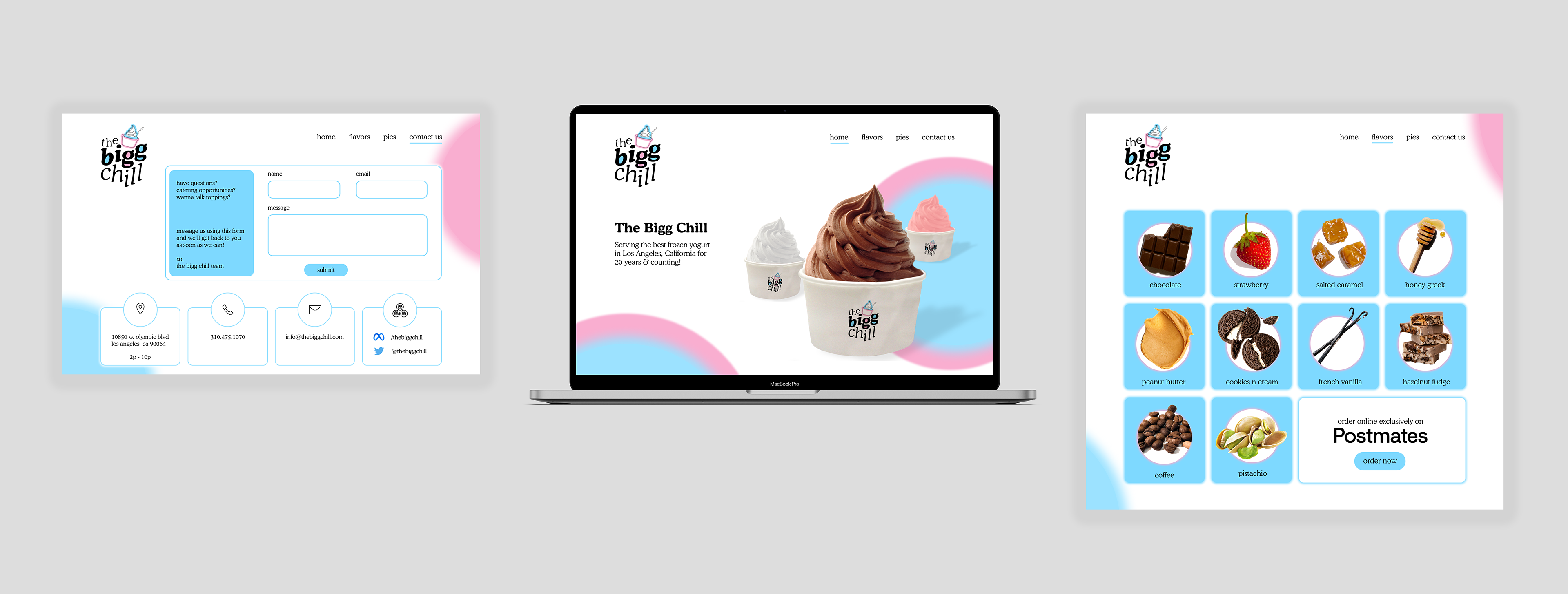
Something in my updated version I wanted to focus on was to make a clearer CTA on the 'Flavors' page to order from partner, Postmates. This could increase traffic and sales through more obvious and explicit language.
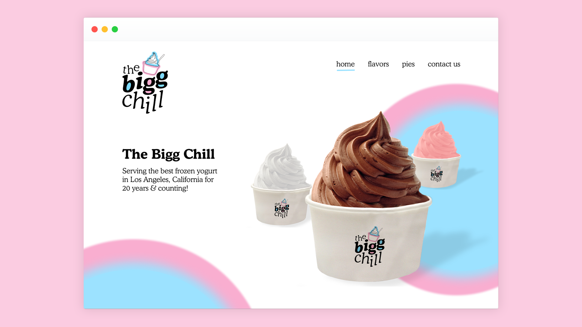
Visual Design Outcomes
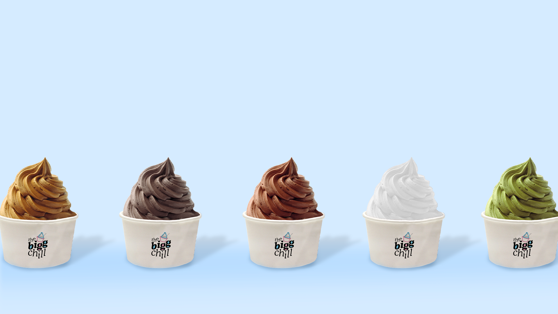
With sufficient understanding of the flows and observing which color palettes may best suit the brand, I decided to proceed forward with the visual design. I focused on the pinks and blues they had in their original designs, but made sure to make this coloring more consistent throughout. There is also a big neon sign in the storefront that draws a lot of millennial attention and photo opportunities so I wanted to have that neon, retro feel relevant in my designs. Overall, the current site offers an element of simplicity that I really appreciate so I wanted to keep that intuitive feel in my re-design. However, I made an intentional effort to make sure the copy effectively communicated necessary messages and also have each piece of text sit on the page in a way that mimics the clear way an image would. I was also very intentional in using this font with a more playful serif as well as not capitalizing anything. I felt that this would bring a fun, simple, and more ~dare I say~ chill energy to the creatives overall.