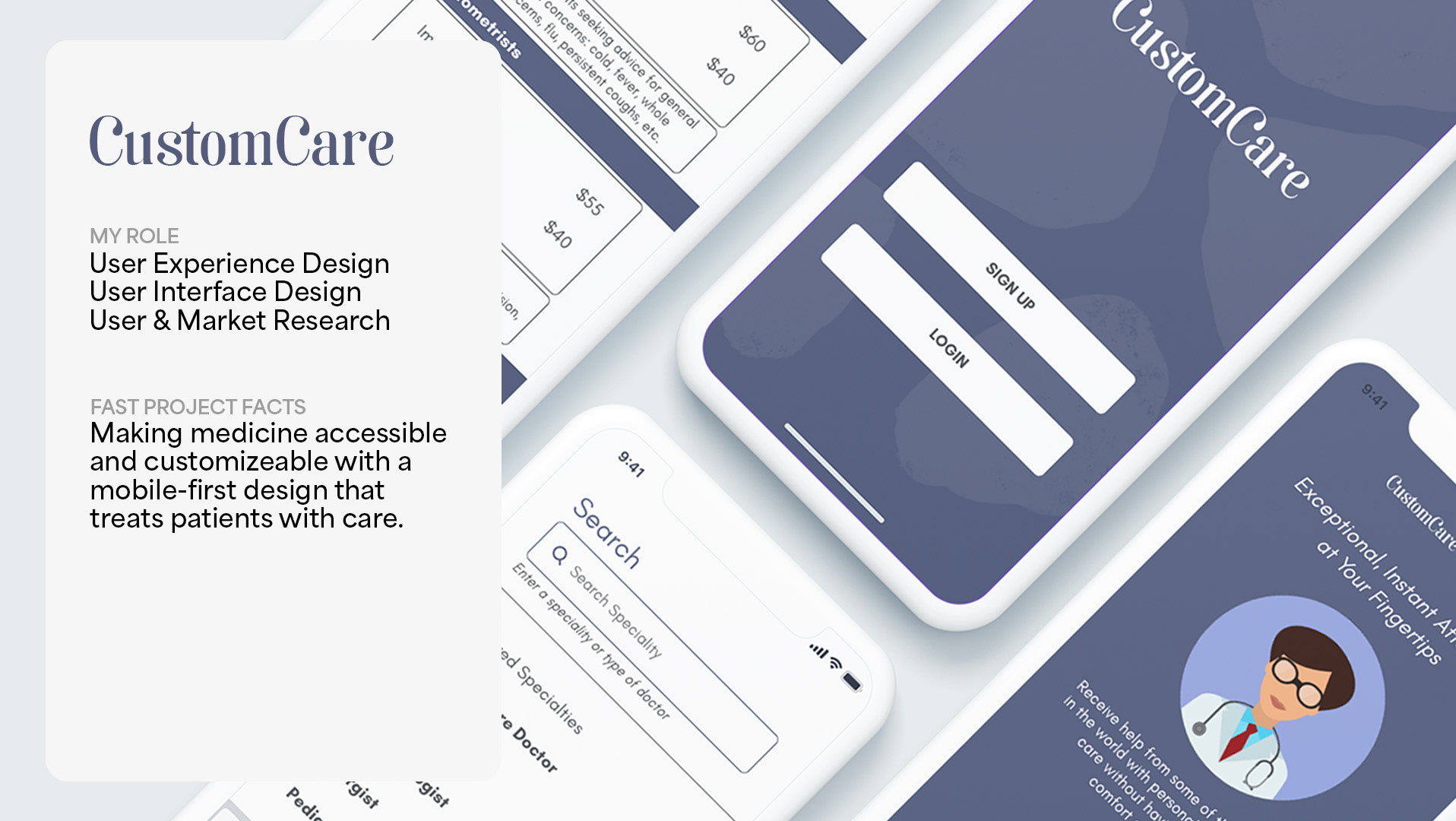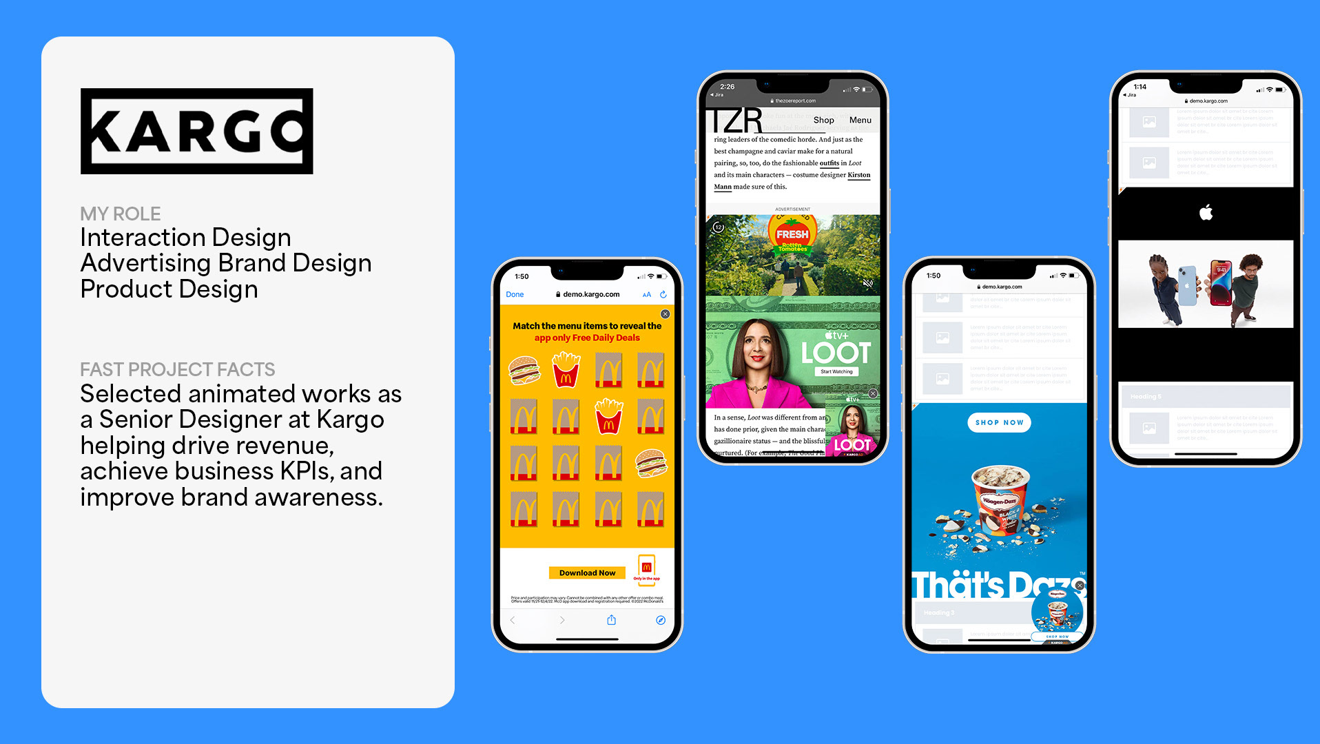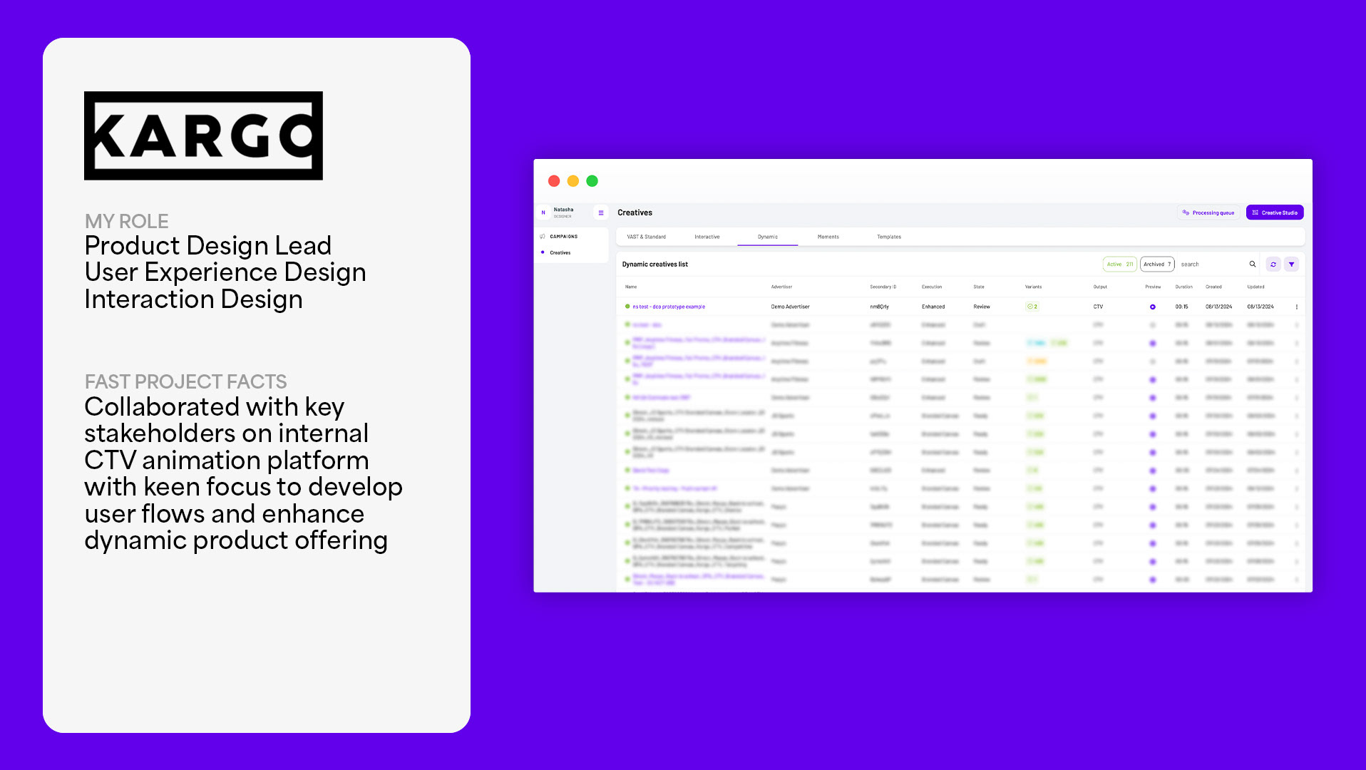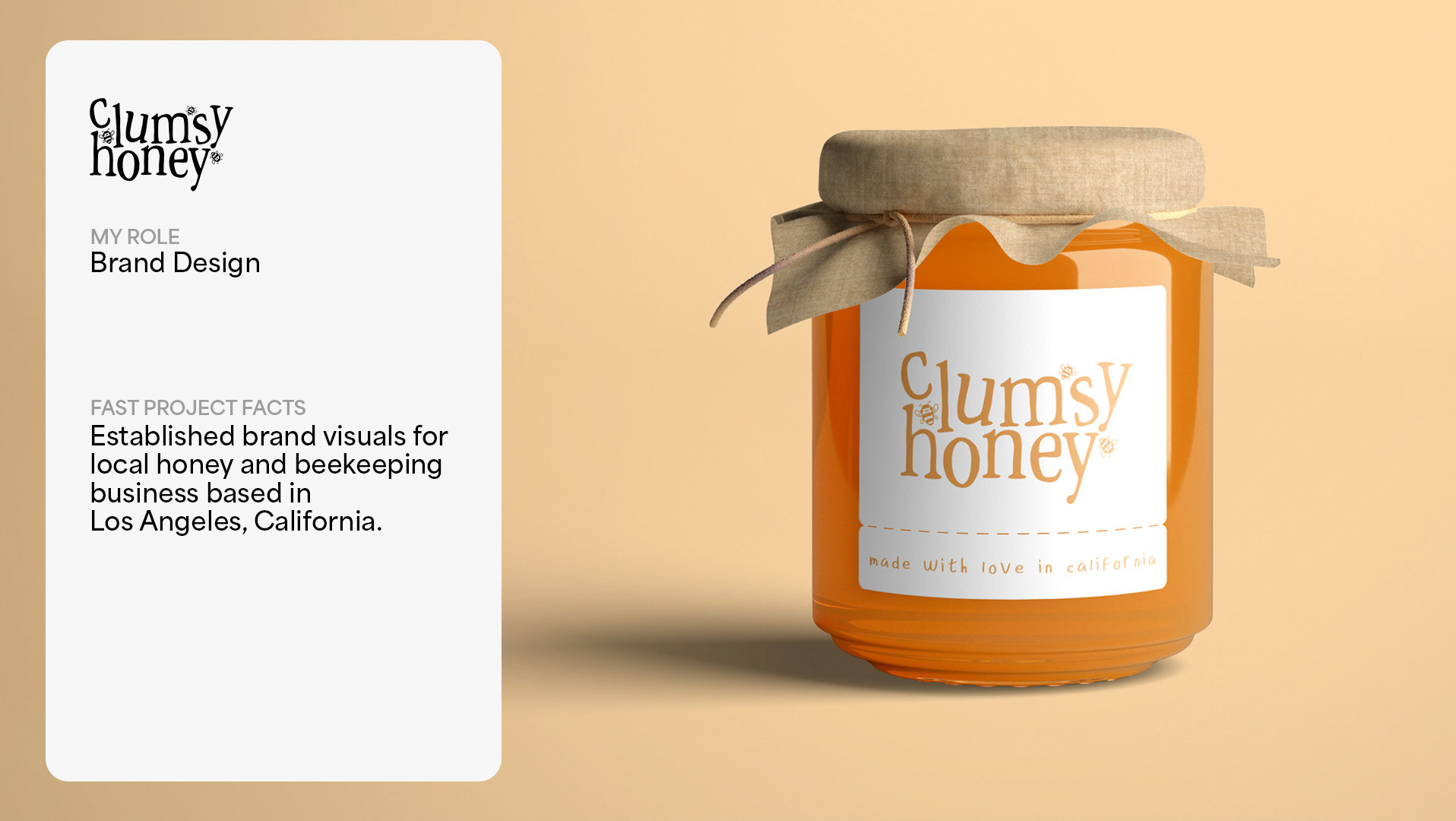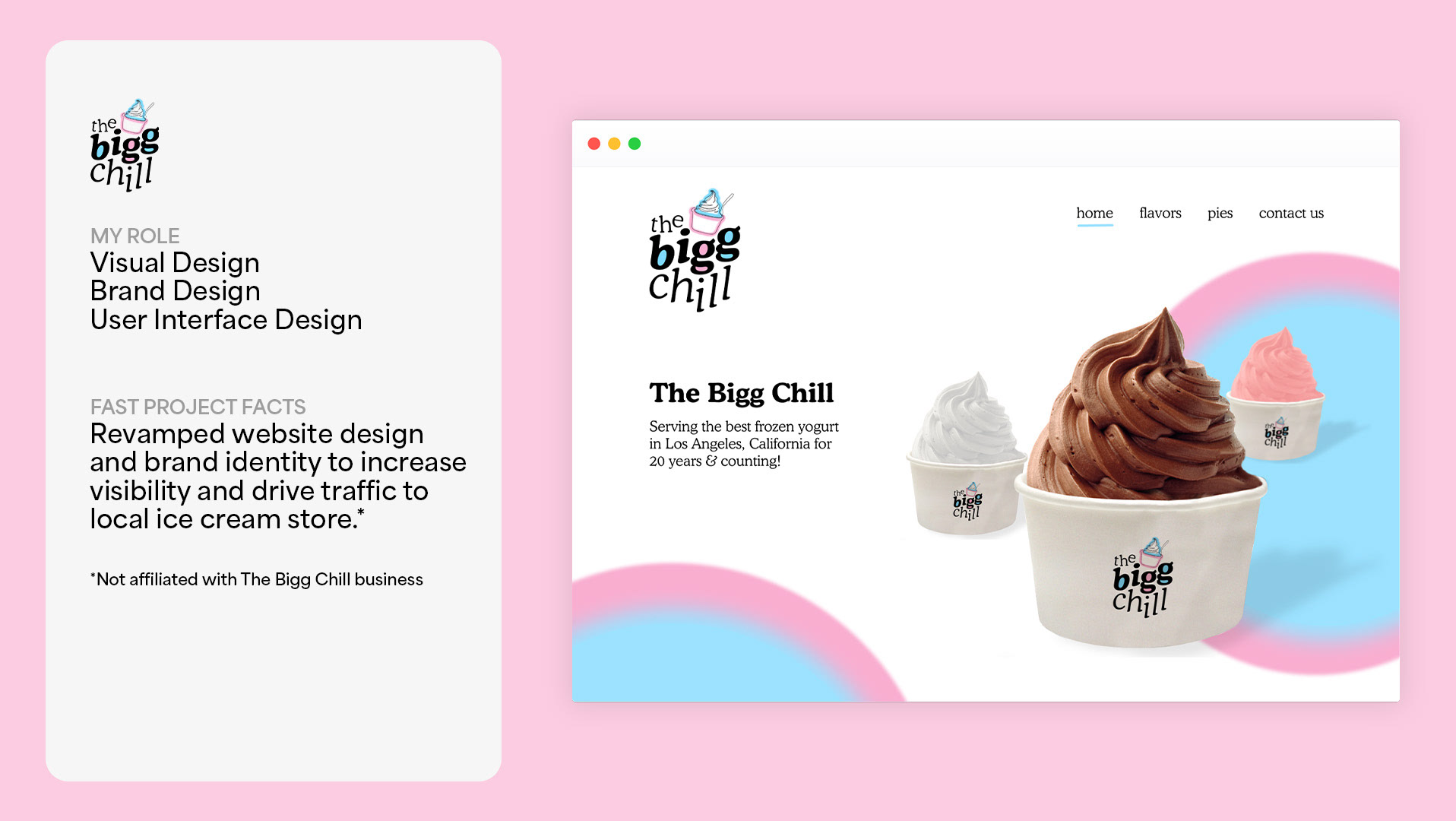
Project Overview
Description: Fitted is a web application designed to motivate people to exercise in a way that suits their level, interests, and most of all – their busy schedule.
The Problem: Finding exercise routines can be difficult when you’re first starting to get fit because it can be too time consuming and intimidating to attend physical classes and be too difficult to learn movements solely from written descriptions.
My Role: UI Designer, Information Architecture, Wireframes, Prototyping
Tools: Sketch, Adobe Illustrator, Adobe Photoshop, InVision, Balsamiq
Timeline: November 2019 - January 2020
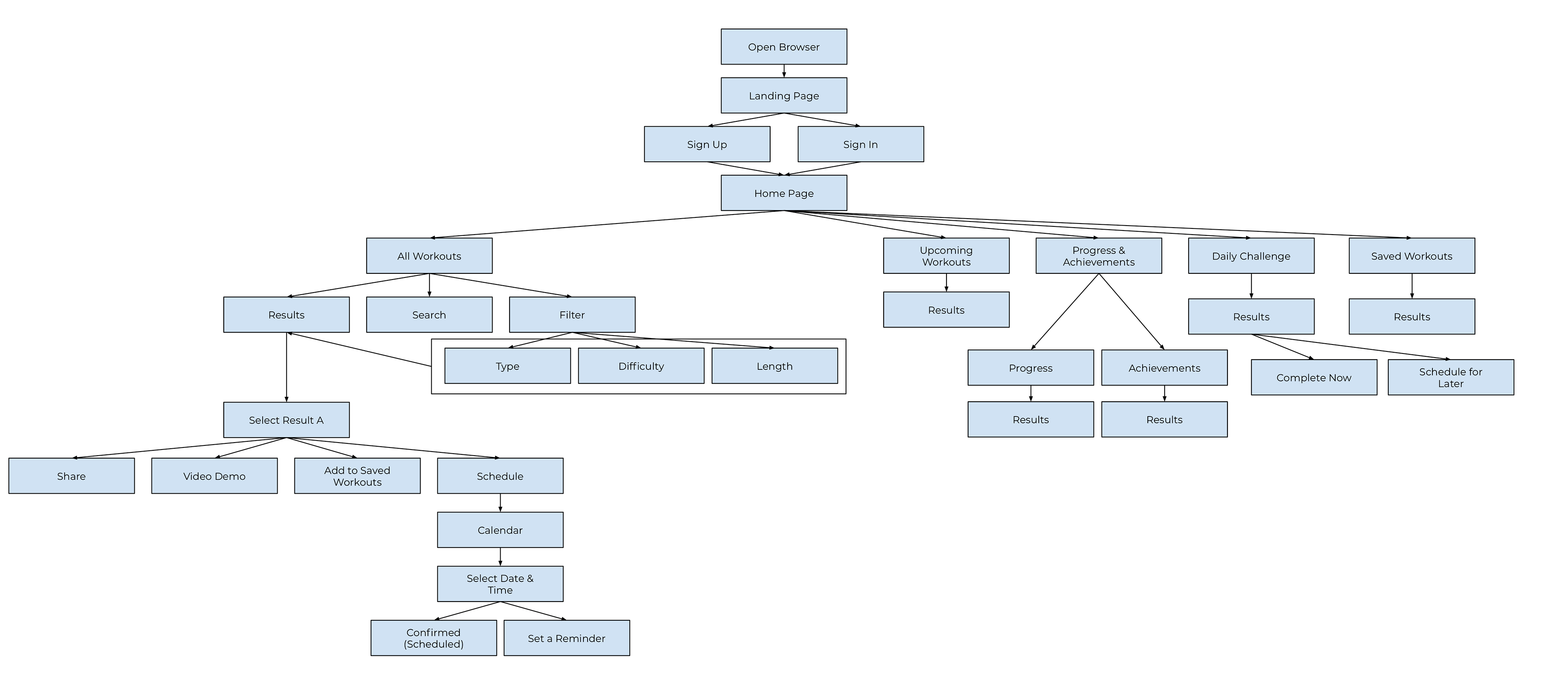
Research & User Flows
As this project was UI focused, primary research and personas were provided. The primary persona’s goal was to get in shape within convenient, short amounts time because her job is sedentary and doesn’t let her exercise much. From this information, I used my user experience knowledge to garner additional research and discover which user flows would be most suitable.
Wireframes
With a basic sitemap and user flows designed, I started building low-fidelity wireframes of the most significant features for the target persona. These features are: filtering a workout, completing a daily challenge, viewing progress and achievements, and scheduling a workout. One aspect I really tried to focus on was making everything easily accessible, with the option to customize further depending on preference or experience. I thought the categories I created were most beneficial because they captured the greater umbrella of a topic while also allowing refinement.
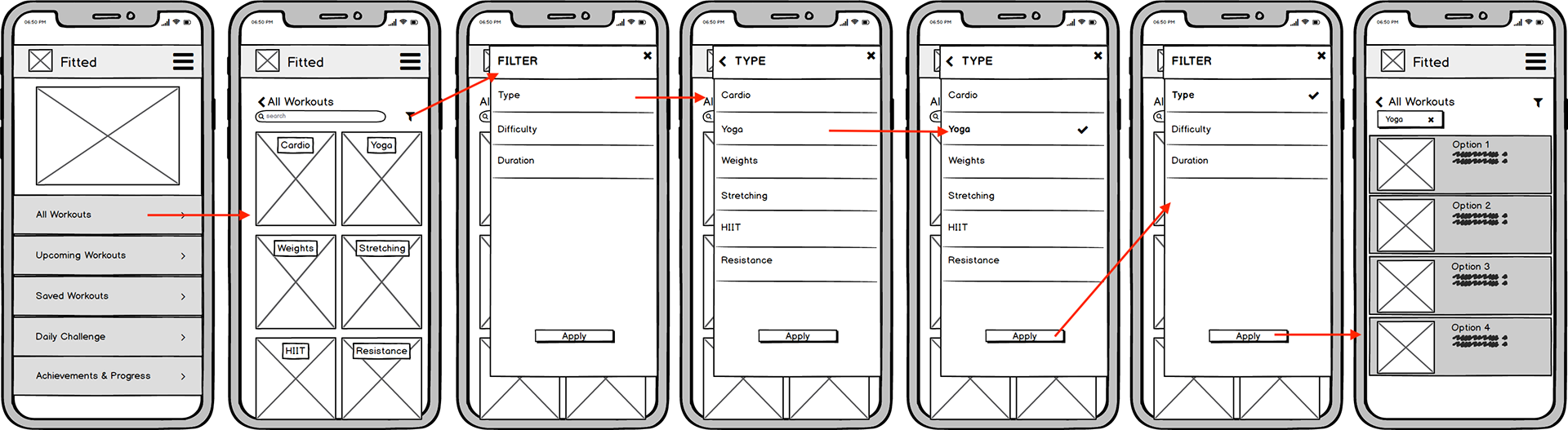
Low Fidelity Wireframe | Filter a Workout
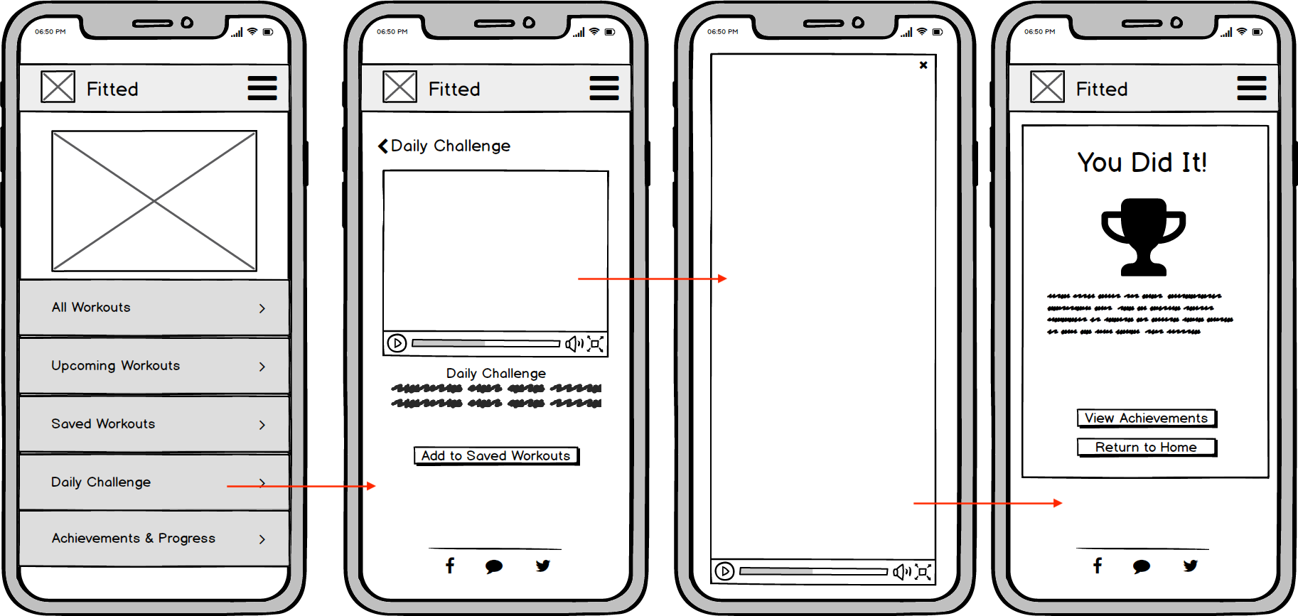
Low Fidelity Wireframe | Perform a Daily Challenge
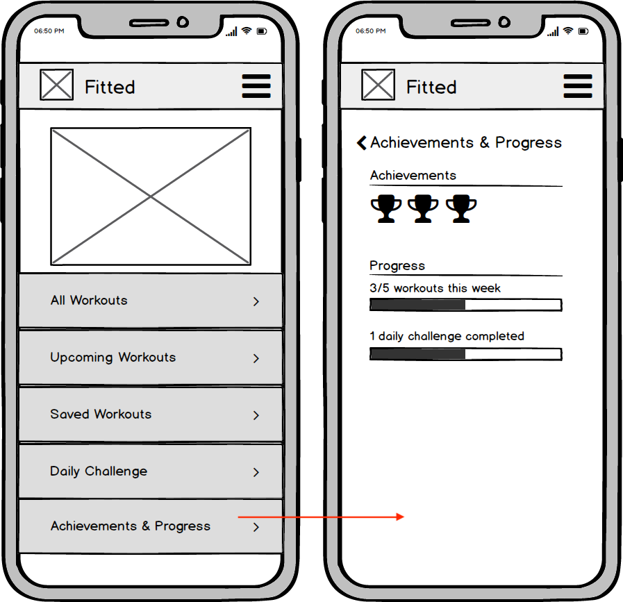
Low Fidelity Wireframe | View Achievements & Progress
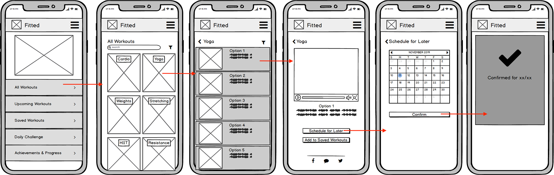
Low Fidelity Wireframe | Schedule a Workout
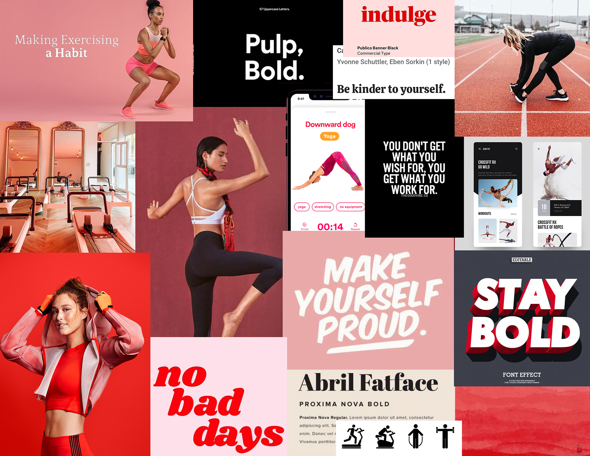
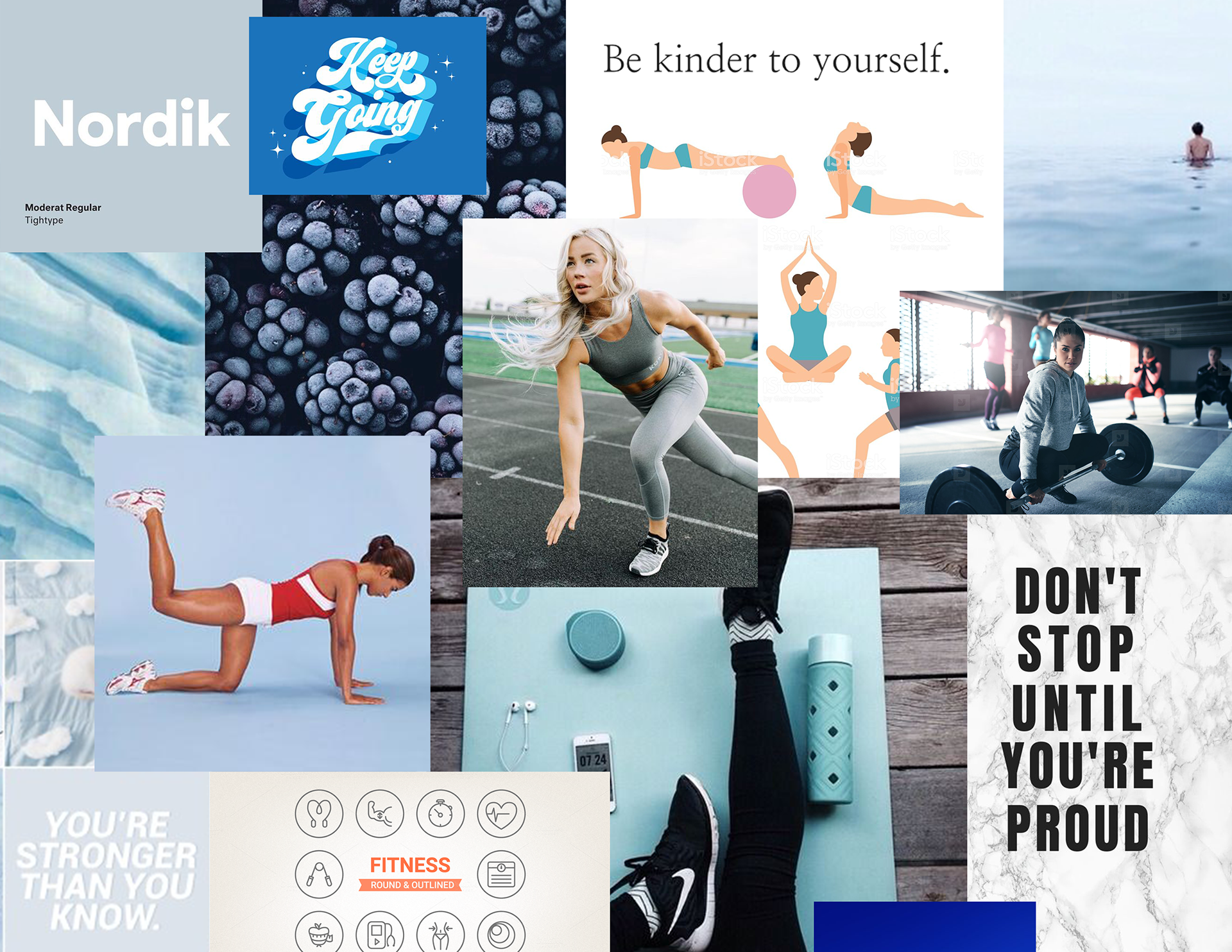
Moodboard
With the basic visual components of my site mapped out, I started to think about color and how it would visually impact the user's needs. I created two distinct moodboards to represent the different directions Fitted's appearance could follow.
Ultimately, I chose the red moodboard because it suited our target persona's passion to get started with exercise while being positive, motivating, and friendly. In considering this as the definitive choice, I decided to include a range of reds to add depth and feeling of mobility within the application.
Style Guide
To ensure brand consistency and a smooth transition if the application were to be moved into development, I developed a thorough style guide that explores logo/brand guidelines, typography, iconography, imagery, UI elements, and grid system. Each of the numbered elements below are quite detailed to try make that potential hand-off as thoughtful and considerate as possible to the development team's needs.
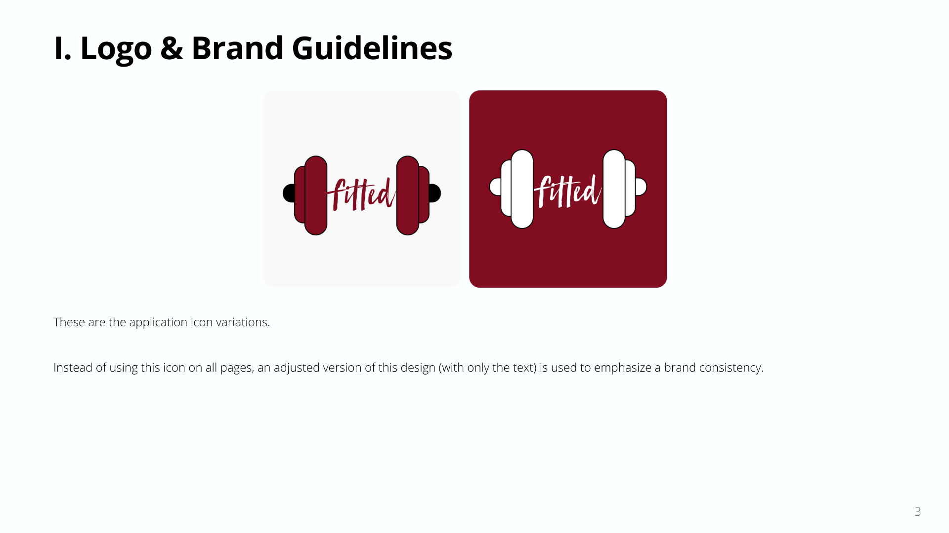
Style Guide | Logo & Brand Guidelines
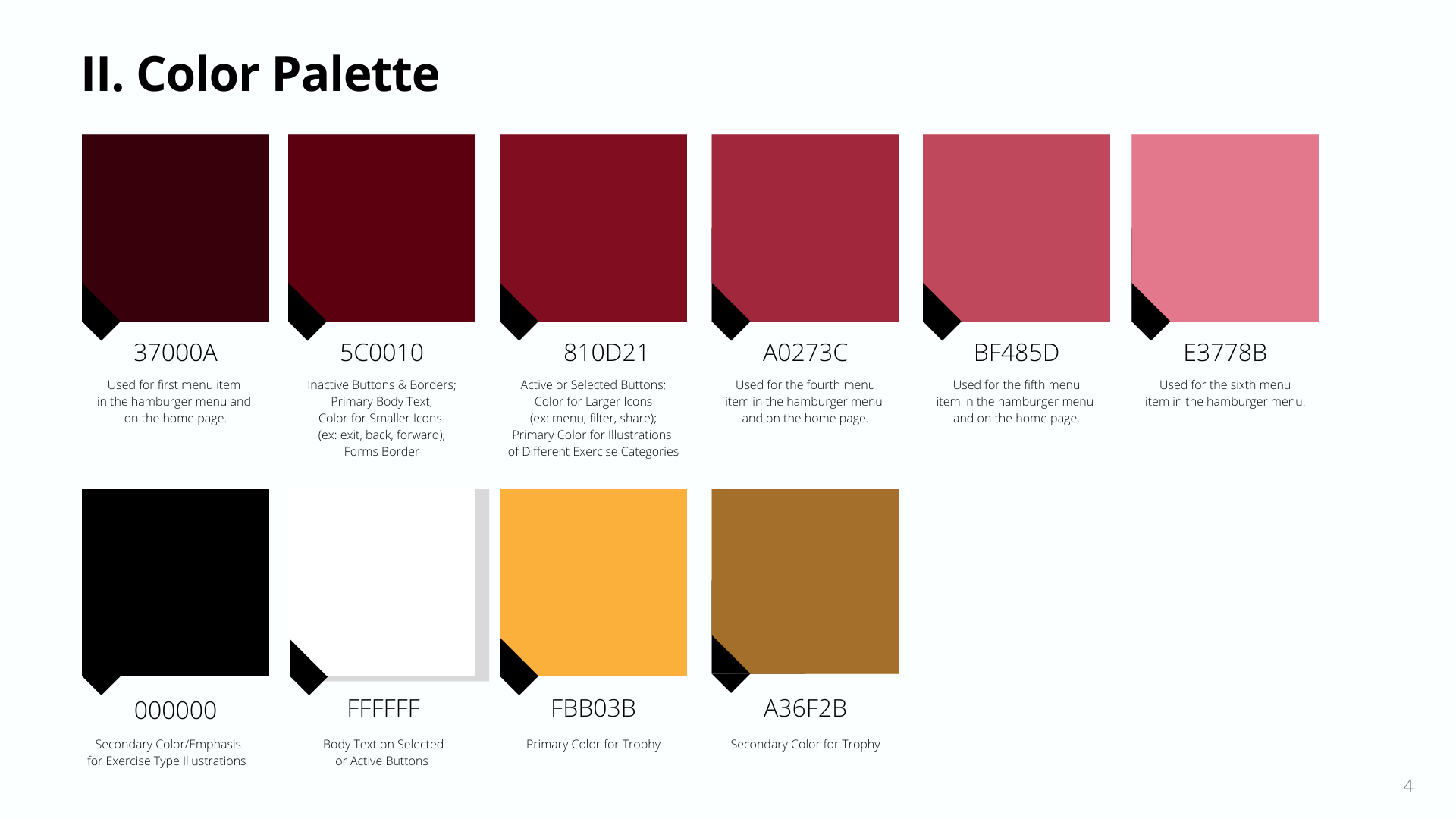
Style Guide | Color Palette
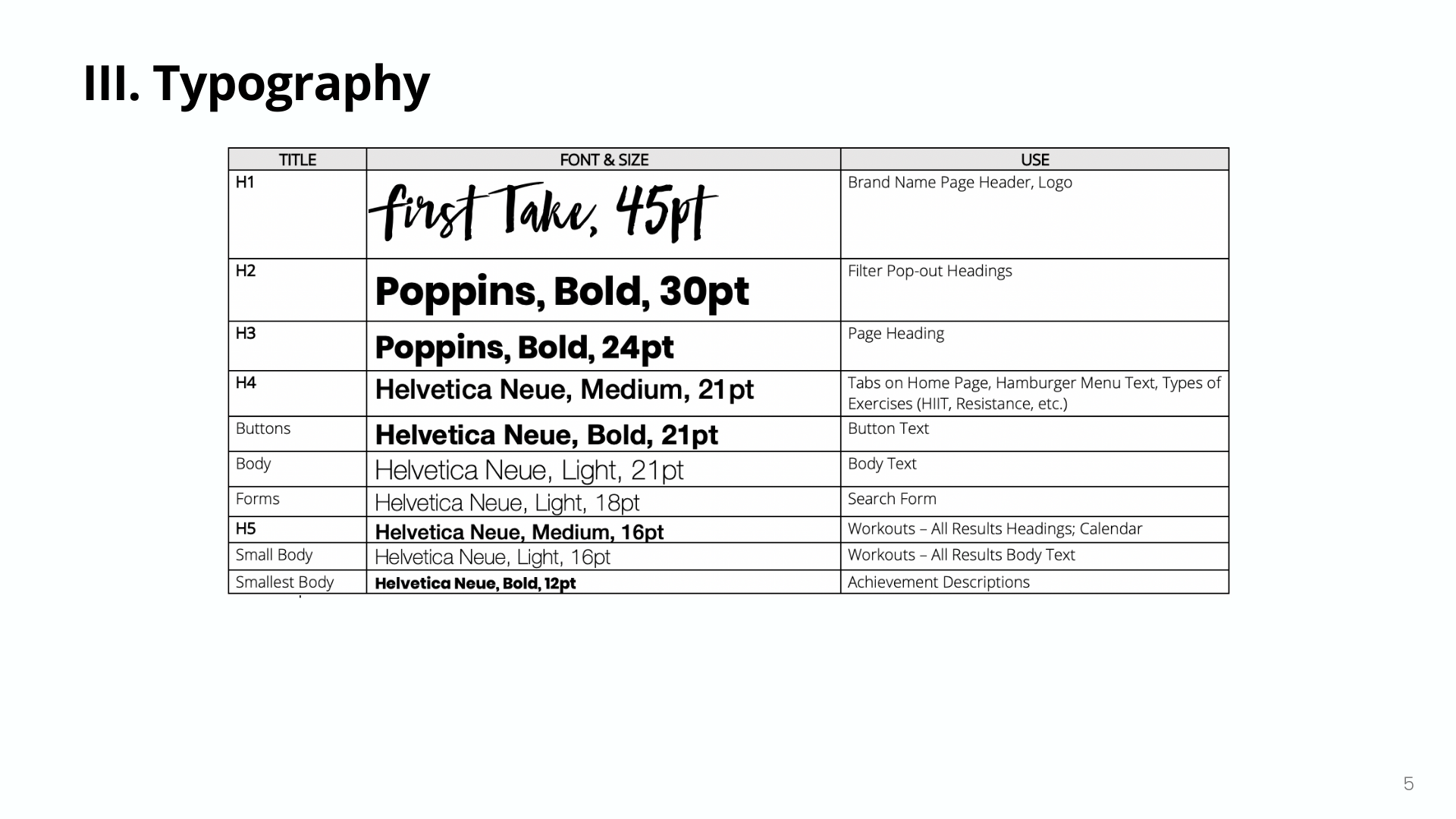
Style Guide | Typography
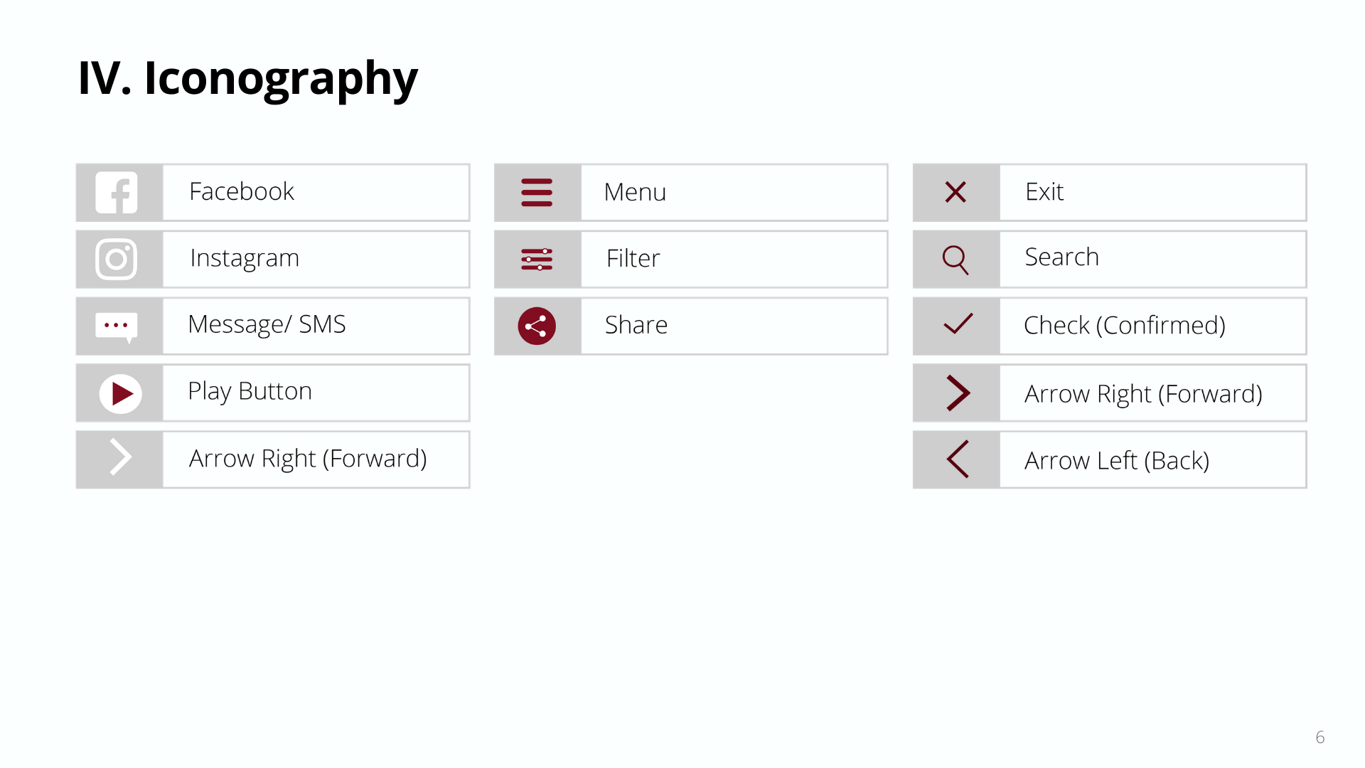
Style Guide | Iconography
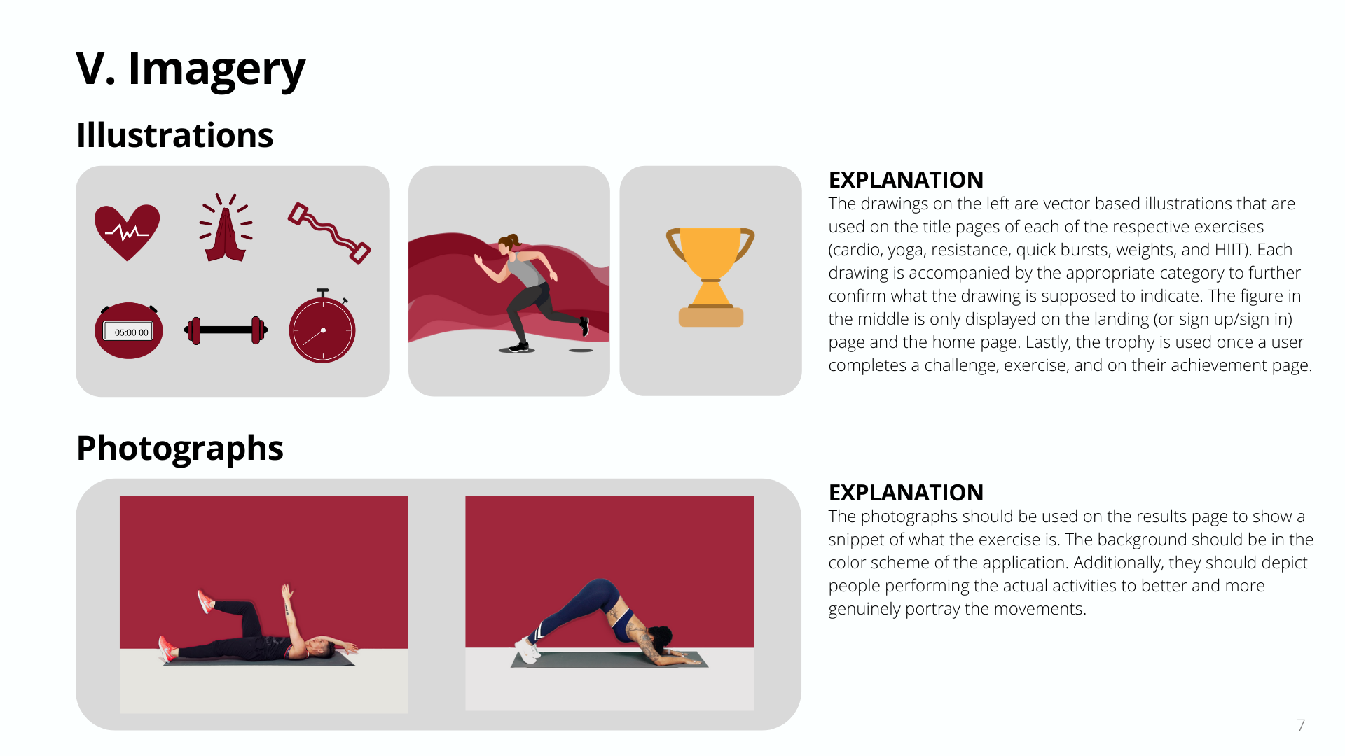
Style Guide | Imagery
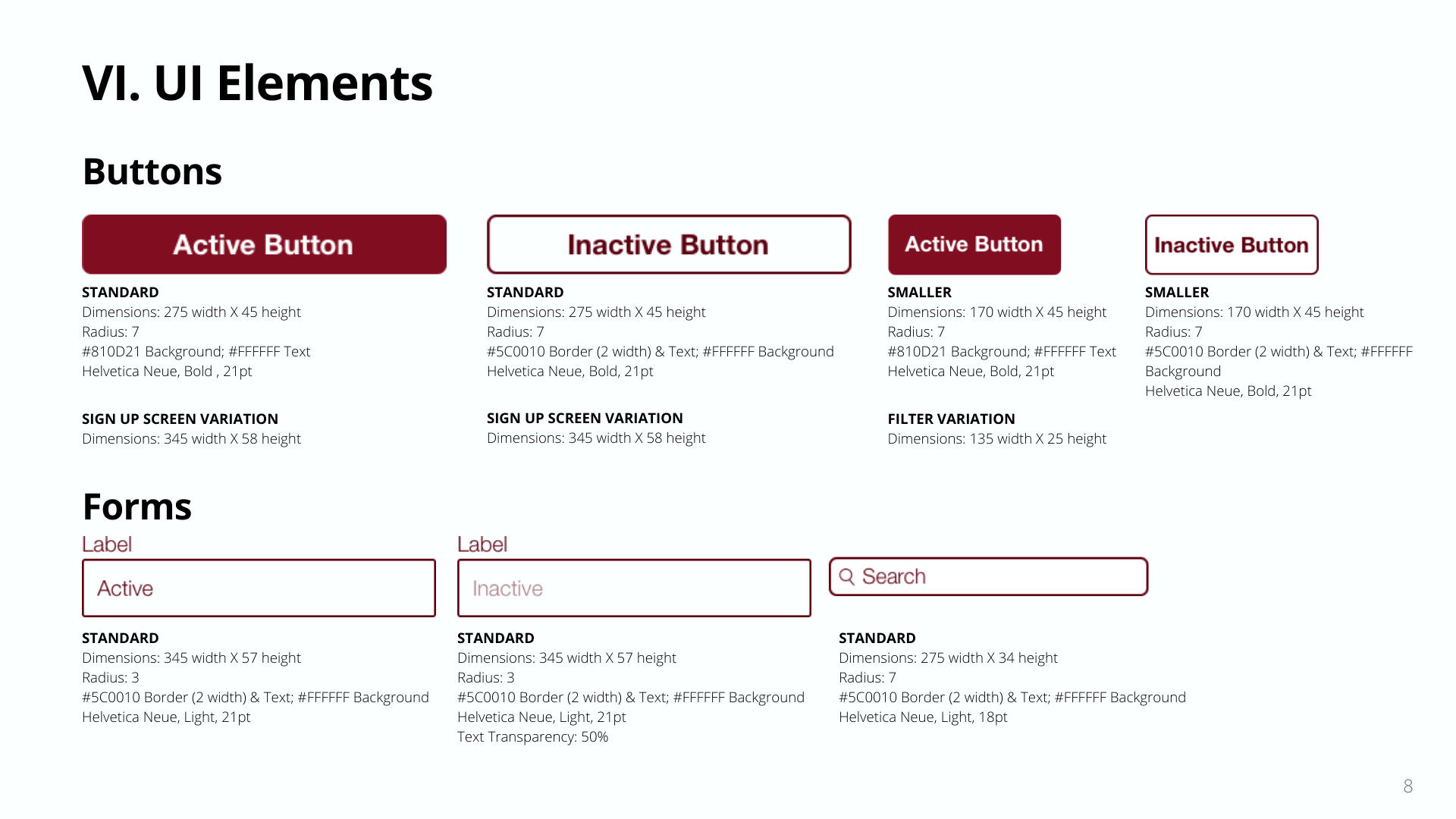
Style Guide | UI Elements Pt. 1
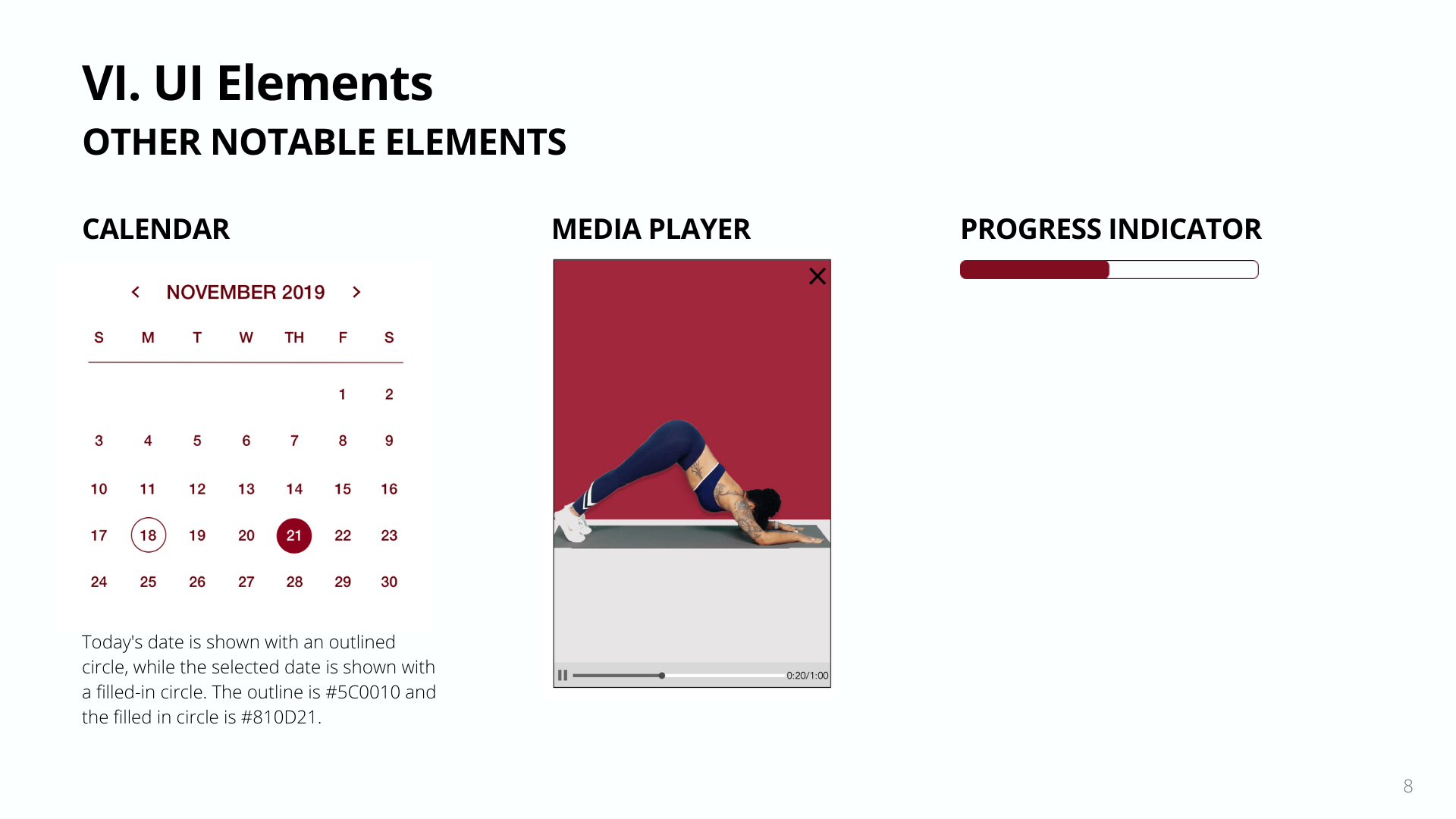
Style Guide | UI Elements Pt. 2
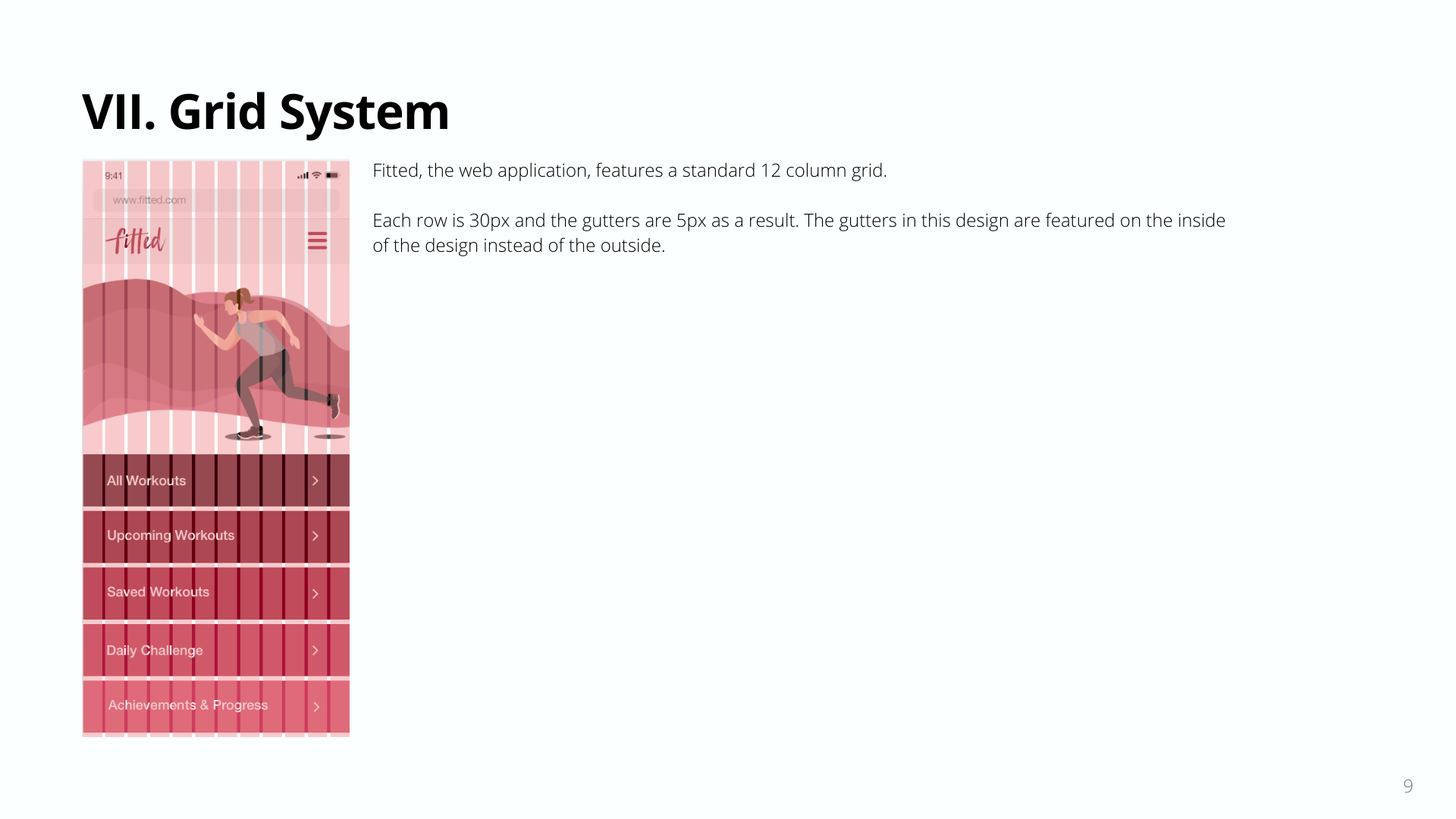
Style Guide | Grid System
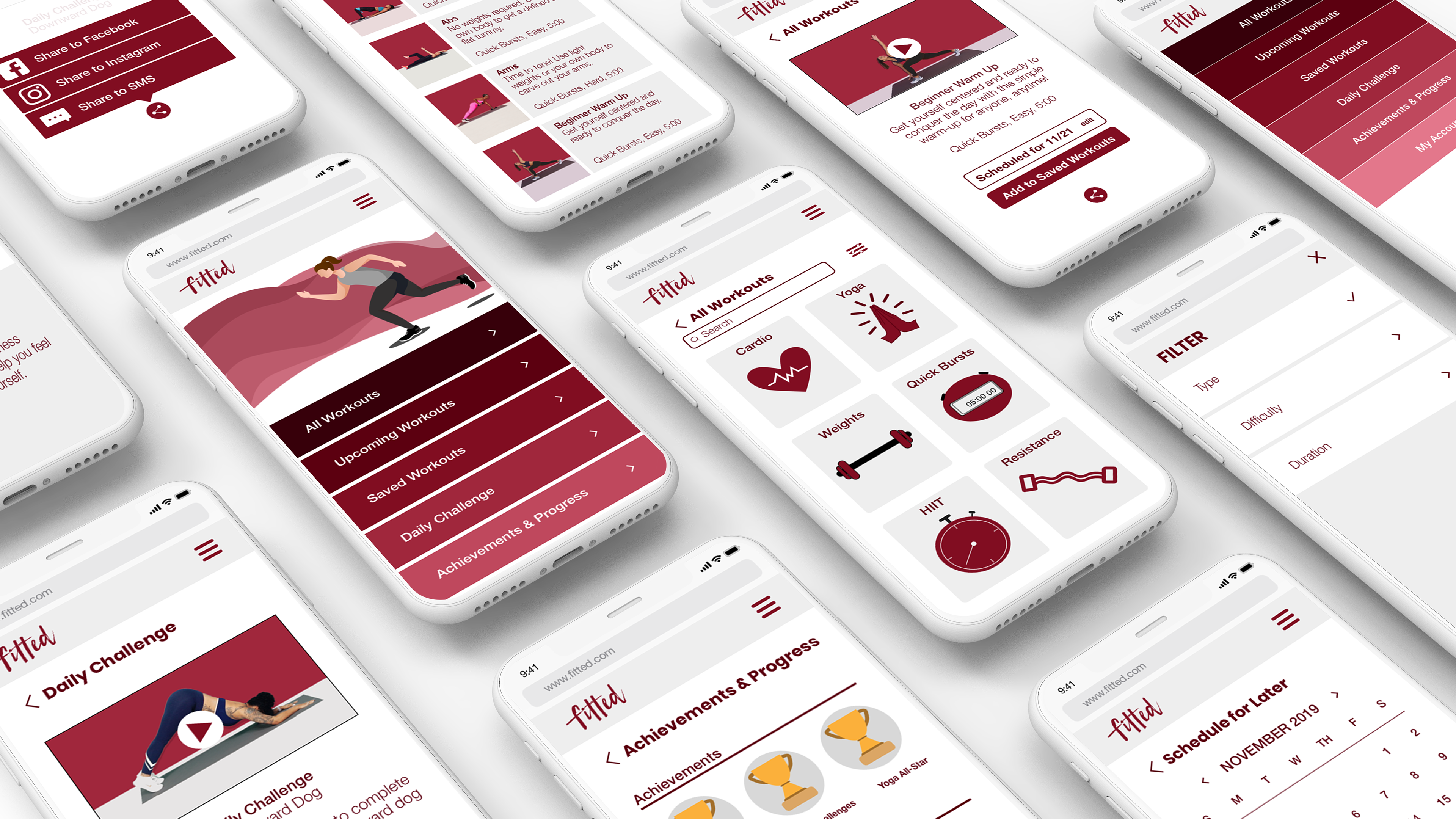
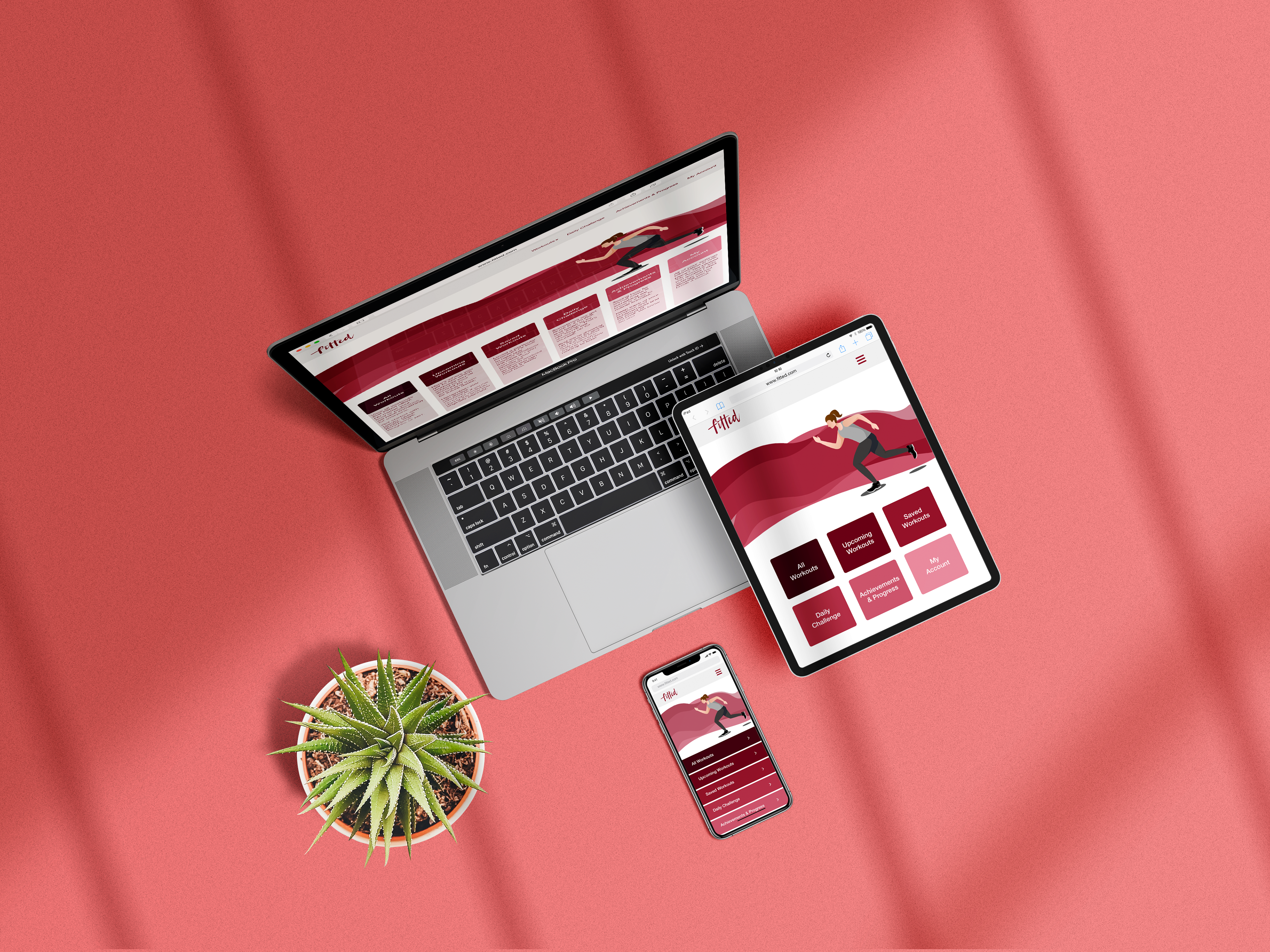
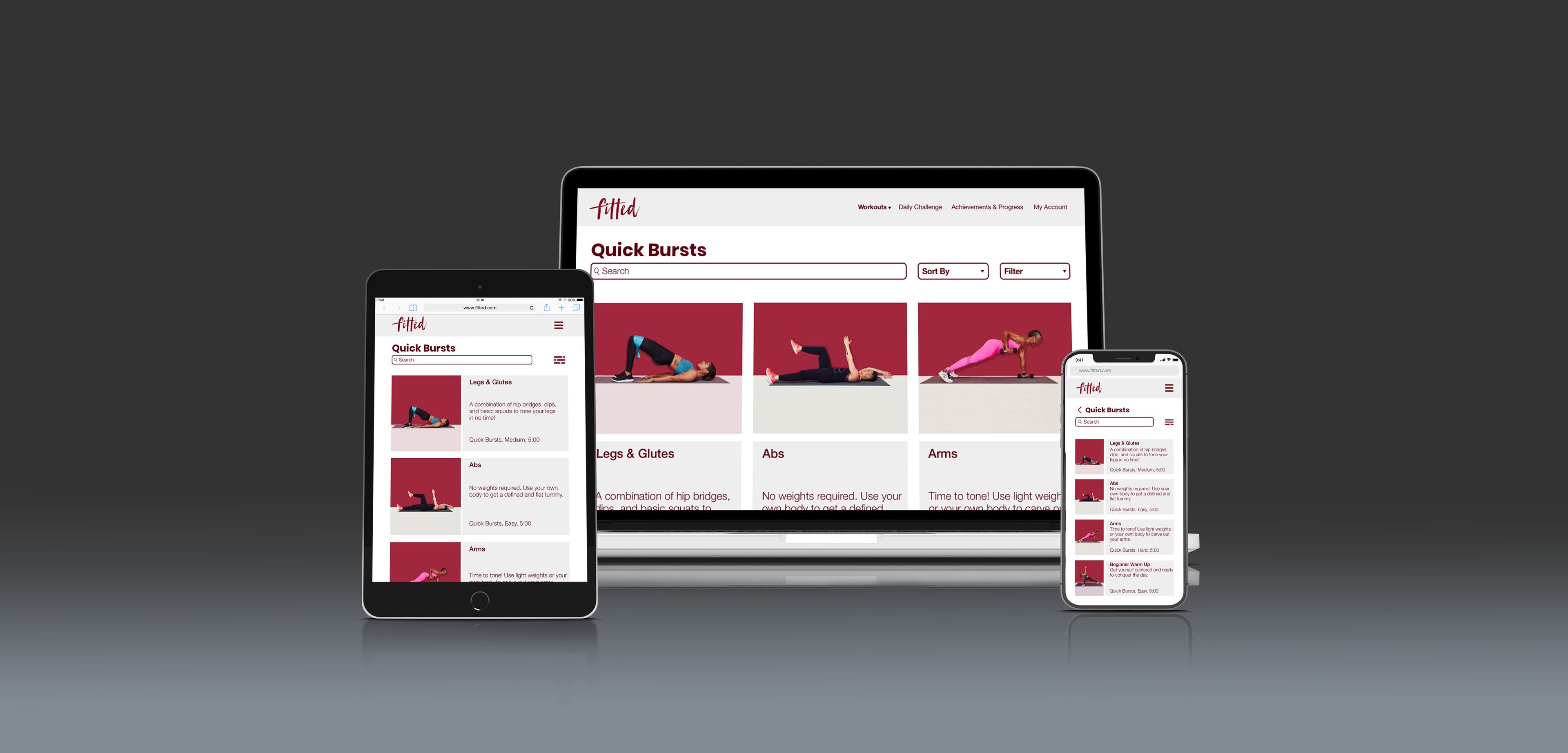
Mockups
Below are varied mockups in three separate breakpoints (mobile, tablet, and desktop) to help demonstrate Fitted's responsive design.

UI Prototype
Learnings
In each step, consult the project brief: After the initial wireframes, I consulted my project brief again to make sure I hadn't forgotten any significant details. One thing I noticed was an emphasis on fitting in exercise and convenience. From there, I decided that the Quick Bursts exercises should be more prominent for users and be featured more in the user flow.
The more details the better: Details are critical for a user experience designer and this UI project was no exception. I think my attention to detail was particularly helpful in the style guide among the UI elements. For the future and next steps, these details are essential to a successful and seamless developer hand-off.