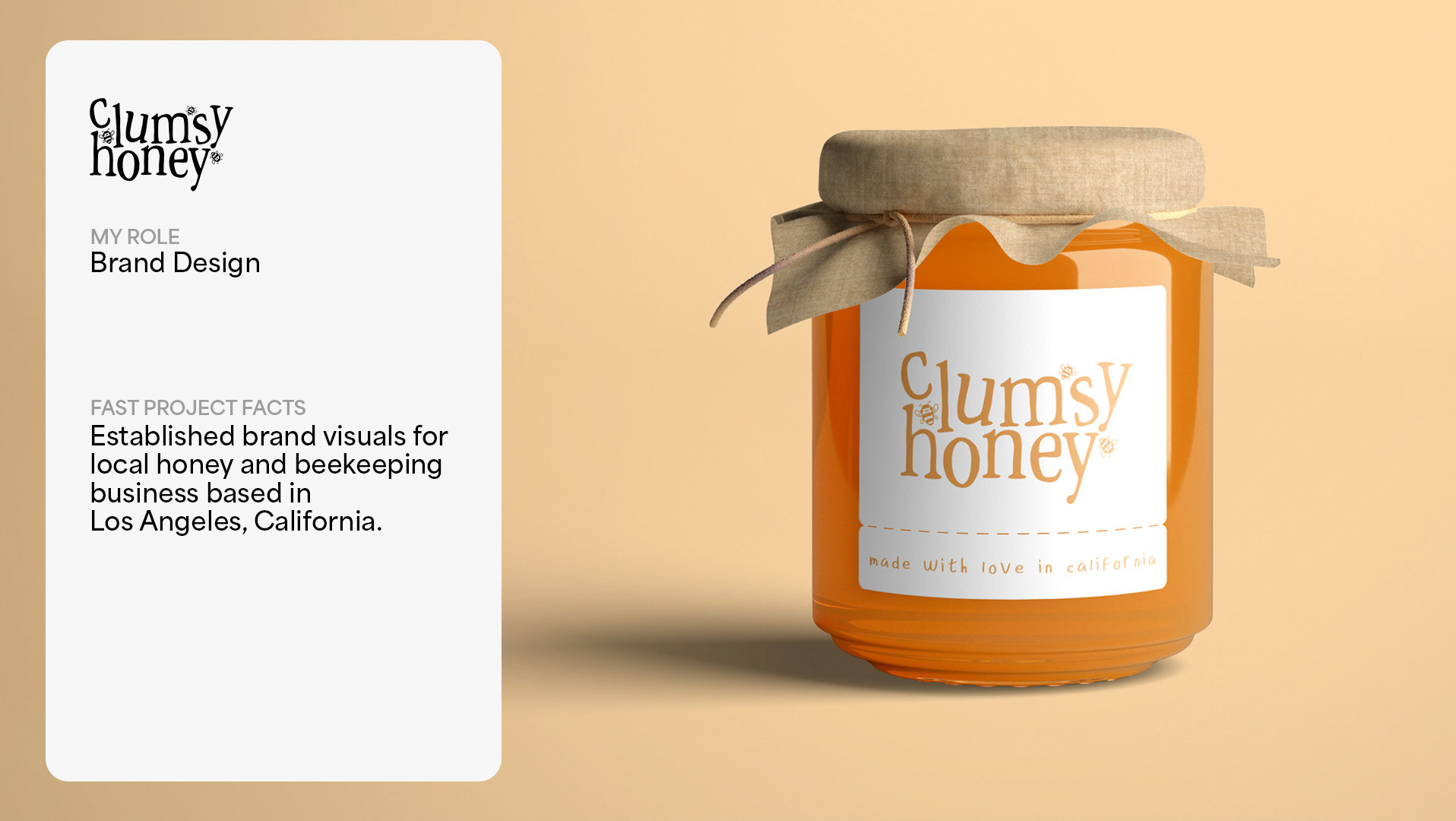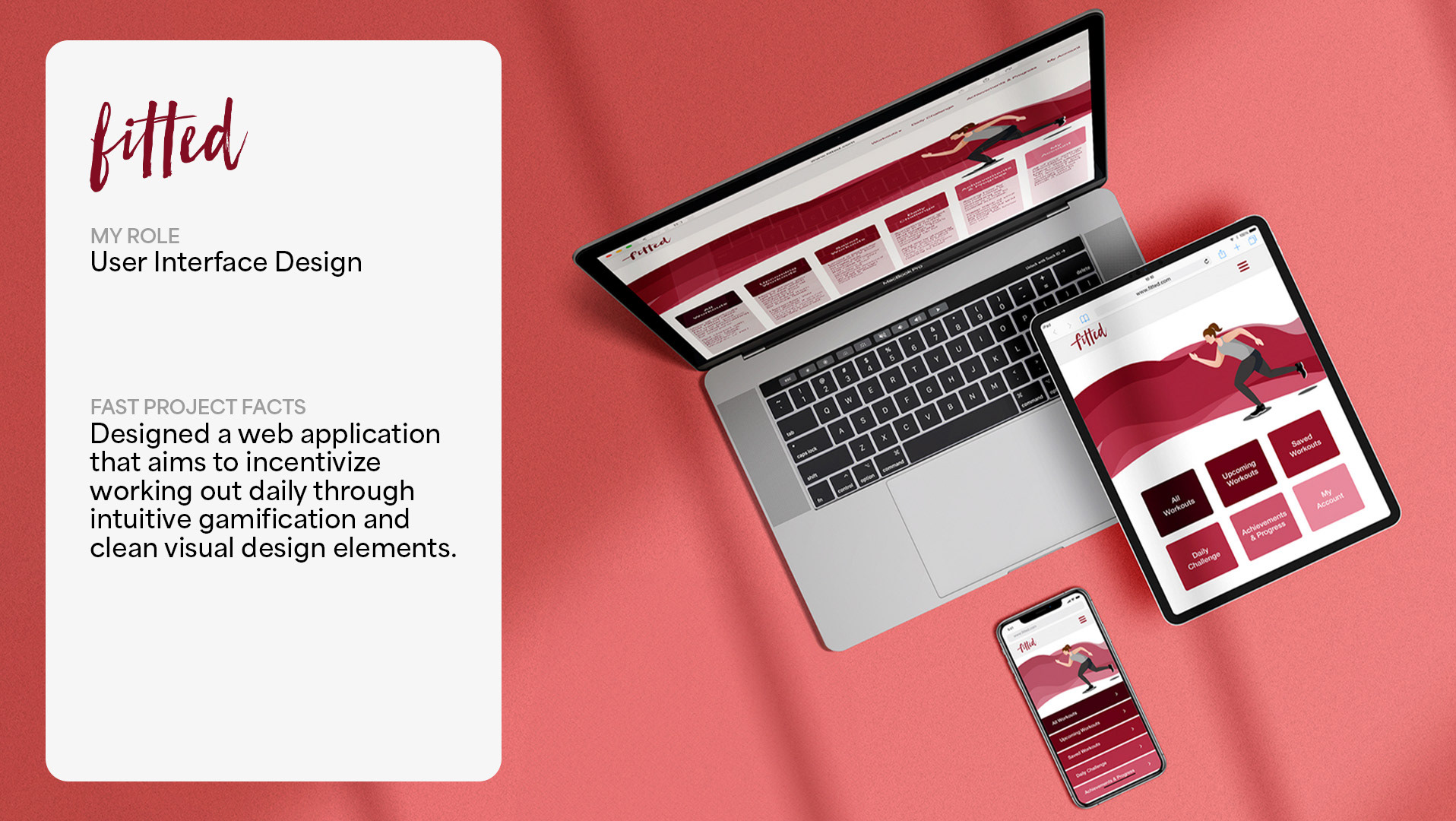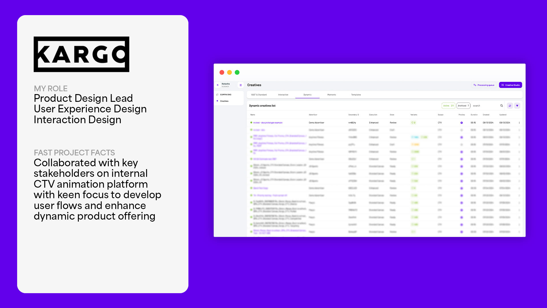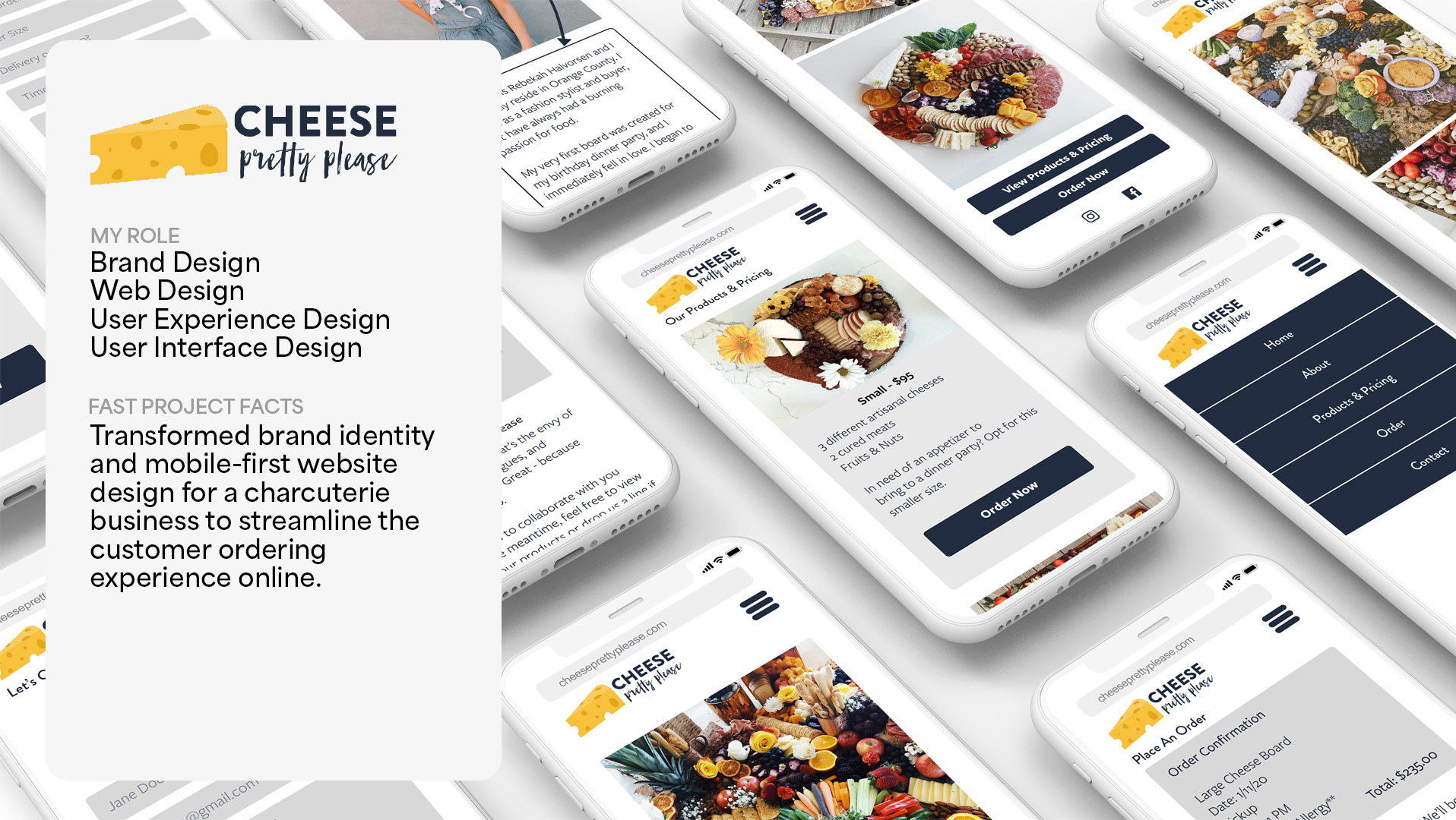
Project Overview
Description: CustomCare is a telemedicine application I created as a case study and is designed to take the hassle out of visiting a doctors’ office. Telemedicine is a process where users can book and complete appointments with doctors online and remotely from their desired location.
The Problem: Users need a way to receive trusted, professional, and affordable medical advice without actually going to a doctor’s office because they need an informed opinion, but don’t know if their concern warrants the time and money associated with a traditional medical experience.
My Role: User Experience Designer, User Interface Designer, User Research, Market Research, Prototyping, and Wireframing
Tools: Adobe XD, Balsamiq, Adobe Photoshop, Pen/Paper
Timeline: May 2019 - October 2019
Competitive Analysis
To start, I conducted some SWOT analysis of comparable brands and products. My major findings from this process is that while there are some existing products on the market, telemedicine is still relatively new and the applications have some major room for improvement in the accessibility and navigation categories.
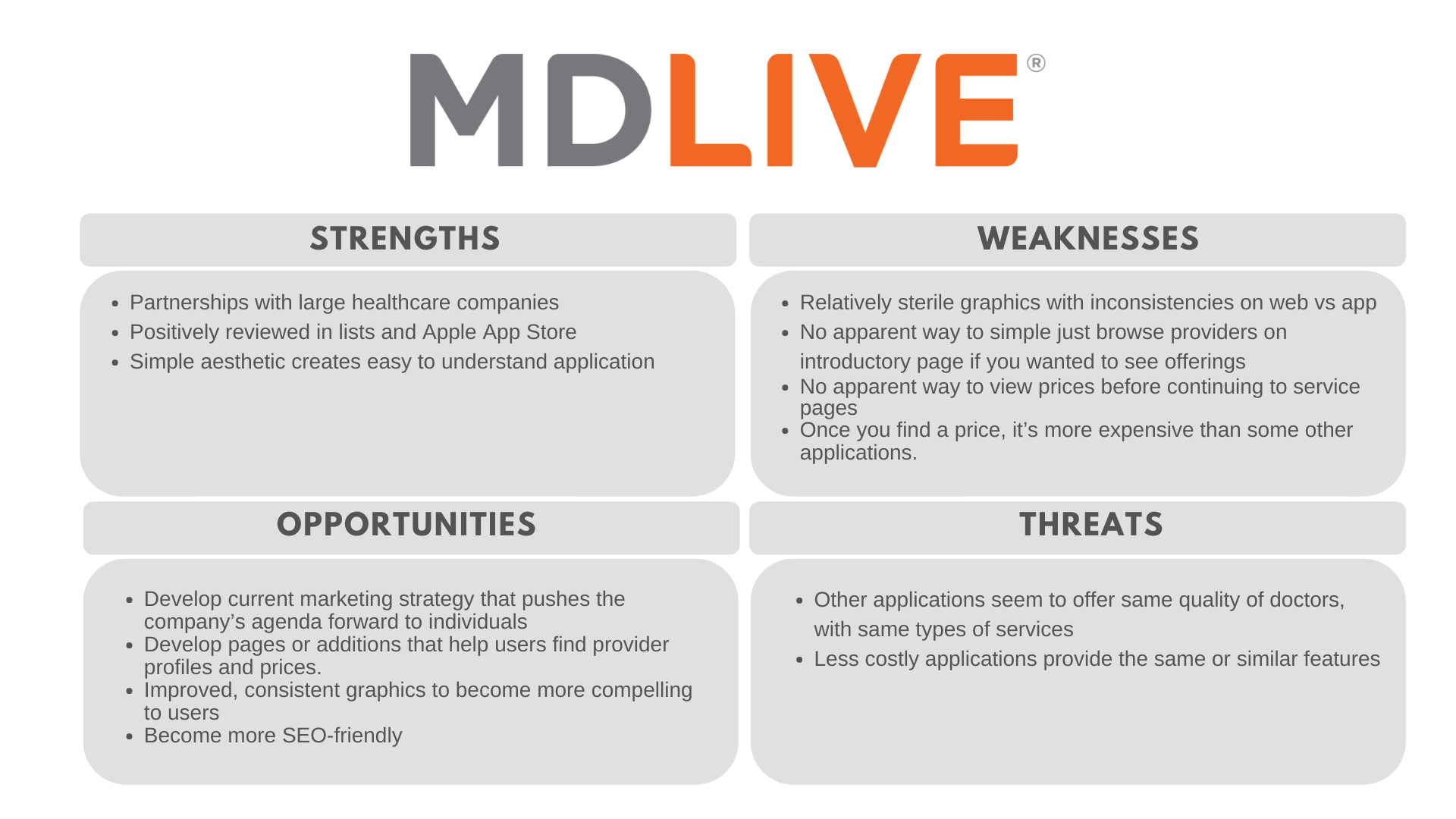
MD Live SWOT Analysis
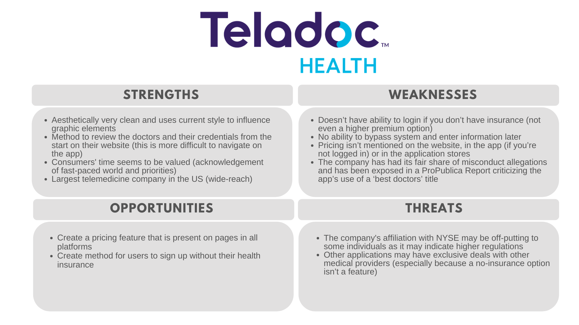
Teladoc Health SWOT Analysis
User Research
Before venturing into design, I wanted to make sure I spoke to people experienced with telemedicine. After all, I believe that effective design is best governed by research. With that in mind, I interviewed colleagues and acquaintances who use these types of applications currently or had done so in the past to gain insight into what they liked and disliked. From these interviews I created affinity maps to better organize and prioritize my findings.
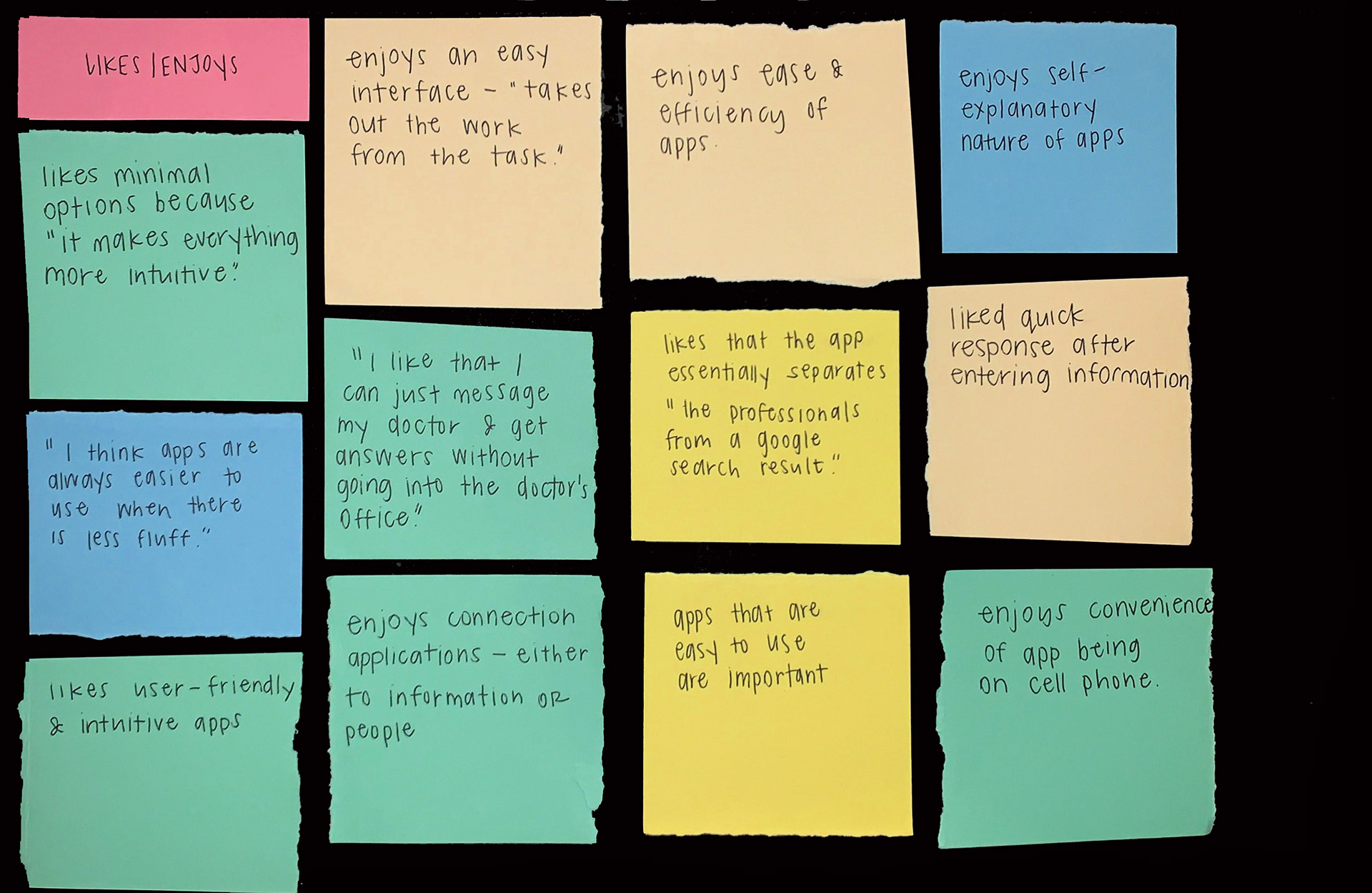
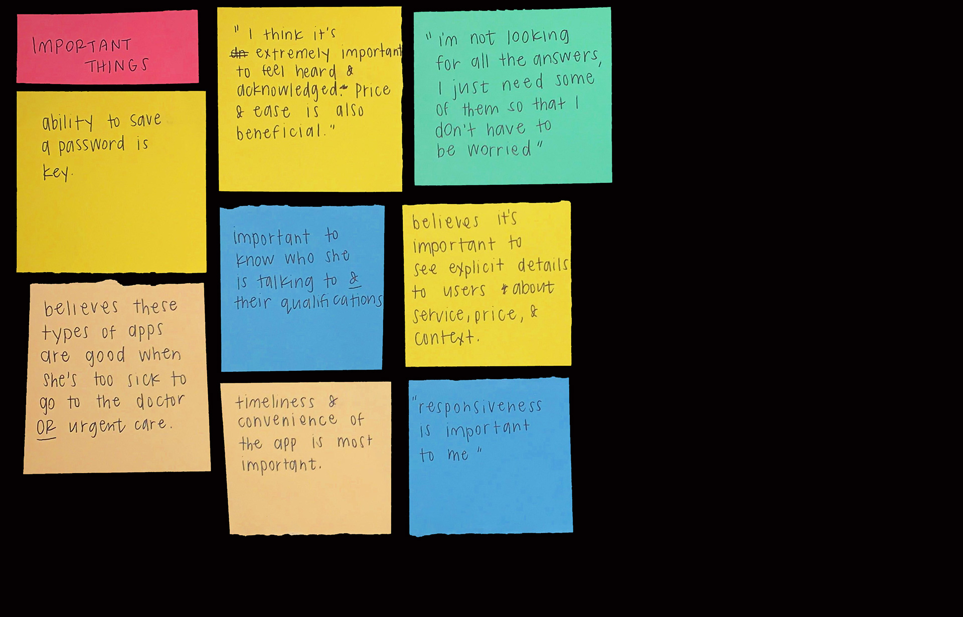
Important Factors
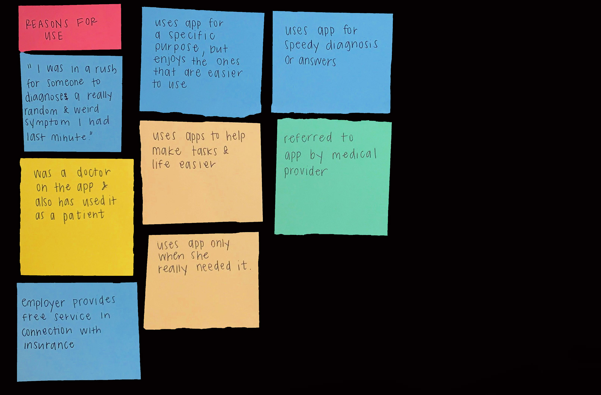
Reasons for Use
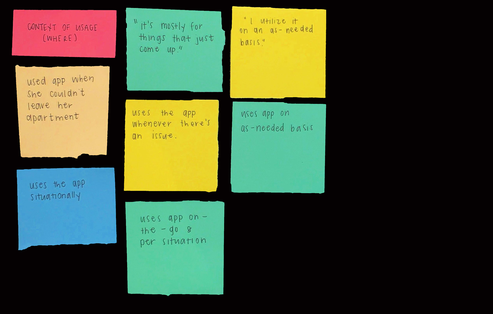
Context of Usage
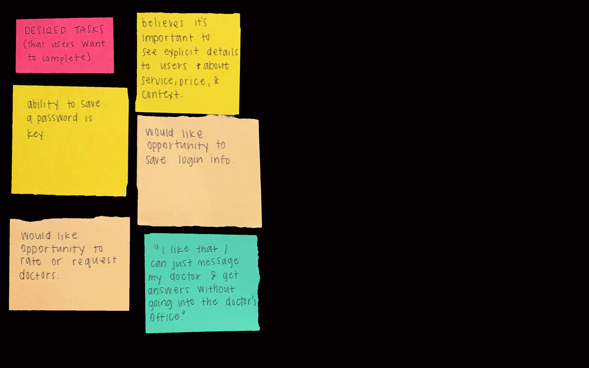
Desired Tasks
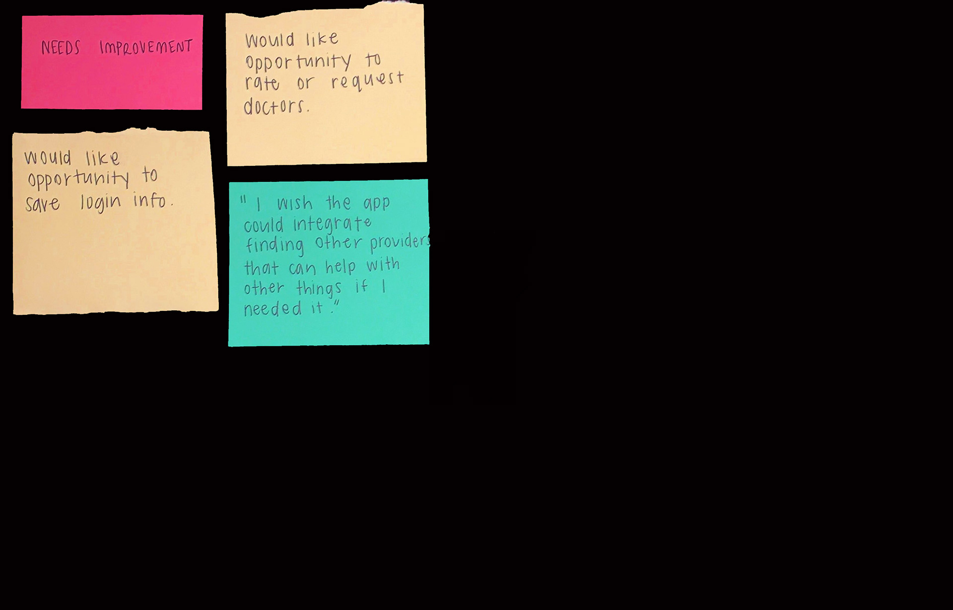
Needs Improvement
User Personas
With sufficient user research obtained, I felt confident that I had a firm grasp on who my audience would be and began crafting the primary and secondary personas. I also mapped each user’s journey to further explore how CustomCare could cater to its target audience. I believe that understanding the intricacies of these details helps make every decision more personal.
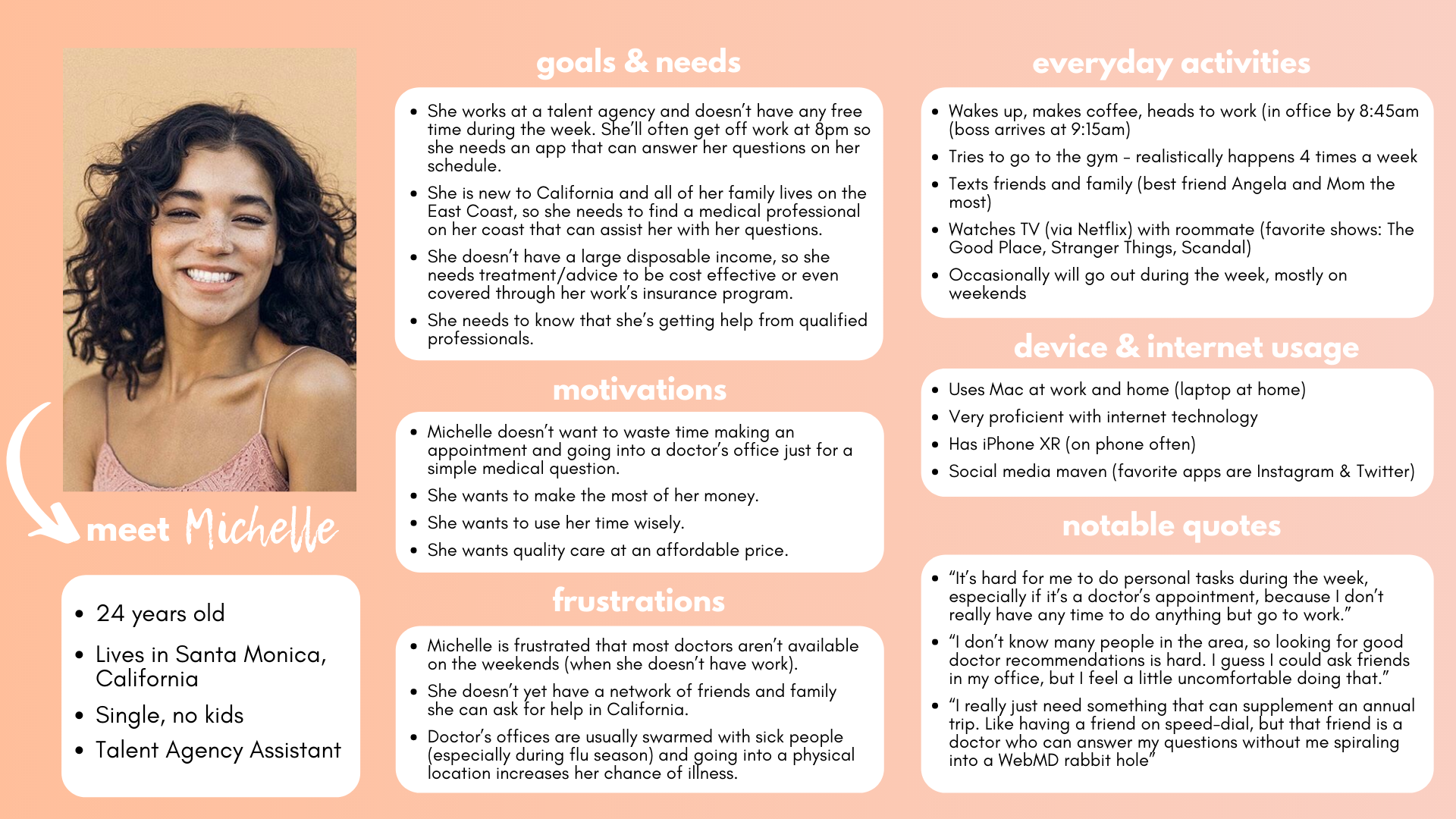
Michelle, Primary Persona
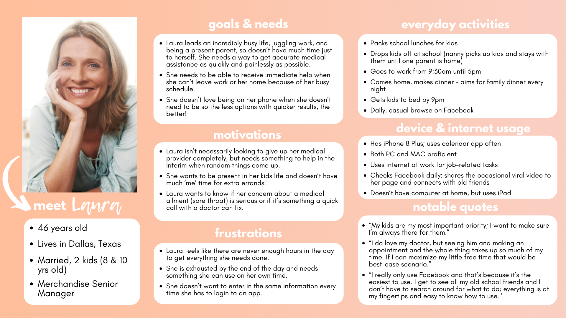
Laura, Secondary Persona
User Flows
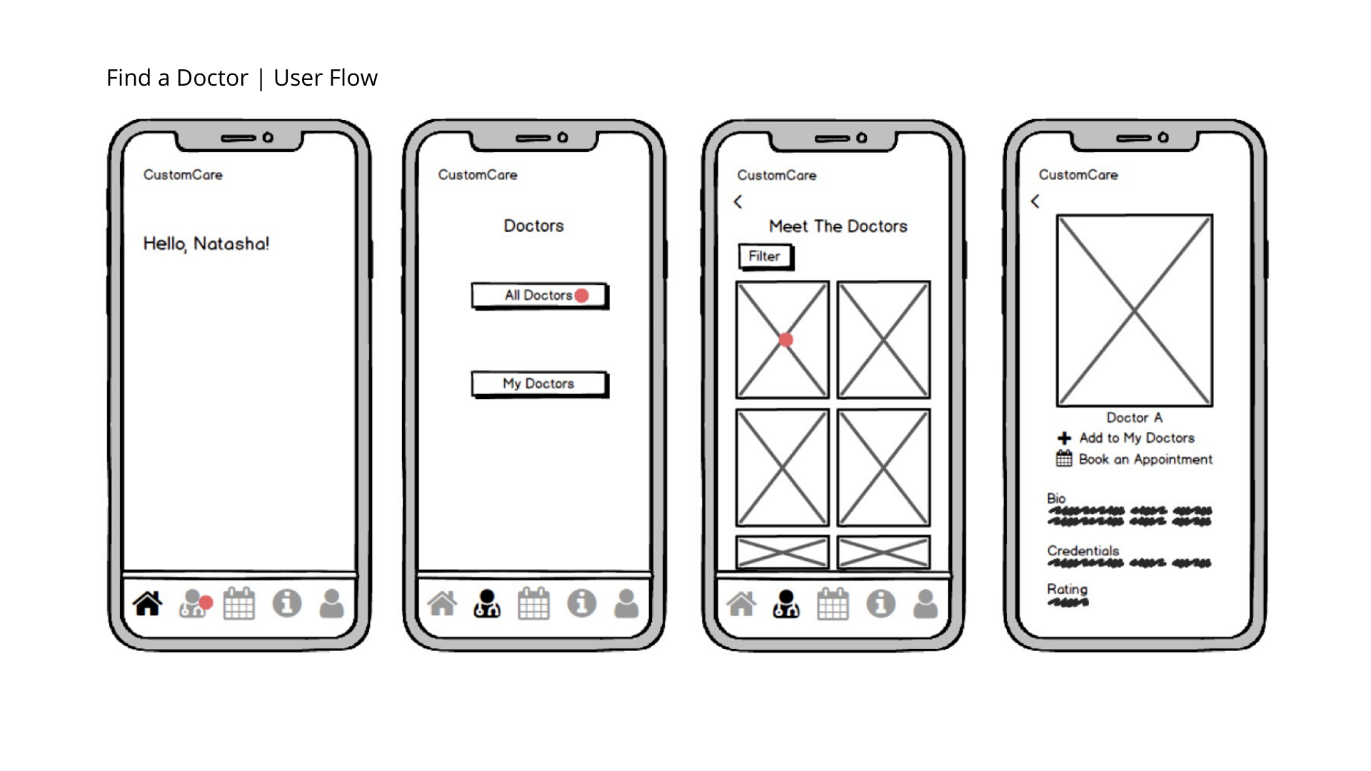
For the primary user flows, I optimized the paths my target audience would want to take to complete their desired tasks. I also created these flows so that before I began designing, I had a blueprint of what I was creating. This process and the evolution of my sitemap were incredibly important in keeping my vision focused on the user’s needs. I identified some of these tasks to be: find a doctor; view the pricing information; and book an appointment.
For this particular example of the 'find a doctor' flow, I decided to show the ability to filter based on specialty. At this point, the specialty wasn't necessarily what the final product would be, but I thought it critical to show a filtering aspect based on my specific research.
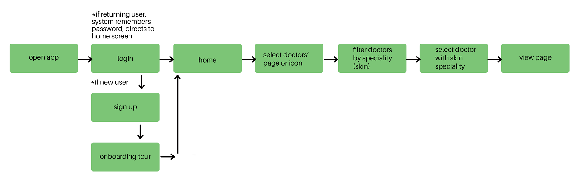
Find a Doctor | User Flow
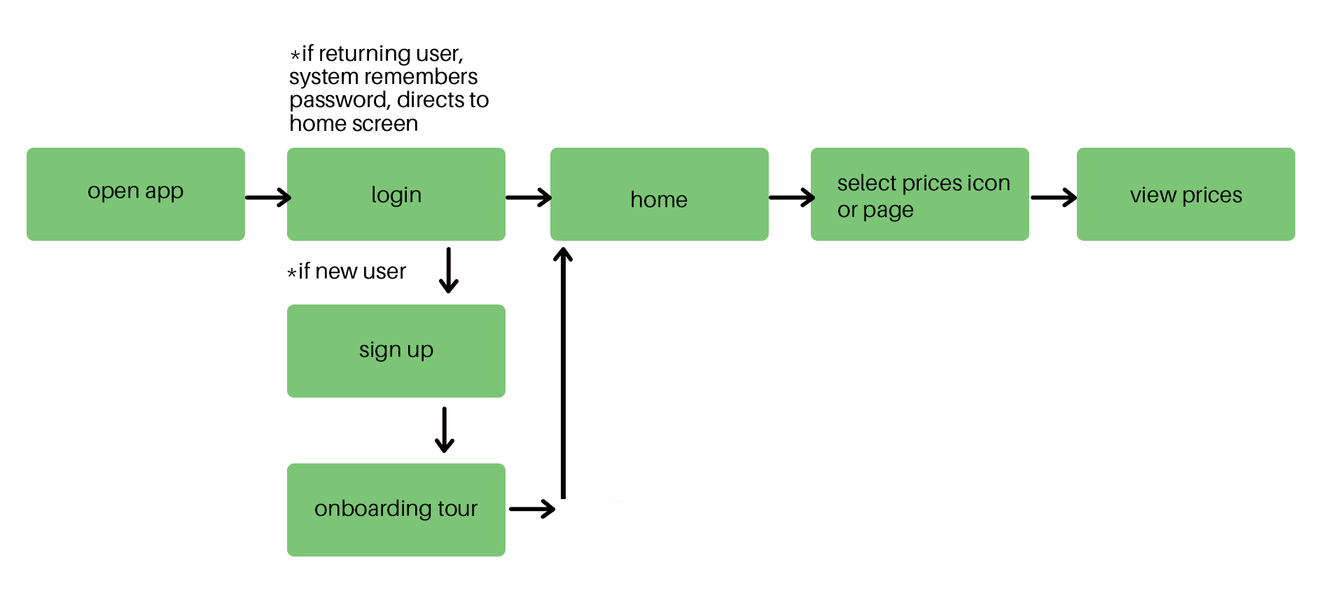
View Pricing | User Flow
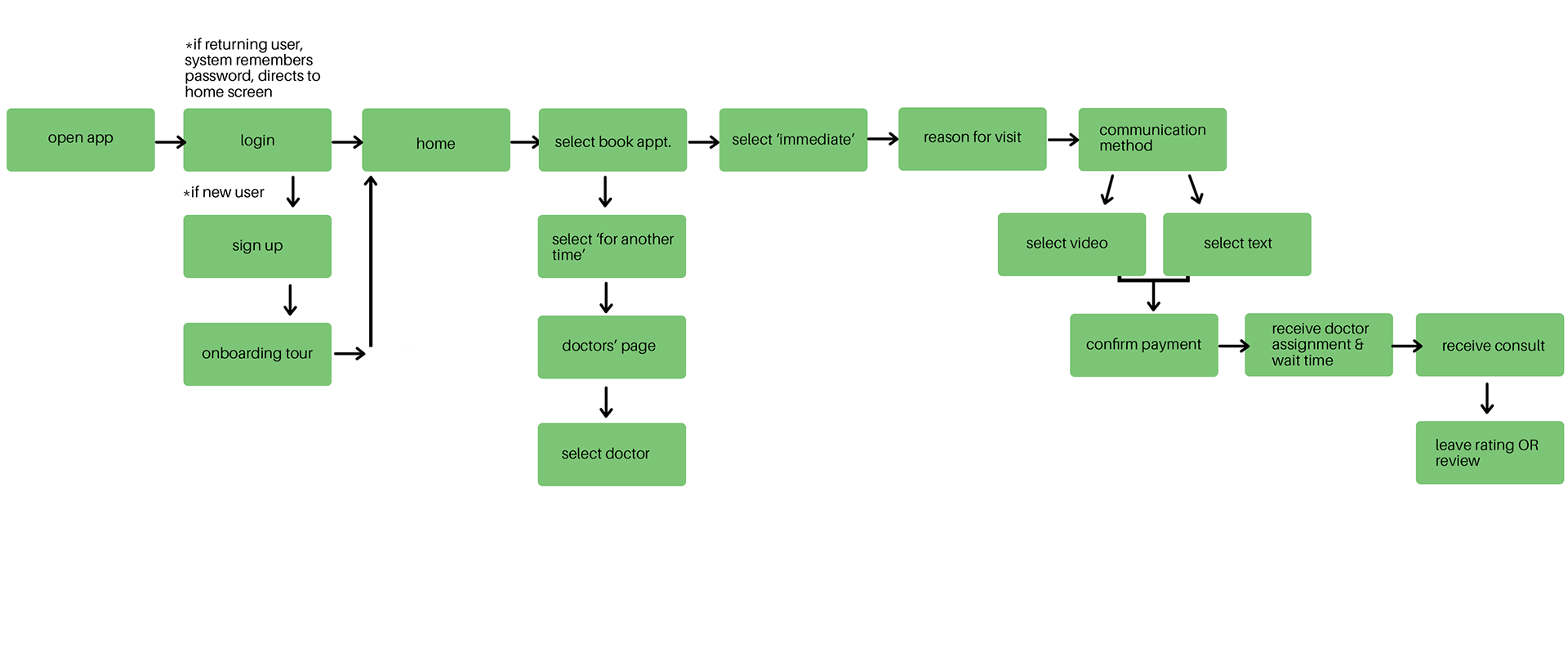
Book an Appointment | User Flow
Wireframes
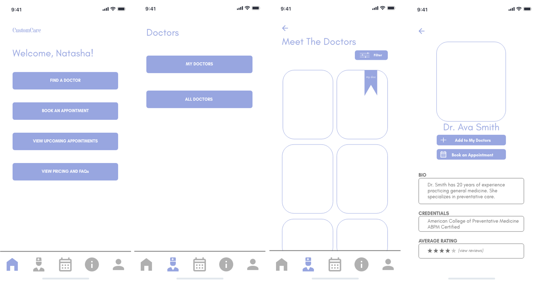
With all initial user information obtained, I started designing CustomCare’s interface using an iterative method: first with pen and pen moving into the application Balsamiq to create mid-fidelity versions and finally fully maturing the iteration in Adobe XD.
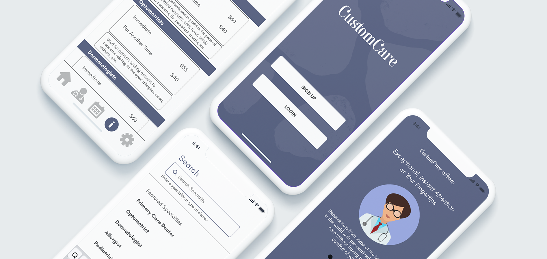
The photo set below shows the evolution of the 'find a doctor' flow through the varied iterations. Perhaps the greatest change in this set was the home page. In the low and mid fidelity wireframes, I made the home screen its own page without any information. I appreciate white space as much as the next person, but this was far too much. In the high-fidelity model, I added some 'go-to' buttons (based on the flows above) so that users didn't have to solely rely on the icons at the bottom to navigate the app.
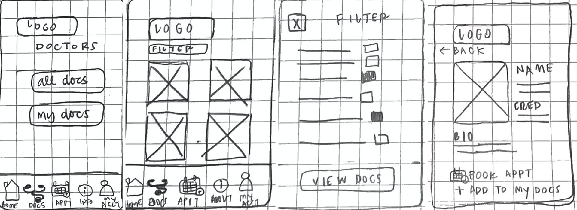
Find a Doctor | User Flow | Low Fidelity (Pen & Paper)
Find a Doctor | User Flow | Mid Fidelity Wireframes
Find a Doctor | User Flow | High Fidelity *missing photos
User Testing
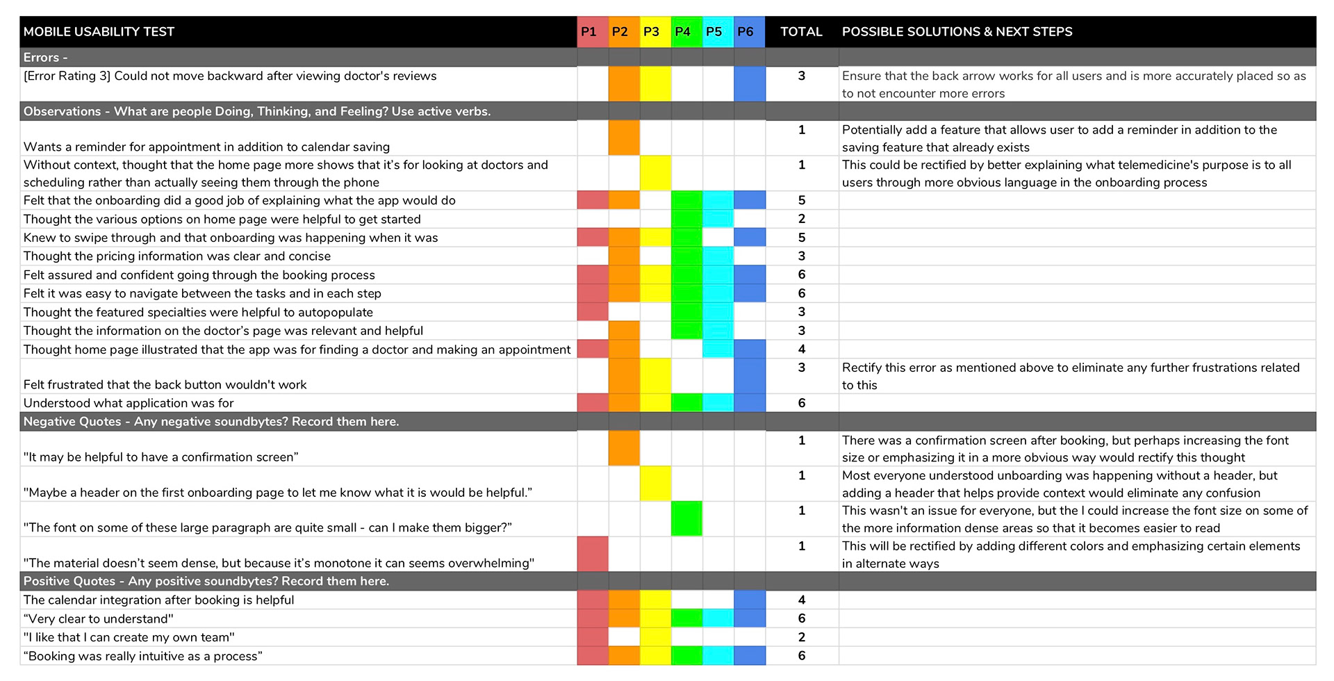
After each iteration of my wireframes, I conducted usability tests to ensure that results enforced my assumptions about the design, while also giving me areas to improve upon. The feedback was wildly helpful and ultimately was the guiding factor in every decision. The grid below categorizes users' errors, observations, and overall feelings toward the app during a usability test on a high-fidelity prototype. I found these results to be particularly beneficial in rectifying errors and simplifying the design to become more intuitive to all users.
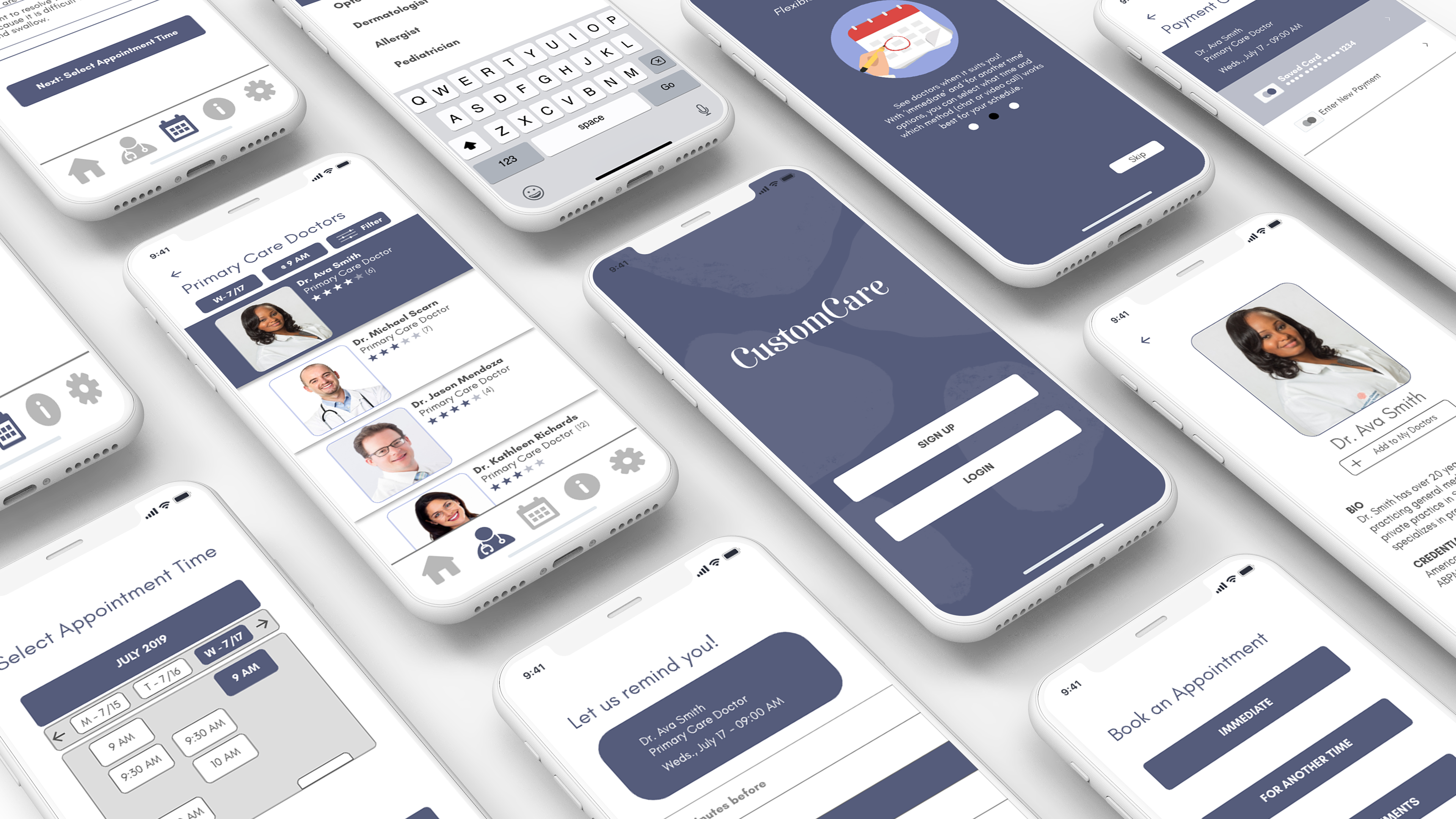
Final Design
After several iterations, helpful peer evaluations, and thoughtful feedback, I finalized my design for the CustomCare application.
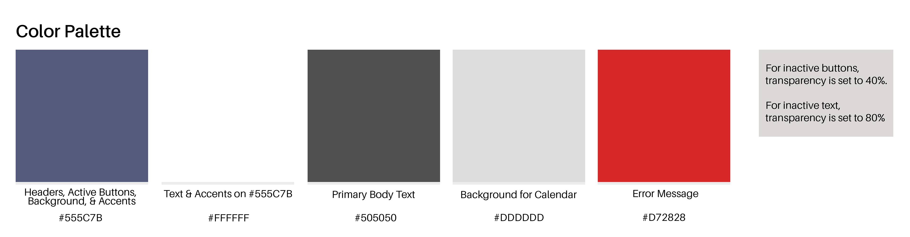
In considering the visual elements of this project, I decided to pursue a deep blue/periwinkle hue as the primary color. In earlier iterations, I had opted for a brighter periwinkle that had more purple in its hue, but through usability testing, I found that this color presented problems with text visibility and wasn't compliant with WCAG accessibility standards. Therefore, I went back to the drawing board to find a new color. In my research phase, I saw that a lot of these types of applications have the same coloring and I wanted to make sure my design stood out among the masses. This final hue shows a security and dependability that everyone wants in a medical app, while also bringing a vibrancy to avoid being stale or boring.
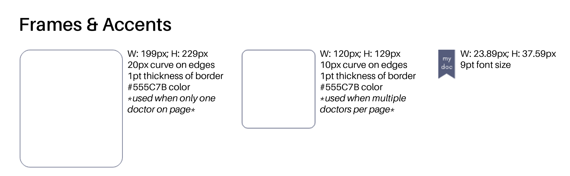
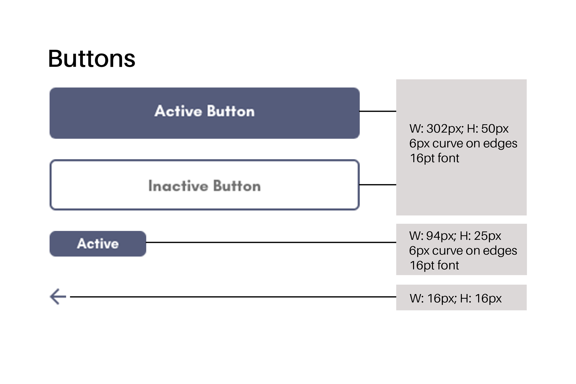
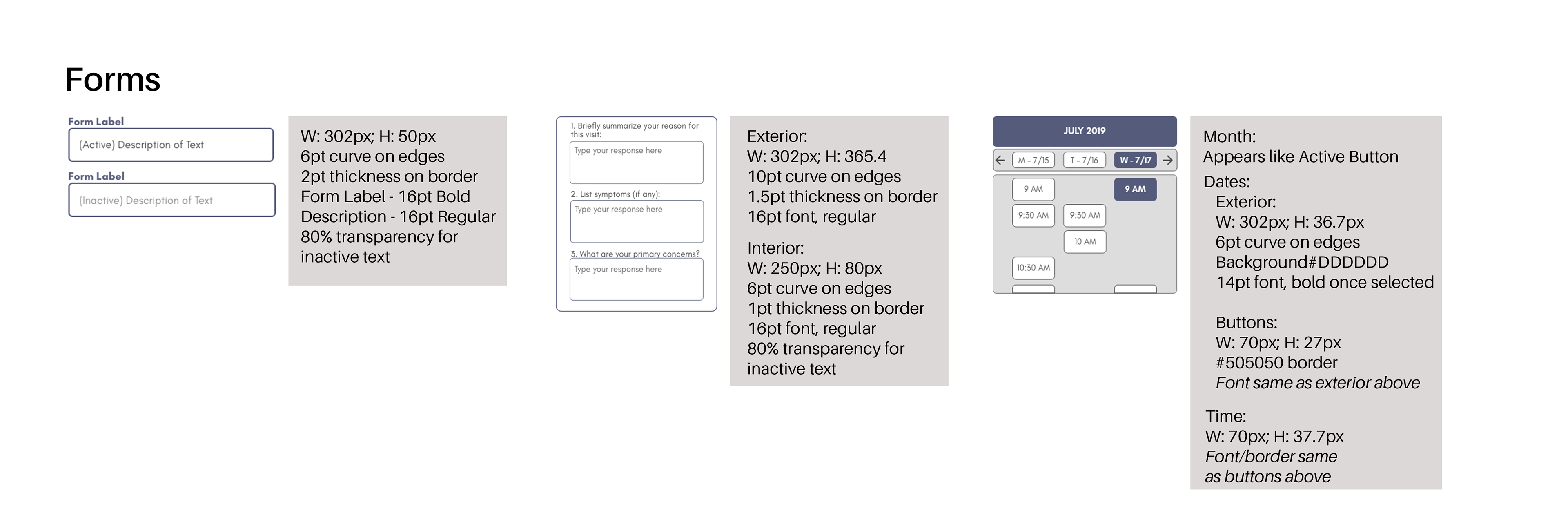
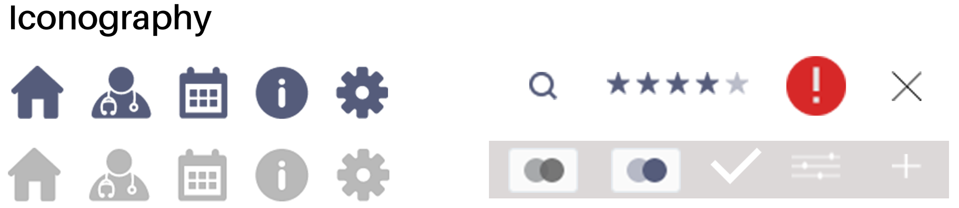
Design Style Guide

Prototype
Learnings & Next Steps
Accessibility is key: In previous iterations, I hadn't considered some WCAG compliant details and once I was made aware of these challenges, I decided it would be best to change the coloring and size of most of the design so that it would be better received by a wider audience.
Always consider your user: Upon receiving feedback, I decided to re-frame my perspective and realized some of my initial thoughts weren't the most user friendly. By listening to earnest users, I was able to implement more accessible and thoughtful designs catered to those using the app. In fact, user testing was critical in helping identify the challenges CustomCare faced. It was during this process that I realized there was a technical error within the prototype that made navigation difficult. Users also suggested ways to improve and simplify the design so that the path from ‘A’ to ‘B’ was the quickest possible. I was able to overcome these problems by fixing the technical error and by cutting out a page that wasn’t necessary to the overall task’s function. Being eager to understand the feedback and adjust accordingly was critical to the final outcome.
To further cement that this design shift was beneficial to my target audience, my next steps would likely be to conduct another series of user testing to confirm this hypothesis.
Sources